

Real Atlas Real World
 |
Description
Book Introduction
The Real Map Story That Saved the Earth
Speaking of the size of the problem, the size of the responsibility, and the size of the hope
This is a statistical atlas that helps us understand and analyze our lives on Earth through maps.
It contains 366 world maps, depicting countries and regions of the world by statistical significance rather than simply physical size, allowing you to see at a glance how they are shaping the new world order.
It appears in different sizes depending on the quantified data, and in particular, it focuses on the various crises we are currently facing, such as conflicts between countries, global warming, and the appearance of a world insecure due to food shortages.
The results under various topics, ranging from basic data such as population, health, wealth, and occupation to the status of toy imports and the number of people eating imported vegetables, are displayed in different colors for easy viewing.
Additionally, each map is accompanied by graphs, diagrams, and detailed explanations to aid understanding.
By examining the world map, which is drawn only in the size of landmasses, from a new perspective, you can collect past, present, and future trends according to your purpose.
"Real Atlas: Real World" teaches us about the world we live in and helps us understand our place in it.
Because our size on the map speaks volumes about the size of our problems, our responsibilities, and our hopes.
Therefore, if our future self changes positively, the statistical map will undoubtedly change as well, and this book provides the right direction to help us find that path throughout the world.
- You can preview some of the book's contents.
Preview
index
introduction
Chapter 1 Resources
Part 1: Land Area and Population
Part 2: Travel and Transportation
Part 3: Natural Resources and Energy Sources
Chapter 2 Trade
Part 1: Globalization and Internationalization
Part 2: Food and Supplies
Part 3: Minerals, Natural Products, and Petrochemicals
Chapter 3 Economy
Part 1: Goods and Services
Part 2: Wealth and Poverty
Part 3: Employment and Production
Chapter 4 Society
Part 1: Housing and Education
Part 2: Communication and Media
Part 3_Health and Disease
Chapter 5 Risk
Part 1: Death and Disaster
Part 2_War and Crime
Chapter 6 Environment
Part 1: Pollution and Depletion
Part 2: Extinction and Risk
Detailed image
Publisher's Review
The Real Map Story That Saved the Earth
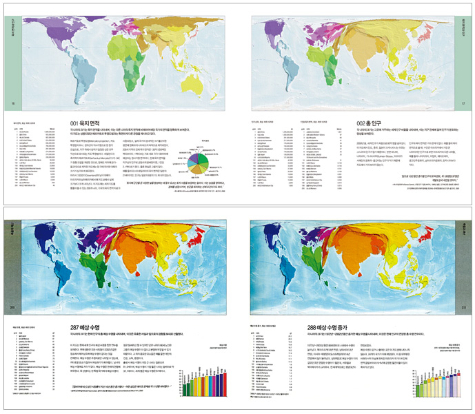
A typical world map shows the size of each country based on the size of its landmass.
For large countries like Russia, China, Canada, and the United States, this may not be a problem, but for small countries like ours, it is not easy for foreigners to even find the country on a map.
But in 『Real Atlas Real World』, the story is different.
Sometimes you can find maps where our country has transformed into a fairly large country.
In the 366 world maps included in 『Real Atlas Real World』, not only our country but also each country and region of the world is drawn differently based on statistical significance rather than physical size.
Depending on the quantified data, some areas appear in different sizes, sometimes larger and sometimes smaller than others.
In particular, it focuses on the various crises we face today, particularly the world insecure due to conflicts between nations, global warming, and food shortages.
Through various maps, you can see at a glance environmental and ecological issues such as how oil, water, and food resources are concentrated in certain countries, how health inequalities are revealed globally through various mortality rate variations, and how much the Earth's forests are being reduced due to desertification.
It covers not only the big questions of life like population, health, wealth, and employment, but also the smaller ones, like how many toys each country imports and who eats the vegetables each country produces.
By examining the world map, which is drawn only in terms of landmasses, from this new perspective, you can collect past, present, and future trends according to your purpose.
To aid understanding, each map is accompanied by graphs, diagrams, and detailed explanations.
For anyone who wants to understand how the world's various countries and regions are shaping a new world order, "The Real Atlas: The Real World" will provide the means and criteria for discovering the true face of Earth.
366 maps broadcast the Earth live as a real documentary.
What we know about the world today is far more vast than ever before.
For example, in the past it was not easy to find out how many televisions there were in Burkina Faso.
But as we enter the 21st century, many things have changed in the field of statistics.
Technological and administrative changes played a major role here.
First, from a technological standpoint, the advent of the Internet and the computer age has made it much easier to gather reliable information.
From an administrative standpoint, the UN and other organizations have undertaken numerous projects aimed at collecting world statistical data on a much broader scale than previously possible.
As a result, we have excellent statistics on a wide range of topics from around the world.
Examples include income, literacy rate, number of doctors, nurses, teenage mothers, number of smokers, military spending, extinct species, greenhouse gas emissions, and number of mobile phones.
All of this material is available for free on the web, but most of it is just a series of numbers in tables, which can be difficult to read and understand.
For example, Japan's domestic water consumption is 17 billion cubic meters per year.
So, is this a large amount? Or a small amount? Is there a way to compare this to Japan's total freshwater supply? Is there a way to compare it to the water consumption of other countries? It's difficult to answer these questions without carefully analyzing the table over time.
A much easier way to visualize what's happening in the world is to create maps.
This book does just that.
The 366 maps in this book illustrate a wide range of geographic and social statistics.
It covers everything from basic data like population, health, wealth, and jobs to details like toy imports and the number of people eating imported vegetables.
It is a book full of new information and knowledge.
The joys and sorrows of the Earth as told by maps
① Joy of the Earth; Voting Rights, p. 28
The size of each country represents the total time that all adults in that country have lived as voters.
It was calculated by multiplying the total population by the number of years in which general elections were held before 2004.
Therefore, on this map, countries with large populations or those that have held universal suffrage for a long time appear larger.
Universal adult suffrage was first introduced in New Zealand in 1893, and was followed by the Scandinavian countries of Finland (1906), Norway (1913), and Denmark (1915).
By 1994, virtually all adults in 190 of the world's 200 countries could vote.
② Earth's Wrath; Forest Depletion, p. 371
The size of each country was measured by the rate of forest loss and the market price of timber in US dollars.
As shown on the map, forest depletion is the result of a severe deforestation reality that cannot be compensated for by timber regeneration, as the rate at which forests are being cut down is increasing.
The loss price was measured as the market price of raw timber that had not undergone any processing.
In other words, this map shows the dollar value of the trees cut down in that country to deplete its forests.
The countries with the highest rates of deforestation are India, Ethiopia, Pakistan and Bangladesh.
Nearly half, or 46 percent, of the world's logging takes place in India.
China and Japan are illegally purchasing large quantities of timber and then transforming it into export products for markets in Europe, North America, Australia, and New Zealand.
It destroys life and it destroys humanity.
③ The Sorrows of the Earth: The Population of the War, 1945–2004, p. 341
The size of each country represents the time it experienced war between 1945 and 2004.
During this period, an average of 2.8 billion people lived in countries at war.
Of these, 29 percent lived in India and 20 percent in China.
Myanmar, formerly known as 'Burma', has never ceased to be at war, and Britain has only enjoyed four years of peace.
Only 22 countries have not experienced any war in 60 years.
④ Earth's Pleasures; Watching Movies, p. 272
The size of each country represents the number of moviegoers in its cinemas.
This map shows where commercial films (excluding short films) are most widely watched.
In 1999, 7.6 billion people went to the movies, of which about 3 billion were in India.
There are currently over 12,000 movie theaters in India, ranging from small, ramshackle neighborhood cinemas to overly extravagant movie theaters.
Iceland has the highest per capita movie attendance, with the average person seeing five films in a cinema each year.
In contrast, Malaysia has only about one in every 100 people who visit the cinema throughout the year, and even then, they rarely see a single film.
Examples of Using Real Atlas Real World
; The past, present, and future of Korea as revealed by the map
① The wounds of the Korean Peninsula from 60 years ago
The size of each country represents the number of deaths from armed conflict between 1945 and 2000.
In North Korea, 10 percent of the population lost their lives in the war, and in South Korea, 4.7 percent of the population lost their lives in the war.
The fact that the Korean Peninsula, including South and North Korea, has grown so large is clearly due to the Korean War that broke out in 1950.
Considering that there has been no significant armed conflict on the Korean Peninsula since the Korean War, one can easily imagine the extent of the tragedy at that time.
North and South Korea are listed among the top 20 countries with the highest number of war deaths since World War II, along with countries notorious for their sad and bloody history, such as Cambodia, East Timor, Rwanda, Afghanistan, and Sudan.
Looking at these countries listed, it seems like the Korean War wasn't that long ago.
_ War and Crime, War Deaths 1945–2000, p. 342
② The South Korean computer that swallowed the world map
This map shows the dollar value of each country's net computer exports.
The impact is significant, as computer net export income accounts for 10.6 percent of global net export income.
We use computers to do our jobs, control machines like cars, trains, and airplanes, and communicate with friends and colleagues on the other side of the world.
In terms of net exports of computers, which play such an important role in our lives, Korea has grown this much.
Many countries in Western Europe are also significant net exporters, but the region as a whole barely qualifies as a net exporter, as exports are almost perfectly balanced by regional imports.
_ Goods and Services, Computer Exports, p. 138
③ Republic of Korea, the world's wheel and wings
The size of each country represents the dollar value of its net exports of transportation vehicles.
Means of transport include cargo vehicles, bicycles, motorcycles, trains, buses, ships, airplanes, and automobile parts, excluding automobiles.
Transportation accounts for 6 percent of global export earnings, and Korea proudly occupies a spot among the top four exporting countries, along with Japan, Germany, and France.
_ Exports of goods, services, and means of transport, p. 142
④ The land is narrow and resources are scarce.
The size of each country represents the dollar value of its exported goods, which have not undergone any manufacturing process.
(Price adjusted to local purchasing power, taking into account the currency values of countries.) Primary products are unprocessed products such as crude oil, fresh fruit, or iron ore.
Our country has a very low dependence on primary product exports in international trade.
Among the 200 countries, Korea ranked 9th from the bottom along with Japan and others in the 10 countries with the lowest level of primary product surgery in 2002.
If we were to look at the amount of natural resources exported, our country would disappear from the map.
For the same reason, our country is growing to occupy a significant area on the map when it comes to energy imports.
Globalization and Internationalization, Primary Product Exports, 2002, p. 81
⑤ Talent will save the Republic of Korea.
The size of each country was measured by the number of papers published by researchers in that country between 1990 and 2001.
By publishing papers in scientific journals, scientists present and explain their findings to other scientists.
Here, 'science' includes physics, biology, chemistry, mathematics, clinical medicine, biomedical research, engineering, computer science, science and technology, and even earth and space science.
The wealthier a country is, the more scientific research it conducts and, consequently, the more results it publishes.
Our country also made it to the list in 11th place.
It is clear that the survival of our country, which exports very small amounts of primary products, depends on scientific and technological prowess.
It has been confirmed that a significant amount of budget is being poured into research and development.
If we draw a world map with the eyes of 'research and development expenses', the United States is the largest country, followed by neighboring Japan.
_ Increase in housing, education, and scientific research, p. 255
⑥ South Korea, which makes the Earth hot and dangerous
The size of each country represents the increase in carbon dioxide emissions between 1980 and 2000.
During this period, carbon dioxide emissions increased in three-quarters of all countries.
Countries where emissions remained the same or decreased are not shown on the map.
The countries with the largest increases in carbon dioxide emissions over this period were China, the United States, and India.
These three countries are home to 42 percent of the world's population and collectively account for 45 percent of global carbon dioxide emissions.
But in terms of per capita carbon dioxide emissions, the United States has grown more than three times as much as China and four times as much as India.
Our country also ranked among the top 10 countries in terms of carbon dioxide emissions, failing to shake off the stigma of being the biggest contributor to global climate change.
_ Pollution and Depletion, Increasing Carbon Dioxide Emissions, p. 352
⑦ Cold and stingy Republic of Korea
The size of each country is expressed in US dollars as the total amount the government has contributed to international food aid.
Many countries around the world are struggling to access basic necessities, including food, due to war, drought, economic collapse, and various disasters.
This map shows the total dollar amount of food donated by each country in 2005 to people whose normal food supply was cut off.
This type of food aid is only a stopgap measure, but it is certainly necessary.
In 2005, governments contributed approximately 2.5 billion US dollars to food aid programs.
Half of this was contributed by the United States, and a third by Western European countries.
International organizations, individuals and charities have donated more than US$500 million.
On this map, our country is so small that it is embarrassingly difficult to locate.
_ Globalization and Internationalization, International Food Aid, p. 92
『Real Atlas Real World』, speaking of the size of the problem, the size of responsibility, and the size of hope.
Most of the maps featured in "Real Atlas Real World" were drawn with concern for the world we live in.
For example, billions of people still live in poverty in slums.
They live without access to clean water, adequate medical care, and even a place to lie down.
Inequality between the rich and the poor is also worsening worldwide.
Maps showing life expectancy generally show a significant increase from 1972 to the present, but virtually none of the countries in Africa have seen an increase.
A map showing the flow of trade shows that production is concentrated on one side of the globe, while consumption is concentrated on the other side.
In the poorest areas, the population is increasing, while in the richer areas, the population is staying the same or even decreasing.
As a result, wealth is increasingly concentrated in the hands of a small number of people.
So, are the maps in "Real Atlas: Real World" entirely pessimistic? Turn the pages again and examine the maps.
These maps will teach us the world we live in and help us understand our place in it.
In that sense, the maps introduced in this book also perform the universal functions of maps.
That is, it shows us where we currently stand and provides direction to help us find our way through the world.
Now, the perspective from which we read 『Real Atlas Real World』 has become clear.
Our size on the map speaks volumes about the size of our problems, our responsibilities, and our hopes.
Of course, there are some aspects that we cannot control, but the shape of the future world is largely in our hands.
If our future changes positively, the appearance of statistical maps will certainly change as well.
Through "Real Atlas Real World," we hope that readers will join us in dreaming of a better world.
GOODS SPECIFICS
- Date of issue: February 15, 2009
- Format: Hardcover book binding method guide
- Page count, weight, size: 400 pages | 2,356g | 265*230*30mm
- ISBN13: 9788970419886
- ISBN10: 8970419888
You may also like
카테고리
korean


korean

![ELLE 엘르 스페셜 에디션 A형 : 12월 [2025]](http://librairie.coreenne.fr/cdn/shop/files/b8e27a3de6c9538896439686c6b0e8fb.jpg?v=1766436872&width=3840)


