

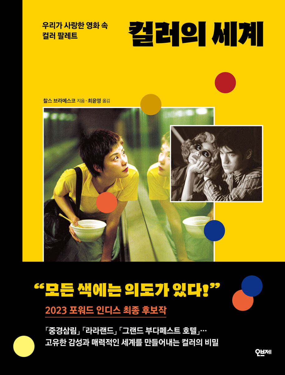
The world of color
 |
Description
Book Introduction
- A word from MD
-
The power of color to transform ideas into inspirationA color guidebook that creates the movie's atmosphere, worldview, and theme.
We've selected films that clearly demonstrate the intent of color, from classics to the present, and organized them so that you can intuitively understand the combination and use of color.
The colors in the film seen through the eyes of a critic provide a new perspective and sensibility on color.
June 7, 2024. Art PD Ahn Hyun-jae
The world of color is endless.
Color plays an essential role in content.
It can evoke emotions and make persuasive arguments without much explanation.
This is why the role of color has always been emphasized in fields such as marketing, branding, drama, and film.
The meaning conveyed changes depending on how colors are combined and what color palette is used.
Art directors, illustrators, designers, and fashion stylists for dramas and movies create color palettes before starting work to create a unique atmosphere and sensibility and effectively convey their message.
The colors used in movies are especially special.
This is because it breaks the socially agreed-upon concept of color and gives it new meaning, immersing the audience in the world of the film.
People who work with color often refer to color palettes from movie scenes for various inspirations.
"The World of Color," a selection of color palettes from the movies we love, is a cinema color guidebook by Charles Bramesco, a regular contributor to film reviews for Rolling Stone, Vanity Fair, and The Guardian. It includes 50 masterpieces from classic to modern times that are known for their ability to effectively express the intent of color.
This book features large illustrations of famous scenes from movies and their matching color palettes, allowing readers to intuitively understand color combinations and uses. It also includes behind-the-scenes explanations of the colors from a critic's perspective.
For those who work with color, it provides a sense of color coordination and excellent eye for effectively conveying intentions, and for those who wish to cultivate artistic culture, it provides a new perspective on color and a delicate sensibility.
Color plays an essential role in content.
It can evoke emotions and make persuasive arguments without much explanation.
This is why the role of color has always been emphasized in fields such as marketing, branding, drama, and film.
The meaning conveyed changes depending on how colors are combined and what color palette is used.
Art directors, illustrators, designers, and fashion stylists for dramas and movies create color palettes before starting work to create a unique atmosphere and sensibility and effectively convey their message.
The colors used in movies are especially special.
This is because it breaks the socially agreed-upon concept of color and gives it new meaning, immersing the audience in the world of the film.
People who work with color often refer to color palettes from movie scenes for various inspirations.
"The World of Color," a selection of color palettes from the movies we love, is a cinema color guidebook by Charles Bramesco, a regular contributor to film reviews for Rolling Stone, Vanity Fair, and The Guardian. It includes 50 masterpieces from classic to modern times that are known for their ability to effectively express the intent of color.
This book features large illustrations of famous scenes from movies and their matching color palettes, allowing readers to intuitively understand color combinations and uses. It also includes behind-the-scenes explanations of the colors from a critic's perspective.
For those who work with color, it provides a sense of color coordination and excellent eye for effectively conveying intentions, and for those who wish to cultivate artistic culture, it provides a new perspective on color and a delicate sensibility.
- You can preview some of the book's contents.
Preview
index
To Korean readers
introduction
Chapter 1.
Beyond the rainbow
Posthumous colorization of black-and-white films
01.
A Journey to the Moon, Georges Méliès
02.
Intolerance, David W.
Griffith
03.
The Wizard of Oz, Victor Fleming
04.
Fantasia, Walt Disney Productions
05.
Black Narcissus, Michael Powell & Emeric Pressburger
06.
The River, Jean Renoir
07.
Singin' in the Rain, Stanley Donen & Gene Kelly
08.
A Love for Innocence, Douglas Sirk
09.
The Searchers, John Ford
10.
Vertigo, Alfred Hitchcock
11.
Lawrence of Arabia, David Lean
Chapter 2.
limitless imagination
Kodak and Fujifilm
01.
The Umbrellas of Cherbourg, Jacques Demy
02.
Red Desert, Michelangelo Antonioni
03.
Color Me Blood Red, Hershel Gordon Lewis
04.
2001: A Space Odyssey, Stanley Kubrick
05.
Shouts and Whispers, Ingmar Bergman
06.
Touki Bouki, Djibril Diop Mambéty
07.
Bobby, Raj Kapoor
08.
Don't look at me, Nicholas Roeg
09.
Anxiety eats away at the soul, Rainer Werner Fassbinder
10.
Jeanne Dielman, Chantal Akerman
11.
God told me, Larry Cohen
12.
Suspiria, Dario Argento
13.
Ran, Akira Kurosawa
Chapter 3.
The advent of a new era
Color theory
01.
Blue Velvet, David Lynch
02.
Dick Tracy, Warren Beatty
03.
Blue, Derek German
04.
Schindler's List, Steven Spielberg
05.
Three Colors Trilogy, Krzysztof Kieślowski
06.
Chungking Express, Wong Kar-wai
07.
Seven, David Fincher
08.
Belly, Hype Williams
09.
Peppermint Candy, Lee Chang-dong
10.
The Virgin Suicides, Sofia Coppola
11.
But I'm a cheerleader, Jamie Bobbitt
12.
Song from the Second Floor, Roy Andersson
13.
Traffic, Steven Soderbergh
14.
Amelie, Jean-Pierre Jeunet
15.
Spirited Away, Hayao Miyazaki
Chapter 4.
Digital Wonderland
color television
01.
The Aviator, Martin Scorsese
02.
Saw II, Darren Lynn Boothman
03.
Speed Racer, Lana & Lilly Wachowski
04.
Enter the Void, Gaspar Noe
05.
Amer, Ellen Cate & Bruno Forzani
06.
Tron: Legacy, Joseph Kosinski
07.
The Grand Budapest Hotel, Wes Anderson
08.
Mad Max: Fury Road, George Miller
09.
La La Land, Damien Chazelle
10.
Black Panther, Ryan Coogler
11.
Lovers Rock, Steve McQueen
Additional References
Acknowledgements
annotation
index
introduction
Chapter 1.
Beyond the rainbow
Posthumous colorization of black-and-white films
01.
A Journey to the Moon, Georges Méliès
02.
Intolerance, David W.
Griffith
03.
The Wizard of Oz, Victor Fleming
04.
Fantasia, Walt Disney Productions
05.
Black Narcissus, Michael Powell & Emeric Pressburger
06.
The River, Jean Renoir
07.
Singin' in the Rain, Stanley Donen & Gene Kelly
08.
A Love for Innocence, Douglas Sirk
09.
The Searchers, John Ford
10.
Vertigo, Alfred Hitchcock
11.
Lawrence of Arabia, David Lean
Chapter 2.
limitless imagination
Kodak and Fujifilm
01.
The Umbrellas of Cherbourg, Jacques Demy
02.
Red Desert, Michelangelo Antonioni
03.
Color Me Blood Red, Hershel Gordon Lewis
04.
2001: A Space Odyssey, Stanley Kubrick
05.
Shouts and Whispers, Ingmar Bergman
06.
Touki Bouki, Djibril Diop Mambéty
07.
Bobby, Raj Kapoor
08.
Don't look at me, Nicholas Roeg
09.
Anxiety eats away at the soul, Rainer Werner Fassbinder
10.
Jeanne Dielman, Chantal Akerman
11.
God told me, Larry Cohen
12.
Suspiria, Dario Argento
13.
Ran, Akira Kurosawa
Chapter 3.
The advent of a new era
Color theory
01.
Blue Velvet, David Lynch
02.
Dick Tracy, Warren Beatty
03.
Blue, Derek German
04.
Schindler's List, Steven Spielberg
05.
Three Colors Trilogy, Krzysztof Kieślowski
06.
Chungking Express, Wong Kar-wai
07.
Seven, David Fincher
08.
Belly, Hype Williams
09.
Peppermint Candy, Lee Chang-dong
10.
The Virgin Suicides, Sofia Coppola
11.
But I'm a cheerleader, Jamie Bobbitt
12.
Song from the Second Floor, Roy Andersson
13.
Traffic, Steven Soderbergh
14.
Amelie, Jean-Pierre Jeunet
15.
Spirited Away, Hayao Miyazaki
Chapter 4.
Digital Wonderland
color television
01.
The Aviator, Martin Scorsese
02.
Saw II, Darren Lynn Boothman
03.
Speed Racer, Lana & Lilly Wachowski
04.
Enter the Void, Gaspar Noe
05.
Amer, Ellen Cate & Bruno Forzani
06.
Tron: Legacy, Joseph Kosinski
07.
The Grand Budapest Hotel, Wes Anderson
08.
Mad Max: Fury Road, George Miller
09.
La La Land, Damien Chazelle
10.
Black Panther, Ryan Coogler
11.
Lovers Rock, Steve McQueen
Additional References
Acknowledgements
annotation
index
Detailed image

Into the book
The author is clear about what he wants the readers to get out of this book.
I hope that not only the general reader but also lifelong film enthusiasts will, after reading this book, not simply absorb the information but also feel a sense of curiosity, as I did.
I hope that when you watch the film, you won't be able to pass a single scene without thinking about exactly what brown that tree is, or why that wall is painted that deep yellow.
--- p.15
Color interference itself may not be a major threat.
But what if you could subtly lighten or darken your skin tone with this? That's a completely different story.
--- p.19
In 1939, American morale was at an all-time low after a decade of economic poverty stemming from the Great Depression.
"The Wizard of Oz," which was released at that time, was very popular as an inexpensive form of entertainment for the masses.
Dorothy's imaginary adventures in a mysterious land provide a refreshing escape to audiences weary of reality.
Even if the time to escape from the hardship is only an hour or two
--- p.24
The interior, reminiscent of a funeral with a stillness that falls, clashes with the red that suggests anxiety.
For example, a flashback shows one sister bleeding and cutting herself with shards of glass in an attempt to drive her husband out.
Director Bergman uses the fade-in technique in red to convey that all humans originate from red.
So every time the scene changes, the screen turns red.
--- p.72
Since the advent of color films, depicting good and evil has not been so simple.
Filmmakers had conflicting opinions on how to use warm and cool colors.
For example, in Star Wars, the lightsabers of the Jedi, the guardians of peace, glow blue or green (signifying inner peace and unity), while those of the Sith, the terrorists, glow red (signifying anger, impulsiveness, and fire).
However, in "Harry Potter," the boy wizard Harry's wand is red (suggesting noble and noble bloodline with courage), and the dark lord Voldemort's wand is green (suggesting snakes, splendor, and poison).
So it's hard to come to a single conclusion about color.
--- p.106
The industrialized city of Lan Kwai Fong is awash in grey, with only the dim lights of street food stalls illuminating the streets.
But when the two characters meet, they radiate colors that Wong Kar-wai describes as “sunshine,” “brightness,” and “loveliness.”
He expresses the gentle sadness underlying these encounters with cool colors of blue, purple, and green.
--- p.124
In the film's opening scene, people in brightly colored clothing climb onto cars and dance on the clogged streets of Los Angeles.
To lure Mia to a party in a garden with a pool and fireworks, her friends dress up in jelly-like, colorful dresses and tempt her with a matching navy dress.
Although the next morning may be a bit disappointing, the night of the party is surprisingly exciting and enjoyable.
I hope that not only the general reader but also lifelong film enthusiasts will, after reading this book, not simply absorb the information but also feel a sense of curiosity, as I did.
I hope that when you watch the film, you won't be able to pass a single scene without thinking about exactly what brown that tree is, or why that wall is painted that deep yellow.
--- p.15
Color interference itself may not be a major threat.
But what if you could subtly lighten or darken your skin tone with this? That's a completely different story.
--- p.19
In 1939, American morale was at an all-time low after a decade of economic poverty stemming from the Great Depression.
"The Wizard of Oz," which was released at that time, was very popular as an inexpensive form of entertainment for the masses.
Dorothy's imaginary adventures in a mysterious land provide a refreshing escape to audiences weary of reality.
Even if the time to escape from the hardship is only an hour or two
--- p.24
The interior, reminiscent of a funeral with a stillness that falls, clashes with the red that suggests anxiety.
For example, a flashback shows one sister bleeding and cutting herself with shards of glass in an attempt to drive her husband out.
Director Bergman uses the fade-in technique in red to convey that all humans originate from red.
So every time the scene changes, the screen turns red.
--- p.72
Since the advent of color films, depicting good and evil has not been so simple.
Filmmakers had conflicting opinions on how to use warm and cool colors.
For example, in Star Wars, the lightsabers of the Jedi, the guardians of peace, glow blue or green (signifying inner peace and unity), while those of the Sith, the terrorists, glow red (signifying anger, impulsiveness, and fire).
However, in "Harry Potter," the boy wizard Harry's wand is red (suggesting noble and noble bloodline with courage), and the dark lord Voldemort's wand is green (suggesting snakes, splendor, and poison).
So it's hard to come to a single conclusion about color.
--- p.106
The industrialized city of Lan Kwai Fong is awash in grey, with only the dim lights of street food stalls illuminating the streets.
But when the two characters meet, they radiate colors that Wong Kar-wai describes as “sunshine,” “brightness,” and “loveliness.”
He expresses the gentle sadness underlying these encounters with cool colors of blue, purple, and green.
--- p.124
In the film's opening scene, people in brightly colored clothing climb onto cars and dance on the clogged streets of Los Angeles.
To lure Mia to a party in a garden with a pool and fireworks, her friends dress up in jelly-like, colorful dresses and tempt her with a matching navy dress.
Although the next morning may be a bit disappointing, the night of the party is surprisingly exciting and enjoyable.
--- p.196
Publisher's Review
A unique sensibility and attractive world
It comes from a well-coordinated color palette.
Everyone has probably experienced being captivated by the colors in a movie at least once after watching it.
"The Grand Budapest Hotel," which was released several years ago, also gained popularity with its pastel-toned, colorful colors, and created a "Wes Anderson syndrome" among audiences.
Even if the story is complex, if impressive colors are used, the audience will be able to fully immerse themselves in the movie.
Color becomes the link between the inside and outside of the movie screen.
Therefore, production designers consider the color palette that reflects the film's planning intent important before producing the film.
Movies that are praised as masterpieces and masterpieces that have left their mark on film history all have unique and distinctive color palettes.
This is why you can tell the difference between Park Chan-wook's films and those directed by Wes Anderson just by looking at stills.
Films use a pre-determined color palette to create a cold or warm atmosphere, to express a character's personality, or to foreshadow upcoming difficulties.
Just by using colors well like this, the effect of the story can be maximized and the emotions of the viewer can be drawn out as the creator intended.
Living in the visual age
A Color Guide for Everyone
"The World of Color" is a book by film critic Charles Bramesco that analyzes films by focusing on color palettes.
In this book, the author has carefully selected 50 films that span 100 years of film history, from the dawn of color cinema to digital IMAX films.
With each page turn, you'll discover a selection of memorable scenes from each film, along with a vibrant color palette drawn from them.
In addition to the Hollywood films we are familiar with, "Peppermint Candy," which is considered to have raised Korean cinema to a world-class level, is also included.
The author's detailed and sharp commentary is also noteworthy.
This book knows what legacy director Sofia Coppola left for today's millennials with the color pink in "The Virgin Suicides," how the colors used in "Chungking Express" express the protagonist's psychological state, and why Young-ho in "Peppermint Candy" wears a gray suit.
Bramesco reveals the meaning and intention of the colors used in the film one by one, showing the reader the power of color with intention.
After reading this book
No color will feel natural!'
Bramesko asserts that once your perspective on color in film shifts, any color in your everyday life will no longer seem ordinary.
Once you begin to question the intentions of color, an infinite world you never knew existed opens up.
This is the goal of 『The World of Color』.
This book cultivates the ability to discern the intentions of the colors on the screen that captivate audiences.
And with that gaze, it allows us to observe and criticize the properties of signs, advertisements, buildings, and all objects we encounter on the street in real life through color.
19th-century color theorist Michel-Eugène Chevreul once said:
“Some colors feel different just by changing their background color.” Readers who have picked up 『The World of Color』 will be able to say this.
“Some colors feel different just by understanding the intention behind them.” Even the monotonous everyday objects we’ve simply passed by, and the works or results we’ve felt boring, can now be seen as art with a purpose.
You might find yourself wanting to explore your surroundings with a focus on color, or perhaps you'd like to add a touch of artistic color to your work.
Now, let's enter the world of color, where inspiration pours in just by turning the pages.
It comes from a well-coordinated color palette.
Everyone has probably experienced being captivated by the colors in a movie at least once after watching it.
"The Grand Budapest Hotel," which was released several years ago, also gained popularity with its pastel-toned, colorful colors, and created a "Wes Anderson syndrome" among audiences.
Even if the story is complex, if impressive colors are used, the audience will be able to fully immerse themselves in the movie.
Color becomes the link between the inside and outside of the movie screen.
Therefore, production designers consider the color palette that reflects the film's planning intent important before producing the film.
Movies that are praised as masterpieces and masterpieces that have left their mark on film history all have unique and distinctive color palettes.
This is why you can tell the difference between Park Chan-wook's films and those directed by Wes Anderson just by looking at stills.
Films use a pre-determined color palette to create a cold or warm atmosphere, to express a character's personality, or to foreshadow upcoming difficulties.
Just by using colors well like this, the effect of the story can be maximized and the emotions of the viewer can be drawn out as the creator intended.
Living in the visual age
A Color Guide for Everyone
"The World of Color" is a book by film critic Charles Bramesco that analyzes films by focusing on color palettes.
In this book, the author has carefully selected 50 films that span 100 years of film history, from the dawn of color cinema to digital IMAX films.
With each page turn, you'll discover a selection of memorable scenes from each film, along with a vibrant color palette drawn from them.
In addition to the Hollywood films we are familiar with, "Peppermint Candy," which is considered to have raised Korean cinema to a world-class level, is also included.
The author's detailed and sharp commentary is also noteworthy.
This book knows what legacy director Sofia Coppola left for today's millennials with the color pink in "The Virgin Suicides," how the colors used in "Chungking Express" express the protagonist's psychological state, and why Young-ho in "Peppermint Candy" wears a gray suit.
Bramesco reveals the meaning and intention of the colors used in the film one by one, showing the reader the power of color with intention.
After reading this book
No color will feel natural!'
Bramesko asserts that once your perspective on color in film shifts, any color in your everyday life will no longer seem ordinary.
Once you begin to question the intentions of color, an infinite world you never knew existed opens up.
This is the goal of 『The World of Color』.
This book cultivates the ability to discern the intentions of the colors on the screen that captivate audiences.
And with that gaze, it allows us to observe and criticize the properties of signs, advertisements, buildings, and all objects we encounter on the street in real life through color.
19th-century color theorist Michel-Eugène Chevreul once said:
“Some colors feel different just by changing their background color.” Readers who have picked up 『The World of Color』 will be able to say this.
“Some colors feel different just by understanding the intention behind them.” Even the monotonous everyday objects we’ve simply passed by, and the works or results we’ve felt boring, can now be seen as art with a purpose.
You might find yourself wanting to explore your surroundings with a focus on color, or perhaps you'd like to add a touch of artistic color to your work.
Now, let's enter the world of color, where inspiration pours in just by turning the pages.
GOODS SPECIFICS
- Date of issue: May 29, 2024
- Format: Hardcover book binding method guide
- Page count, weight, size: 216 pages | 782g | 170*225*20mm
- ISBN13: 9791130653082
- ISBN10: 1130653080
You may also like
카테고리
korean


korean

![GQ KOREA Mark (Monthly): December [2025]](http://librairie.coreenne.fr/cdn/shop/files/8ef265dbbfbf186523ed75ba7319009d.jpg?v=1765340328&width=3840)


