

Letter landscape
 |
Description
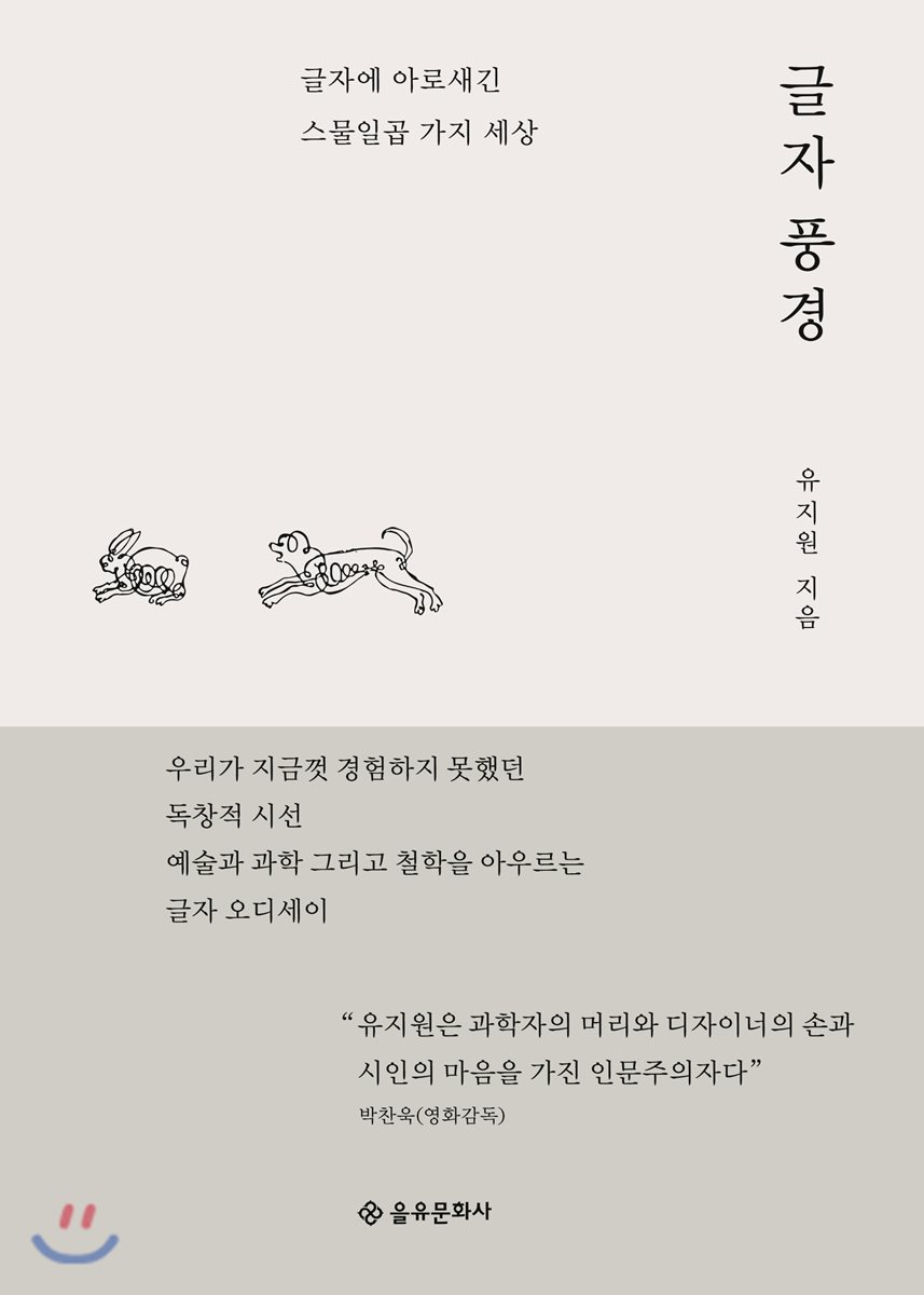
Book Introduction
When your perspective changes, the scenery you see also changes. Twenty-seven unique worlds contained in letters Here is the word 'love'. Anthropologists would talk about the different 'expressions of love' in each culture, and linguists would discuss the different notations in each writing system, such as the Korean '사랑', the Roman 'LOVE', and the Chinese character '愛'. So, what about typography researchers? I imagine typography researchers would observe the shapes of letters to tell stories of love. In this way, the same scenery can look different depending on how you look at the world. 『Landscape of Letters』 presents the experience of encountering a landscape we have never seen before by looking at the world engraved in letters through the unfamiliar eyes of a typography researcher and insightfully through a humanistic perspective. Furthermore, author Yu Ji-won is a typography researcher, but he boldly reveals his own unique voice by attempting comprehensive writing that encompasses various fields such as art, science, and philosophy. Perhaps that is why, as I read this book, I feel as if the author is personally guiding the readers along a new hiking trail that he has pioneered with his own two feet. The author's perspective and writing are that new and original. Meanwhile, Eulyoo Publishing Company started with the liberation and published its first book, “Gajeong Calligraphy Checheop,” a Korean calligraphy book by female writer Lee Gak-gyeong. This year marks the 100th anniversary of the March 1st Movement, and it is significant that Eulyoo Publishing has published a book on the forms of letters around the world. . |
- You can preview some of the book's contents.
Preview
index
Recommendation
Prologue: On the Forest Path of Letters
I.
Letterscapes of Europe and Asia
Letters like conifers north of the Alps and broadleaf trees south of the Alps
The sound of Luther's hammer awakens modernity
The short but beautiful Belle Époque, the splendid joy of life, Jugendstil
The Letter Ecosystem Beyond Continental Europe
Unique letters of the Roman alphabet and beyond
Helvetica in New York, Seoul font in Seoul
Chinese characters and Roman characters in Hong Kong, you are what you are, if different, different.
Türkiye's ancient script and the bitter power struggle over Mediterranean hegemony
There is no empty space in the geometric universe of Arabic script.
India, a vibrant land of color
II.
Hangul, a landscape captured in the eyes and hearts of Koreans
The Korean word for "love" is a word filled with five sounds.
King Sejong's Letter, Hangul's Character Space
Palace style, letters and power, and Hangul and women
Mingjo, a body font that works steadily, almost as if it were invisible.
Flowing font, the beauty created by the limitations of the human body
Trends in Korean font design in the 2010s
III.
Letters that respond to space, nature, science, and technology
Can typefaces save lives and determine destiny?
The brush, the paper, the ink, and the body give and receive strength from each other.
Large letters are easy to see, small letters are easy to read
Gil Sans Ultra Bold i, each problem and each solution
AI and Germany's Anti-Forgery Font for License Plates
Relativity typography on Japanese roads
When a Dutch typeface designer encountered Jikji, he was surprised three times.
IV.
Time to reflect on traces and marks
Flowers blooming on sheet music
A story told by a single drop of ink
Snowy Ukiyo-e
A short poem to hear with your eyes, a small picture to see with your ears
Glossary of terms
Image source
Into the book
I wanted to create this book as an ecosystem of letters.
A forest of letters, where papers flutter like leaves and the scent of ink spreads, where the printing press clatters and sweats as it vigorously prints out texts of the spirit heading towards modern times, where the smell of oil that runs the machine like fresh life blood wafts in the air, where the sturdy body of the machine vividly maintains the temperature of life thanks to the labor and warmth of the craftsmen, where freshly drawn black ink glistens like the luster of skin and gives off a deep body odor, where neon twinkles above the lively street, where the various forms of the spirit on earth are condensed and tied into letters… … .
I hope that readers will step into this landscape, feeling as if they are taking a leisurely stroll through a forest of letters, and that there are also paths that require sweating at times.
--- p.
17
It's Italy.
Ah, I'm in Italy!
On my way to Venice, I came across a sign for an ordinary research institute.
I stood there with a sigh and looked at it.
I had just arrived in Italy, having crossed the border between Germany and Austria.
These were round, bright, and elegantly proportioned letters, a rarity in the German daily life where I lived.
The letters were engraved on a warm-looking white stone, stretching out lazily under the bright sun of the southern country.
Here, Italy was present.
--- p.
25
Because handling letters meant holding information, letters were linked to power and were primarily the domain of men throughout Eastern and Western history.
However, in the history of calligraphy, there were two exceptional writing cultures led by women: one was Hangul and the other was Hiragana.
Gungche is the handwriting used by palace maids in the palace.
The development of Hangul writing has been led by women since the late Joseon Dynasty.
The types of palace script are broadly divided into two: 'seo-gan-che' for writing letters and 'deung-seo-che' for copying novels.
--- p.
157
FE-Font is an abbreviation for 'Faschungserschwerende Schrift', which literally means 'anti-counterfeiting font'.
The FE font currently used on German car license plates has a round, plump feel that escapes mechanical coldness, giving it a somewhat human wit.
This font, which has been praised as the 'world's best-designed license plate' by font researchers outside of Germany, is also used in license plates in Sri Lanka, South Africa, Malta, and Uruguay.
It is said that there are cases where new license plate fonts were developed using this font as a model, even if it was not used as is.
Its introduction is also being considered in Korea.
--- p.
245
'The marks left on the paper are the result of the collaboration between the 'Father of Form' and the 'Mother of Material', but it seems that the information with a strong linguistic nature contained in the 'Father' figure is often considered to be all there is.
This trend is exacerbated today by the loss of physical properties in the pale technological landscape of digital and offset printing.
Of course, I do not intend to view the lack of physical properties only negatively.
However, I also want to point out that the material contains intricate nonverbal information of different levels.
--- p.277
Publisher's Review
A unique perspective we have never experienced before
The humanities encompassing art, science, and philosophy
『Landscape of Letters』 is largely composed of four parts.
Part 1 covers the lettering landscapes of Europe and Asia.
It depicts cityscapes created by letters in various countries, including Germany, Italy, the United States, the United Kingdom, Spain, Turkey, India, and Hong Kong.
If you look at New York, the world's largest city, from a typographic perspective, the modern, straight-line 'Helvetica' typeface that decorates public transportation signage stands out more than the flashy neon signs and skyscrapers.
What about London, England, the city of gentlemen?
If you look at the streets of London, from subway signs to lights and billboards, you will see the round shape of gill sans.
In this way, in Part 1, we can discover landscapes we have not yet seen in already well-known world-class cities.
Part 2 contains the Korean language and the landscapes captured in the eyes and hearts of Koreans.
The author cites King Sejong the Great, a great king and outstanding scholar of the mid-15th century, as the person who ushered in the 'modern era of typography' in Korea.
Since the creation of Hangul signified the ‘democratization of knowledge,’ it is believed that the ‘modern era of Korean typography’ began at this time.
Part 2 examines the Hunminjeongeum created by King Sejong, the letter spaces of Hangeul, the Gungche, Myeongjo, and Cursive fonts, and the Hangeul font designs that have recently gained global prominence.
Part 3 talks about letters that respond to space, nature, science, and technology.
If we can't read the font on road signs at intersections while driving, if we read books written in fonts larger than 20 points, if we confuse "흥" and "홍" in court rulings and mistype them, can we truly enjoy our daily lives? This chapter explores how fonts are deeply connected not only to our lives but also to science and technology.
Finally, in Part 4, we will spend time contemplating the marks and traces left on paper through Bach's handwritten score, the book "The Wood Beyond the World" designed by William Morris, Kawase Hasui's ukiyo-e, and the engravings of Cheongsa Angwangseok.
Even ordinary people who are not typography experts
Experience the unique joy and fun conveyed by letters.
Why do humans create typography? The author says it's for ourselves.
That is, “We want our own individuality and speech to be better expressed when seen and read by people, to communicate better with others in various ways, to be more beautiful, to be more functional, to exchange more diverse emotions, and to convey our thoughts better.”
So, we communicate and use typography to create a better community and to live better together.
Therefore, typography is both a specialized field and a general knowledge that the general public should also know.
Therefore, rather than providing detailed, systematic, and specialized knowledge for specialists, 『Landscape of Letters』 was created so that anyone involved in the life of letters can easily and interestingly approach it.
Even if you haven't studied typography, this book will help you understand the ecology of letters and find joy in it.
Meanwhile, this book is based on the column 'Yu Ji-won's Letter Landscape' that was serialized in 'JoongAng Sunday' for a year, but it adds cases that could not be included due to space limitations at the time, and kindly explains briefly summarized parts.
In addition, five additional articles were added to better illustrate the author's thoughts, and visual elements such as drawings, photographs, and graphics were greatly enhanced.
GOODS SPECIFICS
- Date of issue: January 30, 2019
- Page count, weight, size: 300 pages | 486g | 150*210*20mm
- ISBN13: 9788932473956
- ISBN10: 8932473951
You may also like
카테고리
korean


korean

![GQ KOREA Mark (Monthly): December [2025]](http://librairie.coreenne.fr/cdn/shop/files/8ef265dbbfbf186523ed75ba7319009d.jpg?v=1765340328&width=3840)


