

Dashboard design and data visualization
 |
Description
Book Introduction
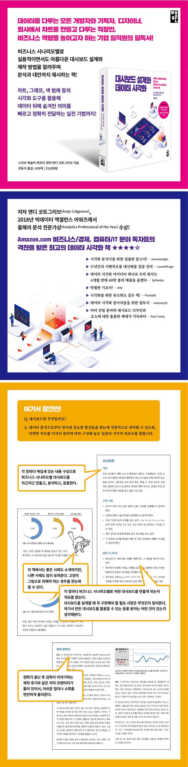
A dashboard is a type of visual report that consists of various charts organized according to design principles to allow users to intuitively grasp important findings from data analysis at a glance.
This book teaches you how to design and build practical yet beautiful dashboards for each business scenario, offering analysis and alternatives.
In particular, we introduce vivid methods to quickly and accurately convey the important meaning hidden behind data using visualization tools such as charts, graphs, and color legends.
This book is a must-read for data scientists, dashboard developers, designers, and planners who want to analyze big data and communicate the insights gained from such analysis, as well as corporate executives and decision-makers who want to enhance their business capabilities by understanding the process of implementing efficient visualization of data analysis results.
- You can preview some of the book's contents.
Preview
index
[Part 1: Basics]
Chapter 1: Fundamentals of Data Visualization
[Part 2 Scenario]
Chapter 2 Lecture Metrics Dashboard
Chapter 3 Performance Evaluation Compared to Peer Instructors
Chapter 4: Future Forecasting: The Impact of Wage Increases
Chapter 5: Sales Dashboard for Executives
Chapter 6: Comparison of Rankings by Period
Chapter 7: Are we on track with our target schedule?
Chapter 8 Multiple Key Performance Indicators
Chapter 9 Power Plant Operation Monitoring
Chapter 10: Comparing annual cumulative and year-over-year performance
Chapter 11 Performance Indicators for Premier League Players
Chapter 12 RBS 6 Nations Championship Match Performance Analysis
Chapter 13 Web Analytics
Chapter 14: Analysis of medical histories of recently hospitalized patients
Chapter 15: Hospitality Dashboard for Hotel Management
Chapter 16: Consumer Sentiment Analysis: Displaying the Overall Distribution
Chapter 17: Expressing Sentiment with Customer Recommendation Index
Chapter 18: Monitoring Server Processes
Chapter 19 Big Mac Index
Chapter 20 Customer Complaints Dashboard
Chapter 21 Hospital Operating Room Utilization Dashboard
Chapter 22: How to Show Rank and Size
Chapter 23: Measuring Compensation Claims Using Various Scales and Dimensions
Chapter 24: Subscription Cancellation or Turnover Rate
Chapter 25: Indicating Actual Uses Compared to Potential Uses
Chapter 26: Monitoring Productivity in Healthcare Providers
Chapter 27: Dashboard for Mobile Operator Executives
Chapter 28: Economic Status at a Glance
Chapter 29 Call Center
[Part 3: Practical Application Cases]
Chapter 30: Personalizing Dashboards to Drive People's Engagement
Chapter 31: Visualizing Time
Chapter 32: Beware of Dashboards That Have Reached a Dead End
Chapter 33: The Temptation of Red and Green
Chapter 34: The Sweet Temptation of Pie and Donuts
Chapter 35: Distant Clouds and Foam
Chapter 36: Journey into the Unknown
[Chart Type Glossary]
Detailed image
Publisher's Review
[Structure of this book]
Part 1, Fundamentals: Covers the fundamentals of data visualization, focusing on essential terminology and building blocks for exploring and understanding scenarios.
Part 2, Scenarios: This is the core of the book, explaining dozens of different business scenarios and then guiding you to a dashboard that "solves" the challenges of those scenarios.
Part 3, Practical Application Cases: This section covers problems that our authors have encountered before and that we anticipate readers will encounter in the future.
We hope that by learning from these three lessons, which are based on decades of real-world experience, your journey will become easier and much more enjoyable.
[Link to a sample dashboard example from the book]
Chapter 9: Power Plant Operation Monitoring Dashboard
https://samples.dundas.com/Dashboard/fa1ee851-8049-457d-92a1-2e2e0c311991?vo=viewonly
Chapter 27: "Dashboard for Mobile Operator Executives"
https://samples.dundas.com/Dashboard/f78d570f-1896-441e-9b5e-90e0999db630?vo=viewonly
Chapter 29: Call Center Dashboard
https://samples.dundas.com/Dashboard/c397551a-e1f0-48e2-bb22-fa0def388063?vo=viewonly
http://www.datarevelations.com/are-you-over-the-hill-in-the-usa
[For whom this book is intended]
- Data scientists and dashboard developers responsible for storytelling through big data analysis and insights gained.
- Designers and planners interested in various data visualizations utilizing the design and color properties of charts and graphs.
- Data analysts who want to quickly perform exploratory data analysis through effective visualization.
- Office workers who want to learn how to design charts and visualizations that are intuitive and easy to understand for reports and presentations.
- Executives and decision makers of companies who want to enhance their business capabilities by understanding the process of implementing efficient visualization of data analysis results.
[Author's Note]
Anyone responsible for building or overseeing the development of business dashboards is the intended audience for this book.
Over the past decade, after conducting training sessions, seminars, and consulting, countless people have approached us, simply showing us their data and asking questions.
“What would be a really good way to present this information?”
They wanted guidance on how to best use dashboards to address specific business challenges (we call them "scenarios").
After reviewing dozens of books on data visualization, our authors were surprised to find that while many explain why line charts work best for time-series data and why bar charts are better than pie charts, none offer insights into dashboards that are well-suited to real-world business use cases.
After gathering our own experience and a vast collection of dashboards, we decided to write our own book.
Our authors encourage readers to explore this book and find the scenario that best fits their specific visualization needs.
While they may not be exact matches, we hope this book will provide you with scenarios that will help you find the one that best suits your needs.
As you read this book, these words may come to mind:
'My data isn't exactly the same as the data in this scenario, but it's pretty close.
Also, this dashboard really helps people like me see and understand that data.
I guess we should try this approach for our project too.'
The first part of each chapter presents the overall dashboard for each scenario, then examines how individual elements contribute to the whole.
We hope this book, which organizes content based on scenarios and provides effective and practical visualization examples, will serve as a reliable reference when building successful business dashboards.
To ensure that readers get the most out of these examples, we've included a glossary of chart types, complete with accompanying visualizations, at the end of the book.
When you come across an unfamiliar term like 'sparkline', first open the glossary and look at it with pictures.
Also, although it may seem unrelated, there may be elements of the scenarios that apply to your own needs, so I encourage you to take the time to review all of the scenarios and solutions covered in this book.
[Translator's Note]
As the original title, "The Big Book of Dashboards: Visualizing Your Data Using Real-World Business Scenarios," suggests, this book contains a wide variety of case studies on dashboards.
It explains the content item by item, almost like an encyclopedia, listing every possible business scenario, presenting charts and graphs as examples, and then explaining them from various perspectives.
Readers of this book will be able to find contextually relevant examples by selecting scenarios tailored to their industry and job role, based on their individual needs.
Since each dashboard deals with different business scenarios, various background knowledge is required to interpret the meaning of the scenarios, graphs, and charts, which makes the translation process difficult.
Although there are certainly more commonly used English expressions in the workplace, we've tried to localize as many charts and graphs as possible to facilitate quicker understanding.
I hope that readers will be generous in reading the content that I have created by taking advantage of the unique characteristics of the medium called books.
I think that a dashboard created with Korean terms would be more helpful for readers' understanding than the dashboard picture in the original English book.
GOODS SPECIFICS
- Date of publication: December 20, 2018
- Page count, weight, size: 436 pages | 1,189g | 230*230*21mm
- ISBN13: 9791196203757
- ISBN10: 119620375X
You may also like
카테고리
korean


korean

![GQ KOREA Mark (Monthly): December [2025]](http://librairie.coreenne.fr/cdn/shop/files/8ef265dbbfbf186523ed75ba7319009d.jpg?v=1765340328&width=3840)


