

THE NEW Secret to Things That Look Good
 |
Description
Book Introduction
“After reading this book, everything looks different.”
From CEOs of large corporations to management experts and startup consultants
The marketing bible recommended by everyone!
There must be a scientific reason why people feel 'good'.
Although it is not easily visible to the general public, the same item can naturally create a desire to buy it depending on how it is presented.
Depending on how it stimulates the five senses of a person, it can become a place that remains in the memory for a long time and makes you want to visit again, even if you only see it once.
What are the laws that make a clear difference even with small things like color, arrangement, angle, and movement?
Here are the secrets that will immediately catch your eye and make you want to buy.
10 behavioral design marketing strategies that stimulate human instincts are revealed.
What is the secret to generating 10 times the sales while selling the same product?
The 'Hand of Midas' that saves even the dying.
Lee Rang-ju, Korea's first visual merchandising doctor.
He has been a pioneer in demonstrating that visual strategy is not simply a matter of design, but is at the core of marketing, branding, and business strategy.
There are many miraculous cases of fate being changed through his hands.
『THE NEW Secret of Things That Look Good』 is a book that condenses his visual strategies and has been recommended by numerous readers, becoming a bestseller and must-read in the field of economics and management.
This book, which has been completely revised to mark its fifth anniversary, contains ten upgraded contents that reflect the laws that remain unchanged in the online and offline era and the new consumption patterns.
Let's take a look at the laws of visual marketing that are essential in an era where people buy things because they want them, not because they need them.
- You can preview some of the book's contents.
Preview
index
Recommendation
Revised Edition Prologue: The Secret of Being Unknowingly Attracted
SECRET 01
What looks good is unforgettable _ The secret of images that dig into people's memories
SECRET 02
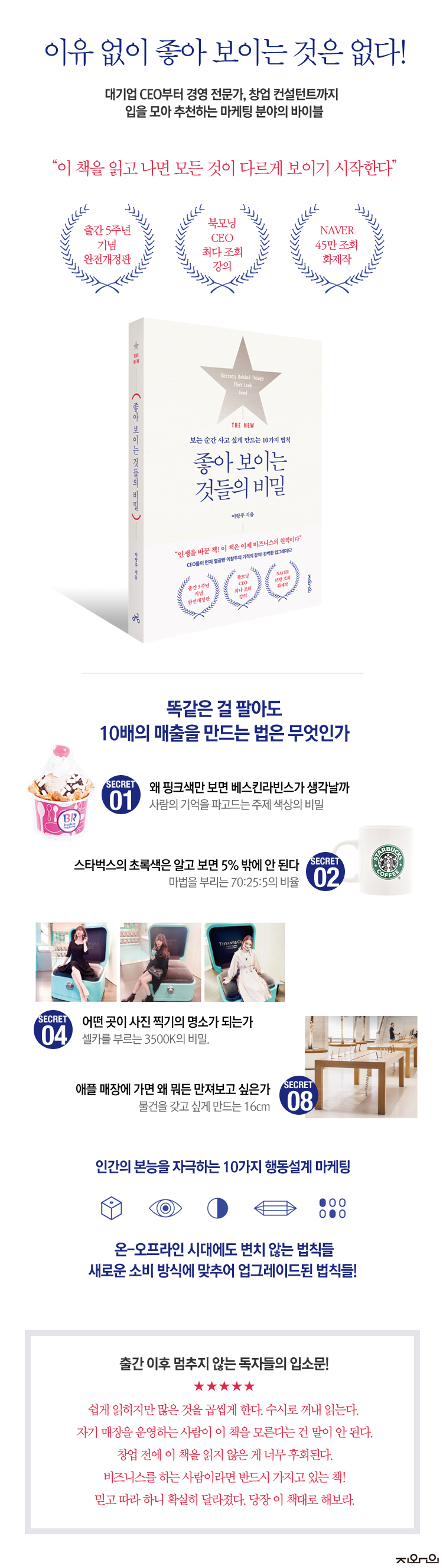
The magical blend ratio is 70:25:5 _ Starbucks' green color is only 5%
SECRET 03
Just by arranging colors, sales increase tenfold. Just looking at it creates desire.
SECRET 04
The Color Temperature of Light Becoming Beautiful: 3500K _ Which Places Become Photogenic?
SECRET 05
The Power to Attract Passersby - Dark Enough, Bright Enough, Use the Difference
SECRET 06
Magic at a 45° angle and 76cm high _ To look more lively and cool
SECRET 07
The Secret of a 10-Li Walk: The "Island Display" That Keeps Customers Coming
SECRET 08
The 16cm Secret That Makes You Want Things _ Why Do I Want to Touch Everything in an Apple Store?
SECRET 09
The Power of Value That Changes Your Lifestyle - Why Don't We Wrap Your Things?
SECRET 10
Creating an image that is complete when you put 'me' in it - Satisfy the customer's imaginative eyes
References
Photo source
Acknowledgements
Revised Edition Prologue: The Secret of Being Unknowingly Attracted
SECRET 01
What looks good is unforgettable _ The secret of images that dig into people's memories
SECRET 02
The magical blend ratio is 70:25:5 _ Starbucks' green color is only 5%
SECRET 03
Just by arranging colors, sales increase tenfold. Just looking at it creates desire.
SECRET 04
The Color Temperature of Light Becoming Beautiful: 3500K _ Which Places Become Photogenic?
SECRET 05
The Power to Attract Passersby - Dark Enough, Bright Enough, Use the Difference
SECRET 06
Magic at a 45° angle and 76cm high _ To look more lively and cool
SECRET 07
The Secret of a 10-Li Walk: The "Island Display" That Keeps Customers Coming
SECRET 08
The 16cm Secret That Makes You Want Things _ Why Do I Want to Touch Everything in an Apple Store?
SECRET 09
The Power of Value That Changes Your Lifestyle - Why Don't We Wrap Your Things?
SECRET 10
Creating an image that is complete when you put 'me' in it - Satisfy the customer's imaginative eyes
References
Photo source
Acknowledgements
Detailed image
Into the book
People are not attracted to things that are 'good', but to things that 'look good'.
If you look closely, this one seems to be a better product, but other products sell better.
The stores look similar, but one store is crowded with people, while the other store is quiet.
How should I explain the reason?
They say it's because it's trendy, it looks expensive, the advertisements are cool, etc.
So, we redecorate the interior, make the design more luxurious, and make the advertising more luxurious.
But if it doesn't work, then what the heck is the problem?
There's a scientific reason why things look good.
Human behavior, such as moving the eyes, moving the hands, and moving the feet, follows universal laws.
---From "Prologue of the Revised Edition: The Secret of What I'm Unknowingly Drawn to"
First, it reflected the changes in the online and offline era.
Online consumption is increasing, while offline consumption continues to evolve.
Emphasizes content that can be applied both online and offline.
Second, the explanations were supplemented to ensure universal application, based on cases of companies I have directly consulted.
In the past, the explanations were mainly tailored to the perspective of those who run stores, but the content has been refined so that it can be understood regardless of the industry.
Third, we have strengthened our consumer-centric perspective.
Today's consumers pursue not only 'value for money' but also 'value for money'.
Taking selfies is a daily routine, and people want to prove their worth through consumption.
We have refined the methods of captivating consumers in this era.
---From "Prologue of the Revised Edition: The Secret of What I'm Unknowingly Drawn to"
So, does Starbucks also follow this 70:25:5 ratio? When you think of Starbucks, you might think of deep green first, and it seems like it's all about green, but it actually only accounts for 5% of the total color palette.
Isn't that amazing? That's the power of eye-catching thematic colors.
Dark brown is used as a secondary color to help the main color, and its proportion is 25%.
And the remaining 70% is made up of the warm-feeling ivory color, which is the basic color, and this plays a big role in eliciting a favorable impression on people.
So, always remember the magic ratio of 70:25:5.
---「SECRET 02: The ratio of magical harmony is 70:25:5」
There are cases where color was actively used to differentiate products and services that may have felt cheap from others by making them more luxurious.
It's Market Kurly.
Market Kurly shocked the world with its 'Morning Star Delivery' system, but it also had the disadvantage of being somewhat expensive.
Market Kurly chose purple as its theme color, satisfying customers' differentiated desire for a more luxurious online shopping experience.
Let me ask you a question here.
What color are the boxes that Market Kurly products come in? If you ask, most people will say purple.
The box is yellow, like a regular cardboard box.
However, the fact that people unconsciously answer purple means that Market Kurly's brand is strongly imprinted with a color image.
---From "SECRET 03 Increase sales by 10 times just by arranging colors"
What if we applied the experiment conducted by Carl von Hess to consumers?
I actually did an experiment related to this myself.
Two stands displayed 100 bunches of identical spinach, one lit at 400 lx and the other at 800 lx, which is twice as bright.
Amazingly, spinach grown under twice the brighter light sold exactly twice as much.
Like bees, humans are automatically drawn to brighter places.
By understanding this human instinct, you can control the intensity of lighting to guide customers to the desired location, keep them in one place for a long time, and sell more of the items you want to sell.
---From "SECRET 05 The Power to Attract Passersby"
The basic principle of traffic flow is to make customers stay longer.
Of course, you should make sure that you stay in a pleasant mood.
Moreover, with the recent increase in online shopping malls, it has become difficult to be chosen by customers simply by displaying products well offline.
Therefore, it is important to analyze the lifestyles and purchasing tendencies of key customers and design spaces that reflect these.
It is necessary to understand the island display not simply as a bait to attract customers, but as a function that conveys the message that the store and products want to convey to customers, and to create a path that implements this.
---From "SECRET 07 The Secret of the Path That Makes You Walk 10 Li"
Do customers look more to the left or right? Human eyes typically move from left to right.
So, it is a good idea to place eye-catching advertising images or products with bright and colorful colors on the left, and basic products or products with plain colors on the right.
In terms of price, it is effective to place products with high discount rates on the left and products with high margins on the right.
Customers who are drawn to the product by its bright colors or low price will then slowly move their gaze to the right and compare it with other products.
---From "SECRET 08 The 16cm Secret That Makes You Want Things"
Especially when it comes to main products that have been around for a long time, displaying items using straight lines creates a sense of trust.
Placing display shelves in a straight line toward customers and displaying items in straight rows on top of them emphasizes representativeness and authority.
On the other hand, unlike straight lines, diagonal lines give an active, dynamic, and sophisticated feeling.
People feel refreshed just by turning a square table diagonally instead of straight ahead.
For seasonal products, display using diagonal lines is effective.
---From "SECRET 08 The 16cm Secret That Makes You Want Things"
Today's customers have two eyes.
One eye sees the actual reality, and the other eye imagines what it would look like if it were saved as an image.
Consumers search online, see images they find, and then go to a product expecting it to look exactly like that image.
They want to experience the 'good-looking image' that has already entered their heads.
Consumption occurs in a way that 'images' call out to 'images'.
---From "Creating an image that is completed when you put in SECRET 10 'I'"
Nowadays, we live in an age where people feel uncomfortable talking directly to customers.
You need to know how to communicate with your customers through images.
This is why visuals are becoming increasingly important in modern marketing and branding.
When you are persuaded by an image and experience it, your wallet opens automatically.
This is the essence of 'the secret of things that look good'.
---From "Creating an image that is completed when you put in SECRET 10 'I'"
GOODS SPECIFICS
- Publication date: August 30, 2021
- Page count, weight, size: 304 pages | 508g | 145*210*30mm
- ISBN13: 9791191521092
- ISBN10: 1191521095
You may also like
카테고리
korean


korean

![ELLE 엘르 스페셜 에디션 A형 : 12월 [2025]](http://librairie.coreenne.fr/cdn/shop/files/b8e27a3de6c9538896439686c6b0e8fb.jpg?v=1766436872&width=3840)


