

Typography of One Thousand and One Nights
 |
Description
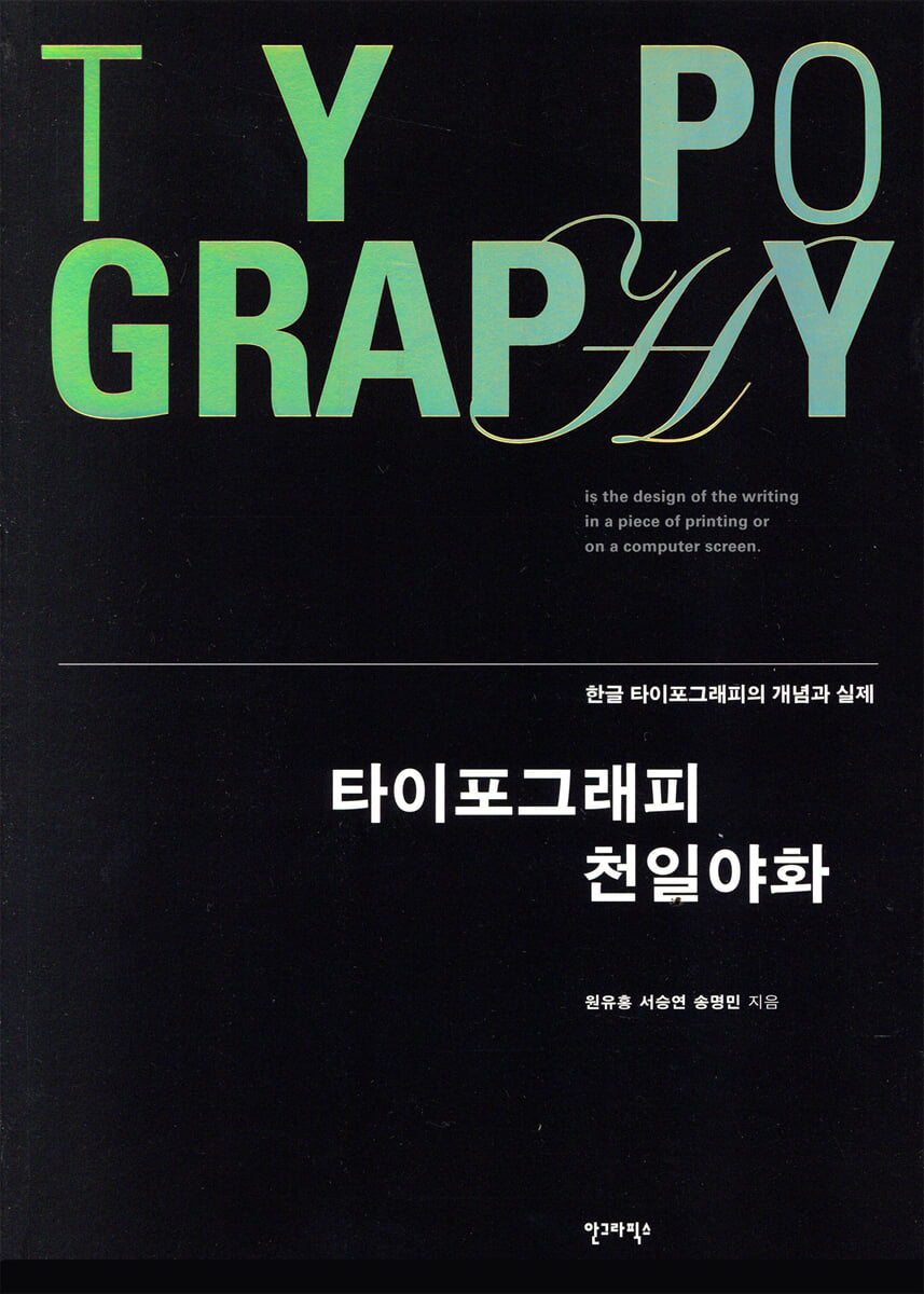
Book Introduction
The consistently popular typography textbook "A Thousand and One Nights of Typography"
Published a second revised edition to mark the 15th anniversary of its publication.
『A Thousand and One Nights of Typography』 is a book written in 2004 by Professor Emeritus Won Yu-hong and Professor Seo Seung-yeon of the Department of Visual Design at Sangmyung University.
In 2012, a revised edition of 『Typography One Thousand and One Nights』 was published, with significant revisions and supplements, including the participation of Song Myeong-min, a current designer and adjunct professor at the same school.
In the process of working on this 2019 edition, 15 years after the first publication, the three authors contemplated what university education needs to address the rapidly changing domestic and international design environment and the social demands of today's design world.
The most notable feature of this revised edition is that it has been revised with current and appropriate examples and the illustrations have been replaced.
In particular, the black-and-white illustrations that were appropriate for cases from 15 years ago have been revised to reflect recent cases and converted to color illustrations, and numerous systematic illustrations have been added to make it easier for readers to understand the content at a glance.
『A Thousand and One Nights of Typography』, which has received the most consistent response from typography educators and students in Korea, is now in its 2019 revised edition, 15 years after its publication, aiming to carefully guide current readers into the world of typography.
Published a second revised edition to mark the 15th anniversary of its publication.
『A Thousand and One Nights of Typography』 is a book written in 2004 by Professor Emeritus Won Yu-hong and Professor Seo Seung-yeon of the Department of Visual Design at Sangmyung University.
In 2012, a revised edition of 『Typography One Thousand and One Nights』 was published, with significant revisions and supplements, including the participation of Song Myeong-min, a current designer and adjunct professor at the same school.
In the process of working on this 2019 edition, 15 years after the first publication, the three authors contemplated what university education needs to address the rapidly changing domestic and international design environment and the social demands of today's design world.
The most notable feature of this revised edition is that it has been revised with current and appropriate examples and the illustrations have been replaced.
In particular, the black-and-white illustrations that were appropriate for cases from 15 years ago have been revised to reflect recent cases and converted to color illustrations, and numerous systematic illustrations have been added to make it easier for readers to understand the content at a glance.
『A Thousand and One Nights of Typography』, which has received the most consistent response from typography educators and students in Korea, is now in its 2019 revised edition, 15 years after its publication, aiming to carefully guide current readers into the world of typography.
- You can preview some of the book's contents.
Preview
index
Typography Quotes
Starting the story
Chapter 1: History of Typography
The emergence and evolution of writing
The emergence and evolution of the alphabet
The emergence and evolution of oriental characters
Advances in typography technology
Manual casting type
Automatic casting type
Phototypesetting
digital type
The birth of Hunminjeongeum
Life before the invention of writing
Creation of Hunminjeongeum
The philosophy of Hunminjeongeum
The principles of Hunminjeongeum
The expansion principle of Hunminjeongeum
The emergence and debate of writing systems in neighboring countries at the time of their creation
History of Hangul Typography
Old movable type era (electricity)
Old movable type era (late)
The era of new type
The era of movable type
The digital type era
Korean Typography Chronology
Chapter 2: Typography Basics
Typography elements
Typography concept elements
Typography visual elements
Typography related elements
Anatomical structure of the type
Names of each part of the Roman alphabet
Names of each part of the Korean alphabet
Visual correction of type
Optical illusions and visual correction
Visual consistency of types
Typography Measurements and Units
Parameters of type
Fonts and Families
Font
Family
Universe Family
Typeface classification
The evolution of typefaces over time
Type for body text and type for title
Type for body text
Type for title
Readability and legibility
Readability
Readability
Typography conventions
Learning typography conventions
Typography factors
Chapter 3: Typography Structure and System
Letters and words
single letter
word
Lines and paragraphs
Lines of text
short
Paragraph and alignment
Columns and Margins
grid
Grid structure
Elements of the grid
Grid changes
Pages and Books
Visual consistency on the page
Page Components
Structure and organization of the book
Chapter 4 Typography Syntax
Typographic characteristics
Thai fish
Typographic characteristics
Typography Space
Typography Space
The meaning of margins
Visual Deficiency and Compensation
Typography layout and format
Visual alignment line
Visual punctuation
Domination and subordination
density
stress
Contrast
Typography Color
typography shapes
geometric shapes
graphic motifs
Typography Silhouette
Chapter 5: Typographic Communication
Typography Principles and Properties
Typography principles
Typography properties
Typography Visual Hierarchy
visual hierarchy
Typography Message
Form and function
Verbal and visual balance
Message and Style
Text and images
New Media Typography
A new landscape for typography
The emergence of moving typography
Properties of moving typography
Chapter 6: Modern Typography Trends
Contemporary typography trends
Retro typography
Fun and comic typography
Investigative typography
Radical Typography
Lowbrow Typography
Rap typography
calligraphy
Collage/Montage
Layer/Transparency
Modules/Bitmaps
Parody
Swiss style
Narrative Typography
Architectural Typography
Time and movement
Chapter 7: Typography Practice
Visual correction
Type Pattern
Form and antiform
Verbal and visual balance
Points, lines, planes and textures
Word chain game
four-character idiom
Follow the poster
TypeFace
Typo Portrait
Typography layout
Macro and micro structures
Type + Image
Typography Journey
Typographic Resonance
Typography Essay
Font design
Typeface Sample Book
Bible Renewal
Grid/Edit Design
Text/Edit Design
Information/Posters
Type Calendar
Book design
Seeing Sound
elementary school entrance ceremony
That man, that woman
Let me tell you about today's weather.
supplement
Glossary
Search
References
List of illustrations
History of Typography
History of the Roman type
Starting the story
Chapter 1: History of Typography
The emergence and evolution of writing
The emergence and evolution of the alphabet
The emergence and evolution of oriental characters
Advances in typography technology
Manual casting type
Automatic casting type
Phototypesetting
digital type
The birth of Hunminjeongeum
Life before the invention of writing
Creation of Hunminjeongeum
The philosophy of Hunminjeongeum
The principles of Hunminjeongeum
The expansion principle of Hunminjeongeum
The emergence and debate of writing systems in neighboring countries at the time of their creation
History of Hangul Typography
Old movable type era (electricity)
Old movable type era (late)
The era of new type
The era of movable type
The digital type era
Korean Typography Chronology
Chapter 2: Typography Basics
Typography elements
Typography concept elements
Typography visual elements
Typography related elements
Anatomical structure of the type
Names of each part of the Roman alphabet
Names of each part of the Korean alphabet
Visual correction of type
Optical illusions and visual correction
Visual consistency of types
Typography Measurements and Units
Parameters of type
Fonts and Families
Font
Family
Universe Family
Typeface classification
The evolution of typefaces over time
Type for body text and type for title
Type for body text
Type for title
Readability and legibility
Readability
Readability
Typography conventions
Learning typography conventions
Typography factors
Chapter 3: Typography Structure and System
Letters and words
single letter
word
Lines and paragraphs
Lines of text
short
Paragraph and alignment
Columns and Margins
grid
Grid structure
Elements of the grid
Grid changes
Pages and Books
Visual consistency on the page
Page Components
Structure and organization of the book
Chapter 4 Typography Syntax
Typographic characteristics
Thai fish
Typographic characteristics
Typography Space
Typography Space
The meaning of margins
Visual Deficiency and Compensation
Typography layout and format
Visual alignment line
Visual punctuation
Domination and subordination
density
stress
Contrast
Typography Color
typography shapes
geometric shapes
graphic motifs
Typography Silhouette
Chapter 5: Typographic Communication
Typography Principles and Properties
Typography principles
Typography properties
Typography Visual Hierarchy
visual hierarchy
Typography Message
Form and function
Verbal and visual balance
Message and Style
Text and images
New Media Typography
A new landscape for typography
The emergence of moving typography
Properties of moving typography
Chapter 6: Modern Typography Trends
Contemporary typography trends
Retro typography
Fun and comic typography
Investigative typography
Radical Typography
Lowbrow Typography
Rap typography
calligraphy
Collage/Montage
Layer/Transparency
Modules/Bitmaps
Parody
Swiss style
Narrative Typography
Architectural Typography
Time and movement
Chapter 7: Typography Practice
Visual correction
Type Pattern
Form and antiform
Verbal and visual balance
Points, lines, planes and textures
Word chain game
four-character idiom
Follow the poster
TypeFace
Typo Portrait
Typography layout
Macro and micro structures
Type + Image
Typography Journey
Typographic Resonance
Typography Essay
Font design
Typeface Sample Book
Bible Renewal
Grid/Edit Design
Text/Edit Design
Information/Posters
Type Calendar
Book design
Seeing Sound
elementary school entrance ceremony
That man, that woman
Let me tell you about today's weather.
supplement
Glossary
Search
References
List of illustrations
History of Typography
History of the Roman type
Detailed image

Into the book
However, there is one thing that hinders designers from understanding typography the most: confusion about the difference between type and typography.
Type is merely the raw material needed to perform typography, but it is not typography.
If you want to eat raw cucumbers, carrots, or pieces of meat on the table, you can force yourself to eat them, but that is not eating food.
Just as cooked food and raw materials are distinctly different, type and typography are distinctly different.
To create a great dish (typography), a chef (designer) needs to go through a series of processes, including preparing fresh food ingredients (types) (typographic properties), processing them (layout), seasoning them (colors or shapes), and cooking them (printing) with a hot air gun (input/output computer equipment).
--- p.19, from “Starting the Story - Type and Typography”
Typography evolved alongside printing.
Because the limitations of typographic expression mainly arise from the limitations that arise during the printing process.
Therefore, typography demands a constant sense of challenge to overcome the limitations of printing technology while enhancing aesthetics and communication potential.
--- p.34, from “Chapter 1: History of Typography - Manual Cast Type”
Typographic shapes are used to divide space or emphasize a part, but they should be applied minimally.
The typographic shapes used so diversely are unsettling, as if watching acrobatics.
If the visual difference is ambiguous, it is better to unify it under the same conditions.
Typographic shapes are also the material that ultimately establishes the visual impression of the surface.
This plays a big role in editorial design, of course, but it's even more so in identity design.
--- p.168, from “Chapter 4 Typography Syntax - Typography Shapes”
Traditional typography, which only allowed for conceptual and static expressions, now allows for visual, auditory, and even tactile expressions by adding new elements of time, movement, and sound.
Typography has now expanded into a wider realm of space, time, speed, sound, and technology, and there is no doubt that its role in future communication will grow beyond the static foundation of print.
--- p.198, from “Chapter 5 Typographic Communication - New Media Typography”
It is difficult to clearly define the various trends in typographic communication today.
Traditional typography of the past has now entered a new era with the advent of desktops, the Internet, multimedia, and smart media.
The complexity and ambiguity of modern society contrast with the simplicity that is the hallmark of modernism, reflecting today's chaotic ethics and aesthetics.
The chaotic and noisy nature of modern typography is partly a rejection of the cold rationalism of the previous generation.
Type is merely the raw material needed to perform typography, but it is not typography.
If you want to eat raw cucumbers, carrots, or pieces of meat on the table, you can force yourself to eat them, but that is not eating food.
Just as cooked food and raw materials are distinctly different, type and typography are distinctly different.
To create a great dish (typography), a chef (designer) needs to go through a series of processes, including preparing fresh food ingredients (types) (typographic properties), processing them (layout), seasoning them (colors or shapes), and cooking them (printing) with a hot air gun (input/output computer equipment).
--- p.19, from “Starting the Story - Type and Typography”
Typography evolved alongside printing.
Because the limitations of typographic expression mainly arise from the limitations that arise during the printing process.
Therefore, typography demands a constant sense of challenge to overcome the limitations of printing technology while enhancing aesthetics and communication potential.
--- p.34, from “Chapter 1: History of Typography - Manual Cast Type”
Typographic shapes are used to divide space or emphasize a part, but they should be applied minimally.
The typographic shapes used so diversely are unsettling, as if watching acrobatics.
If the visual difference is ambiguous, it is better to unify it under the same conditions.
Typographic shapes are also the material that ultimately establishes the visual impression of the surface.
This plays a big role in editorial design, of course, but it's even more so in identity design.
--- p.168, from “Chapter 4 Typography Syntax - Typography Shapes”
Traditional typography, which only allowed for conceptual and static expressions, now allows for visual, auditory, and even tactile expressions by adding new elements of time, movement, and sound.
Typography has now expanded into a wider realm of space, time, speed, sound, and technology, and there is no doubt that its role in future communication will grow beyond the static foundation of print.
--- p.198, from “Chapter 5 Typographic Communication - New Media Typography”
It is difficult to clearly define the various trends in typographic communication today.
Traditional typography of the past has now entered a new era with the advent of desktops, the Internet, multimedia, and smart media.
The complexity and ambiguity of modern society contrast with the simplicity that is the hallmark of modernism, reflecting today's chaotic ethics and aesthetics.
The chaotic and noisy nature of modern typography is partly a rejection of the cold rationalism of the previous generation.
--- p.214, from “Chapter 6 Modern Typography Trends - Modern Typography Trends”
Publisher's Review
Like Scheherazade in A Thousand and One Nights
A diverse and rich typography story
『A Thousand and One Nights』, also known as 『Arabian Nights』, is a folk tale handed down in the Persian region.
Scheherazade tells King Shapuriyar a variety of interesting old stories over a period of 1,000 nights.
The stories of typography and design told by the three authors of 『A Thousand and One Nights of Typography』, Won Yu-hong, Seo Seung-yeon, and Song Myeong-min, are also woven in a fun and colorful structure, much like Scheherazade's 1,000 stories.
Readers, including typography students, can learn about the history of domestic and international typography, the basic parts of letters and terminology, basic editing design knowledge such as grids, structures, and layouts, as well as practical application examples, all by reading this book.
Still recognized by typography educators, even after two revisions, "A Thousand and One Nights of Typography" replaces some of the older examples, illustrations, and diagrams, and once again introduces the general scope of typography to readers in 2019.
From humanity's first written language to modern typography practices
『A Thousand and One Nights of Typography』, consisting of seven chapters
This book consists of seven chapters and two appendices.
Chapter 1, “History of Typography,” explains the first letters and letter designs of mankind, and the process of their creation.
Chapter 2, "Typography Fundamentals," and Chapter 3, "Typography Structure and Systems," cover everything from the structure and names of individual letters to families, which are groups of typefaces, and the basics of editorial design, from single letters to sentences, paragraphs, and even entire page compositions.
Chapter 4, “Typographic Syntax,” explains the characteristics of typography, the use of space, and color, and Chapter 5, “Typographic Communication,” teaches how typography, structured in this way, functions as text.
You can also see how typography has changed in the digital environment.
Chapter 6, “Modern Typographic Communication,” addresses such new media more directly and shows the transformation of typography that has already begun.
Chapter 7, “Typography Practice,” contains real-life examples of typography-based works created by three authors and students from various schools or designers working in the field, each with a single theme.
The Roman alphabet, of course, and even the structure of the Korean alphabet
A detailed domestic typography textbook
While the typography book market is not very large, Korean typography books are even harder to find.
In that respect, 『A Thousand and One Nights of Typography』 can still be said to be noteworthy.
Rather than simply introducing the typography of the Roman alphabet, the authors translated the text and materials into Korean as much as possible to fit the typographic reality of our language and writing.
In the field, many terms that are phonetic transcriptions of English words such as 'eye', 'ear', 'spine', and 'tail' are used, but this book recommends using Korean terms as much as possible in Korean typography by indicating 'eye', 'ear', 'spine', and 'tail' along with such general terms.
At the end of the book, an appendix detailing the history of typography and the history of Roman alphabet types is included to help readers understand the historical flow at a glance.
A diverse and rich typography story
『A Thousand and One Nights』, also known as 『Arabian Nights』, is a folk tale handed down in the Persian region.
Scheherazade tells King Shapuriyar a variety of interesting old stories over a period of 1,000 nights.
The stories of typography and design told by the three authors of 『A Thousand and One Nights of Typography』, Won Yu-hong, Seo Seung-yeon, and Song Myeong-min, are also woven in a fun and colorful structure, much like Scheherazade's 1,000 stories.
Readers, including typography students, can learn about the history of domestic and international typography, the basic parts of letters and terminology, basic editing design knowledge such as grids, structures, and layouts, as well as practical application examples, all by reading this book.
Still recognized by typography educators, even after two revisions, "A Thousand and One Nights of Typography" replaces some of the older examples, illustrations, and diagrams, and once again introduces the general scope of typography to readers in 2019.
From humanity's first written language to modern typography practices
『A Thousand and One Nights of Typography』, consisting of seven chapters
This book consists of seven chapters and two appendices.
Chapter 1, “History of Typography,” explains the first letters and letter designs of mankind, and the process of their creation.
Chapter 2, "Typography Fundamentals," and Chapter 3, "Typography Structure and Systems," cover everything from the structure and names of individual letters to families, which are groups of typefaces, and the basics of editorial design, from single letters to sentences, paragraphs, and even entire page compositions.
Chapter 4, “Typographic Syntax,” explains the characteristics of typography, the use of space, and color, and Chapter 5, “Typographic Communication,” teaches how typography, structured in this way, functions as text.
You can also see how typography has changed in the digital environment.
Chapter 6, “Modern Typographic Communication,” addresses such new media more directly and shows the transformation of typography that has already begun.
Chapter 7, “Typography Practice,” contains real-life examples of typography-based works created by three authors and students from various schools or designers working in the field, each with a single theme.
The Roman alphabet, of course, and even the structure of the Korean alphabet
A detailed domestic typography textbook
While the typography book market is not very large, Korean typography books are even harder to find.
In that respect, 『A Thousand and One Nights of Typography』 can still be said to be noteworthy.
Rather than simply introducing the typography of the Roman alphabet, the authors translated the text and materials into Korean as much as possible to fit the typographic reality of our language and writing.
In the field, many terms that are phonetic transcriptions of English words such as 'eye', 'ear', 'spine', and 'tail' are used, but this book recommends using Korean terms as much as possible in Korean typography by indicating 'eye', 'ear', 'spine', and 'tail' along with such general terms.
At the end of the book, an appendix detailing the history of typography and the history of Roman alphabet types is included to help readers understand the historical flow at a glance.
GOODS SPECIFICS
- Date of publication: August 23, 2019
- Page count, weight, size: 368 pages | 994g | 190*257*30mm
- ISBN13: 9788970595115
- ISBN10: 8970595112
You may also like
카테고리
korean


korean

![GQ KOREA Mark (Monthly): December [2025]](http://librairie.coreenne.fr/cdn/shop/files/8ef265dbbfbf186523ed75ba7319009d.jpg?v=1765340328&width=3840)


