

100 Invariant Laws of Layout
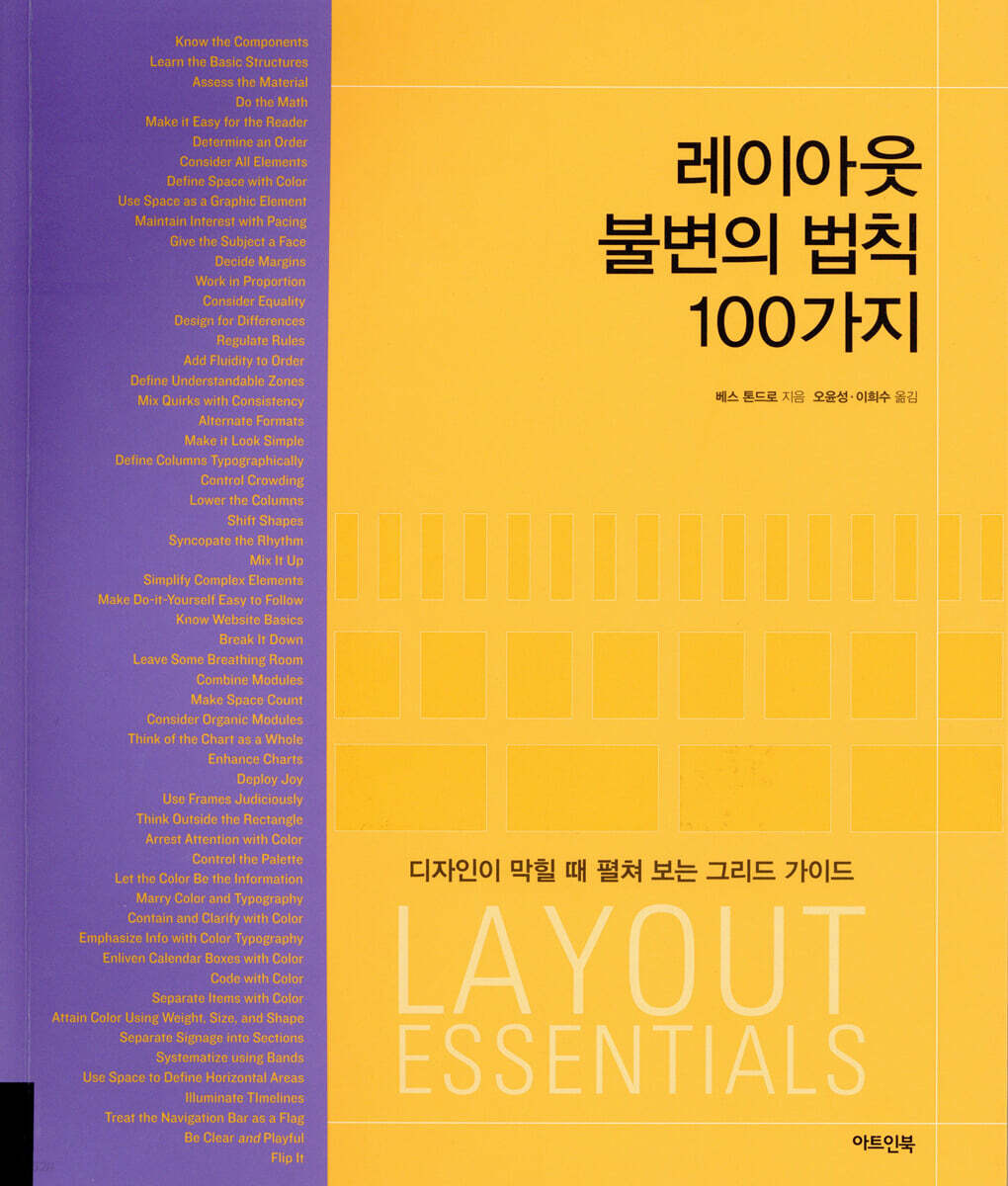 |
Description
Book Introduction
Grid, the beginning and end of design
A grid is a tool that organizes space and information and presents it to the reader, acting like a map that serves as the basis for the entire design work.
Grids have been around for hundreds of years, but over time they have become seen as outdated and outdated.
“A grid is a layout, not a prison,” says author Beth Tondro, offering 100 core rules for layout.
"100 Invariant Rules of Layout" consists of "Grid Basics" and "Practical Grids."
In the basics of grids, we start with a brief explanation of the elements that make up a grid, such as columns, modules, margins, flow lines, and markers. We then introduce the structure of the grid and the grid that is appropriate for the information you want to convey, and we suggest ways to organize information within the grid and give it personality.
In the practical grid, we will teach you how to use various grids and how to effectively convey information by taking advantage of the grid's advantages.
We'll also talk about how to create beautiful and useful grids by mixing and matching charts, graphs, colors, images, and margins, and the attitudes designers should have.
The greatest strength of this book is its wealth of work from outstanding designers active around the world.
We demonstrate how key concepts are applied through real-world examples.
Readers will follow this process to gain a deeper understanding of the laws and find inspiration for their own.
You'll explore practical grid design used in the field, from various printed materials like posters, ballots, timetables, signs, shopping bags, and receipts, to web design and mobile devices.
The case studies in this book provide readers with information, insight, and new perspectives.
A grid guide to help you navigate design challenges
Fundamentals like the grid are often overlooked because they are so obvious and unseen.
It's hard to put into words, but designs that give off a weird feeling are often the result of a fundamental flaw.
Even experienced designers sometimes forget the basics when dealing with various design elements.
This is why the subtitle of "100 Immutable Rules of Layout" is "A Grid Guide to Use When You're Stuck on a Design".
The author demonstrates the fundamentals of grid usage, reminding readers of the feeling of being a beginner and finding inspiration.
For new designers, it will provide the joy of experimenting with various grid design theories and practices, while for experienced designers, it will provide clues for solving problems when they get stuck.
A grid is a tool that organizes space and information and presents it to the reader, acting like a map that serves as the basis for the entire design work.
Grids have been around for hundreds of years, but over time they have become seen as outdated and outdated.
“A grid is a layout, not a prison,” says author Beth Tondro, offering 100 core rules for layout.
"100 Invariant Rules of Layout" consists of "Grid Basics" and "Practical Grids."
In the basics of grids, we start with a brief explanation of the elements that make up a grid, such as columns, modules, margins, flow lines, and markers. We then introduce the structure of the grid and the grid that is appropriate for the information you want to convey, and we suggest ways to organize information within the grid and give it personality.
In the practical grid, we will teach you how to use various grids and how to effectively convey information by taking advantage of the grid's advantages.
We'll also talk about how to create beautiful and useful grids by mixing and matching charts, graphs, colors, images, and margins, and the attitudes designers should have.
The greatest strength of this book is its wealth of work from outstanding designers active around the world.
We demonstrate how key concepts are applied through real-world examples.
Readers will follow this process to gain a deeper understanding of the laws and find inspiration for their own.
You'll explore practical grid design used in the field, from various printed materials like posters, ballots, timetables, signs, shopping bags, and receipts, to web design and mobile devices.
The case studies in this book provide readers with information, insight, and new perspectives.
A grid guide to help you navigate design challenges
Fundamentals like the grid are often overlooked because they are so obvious and unseen.
It's hard to put into words, but designs that give off a weird feeling are often the result of a fundamental flaw.
Even experienced designers sometimes forget the basics when dealing with various design elements.
This is why the subtitle of "100 Immutable Rules of Layout" is "A Grid Guide to Use When You're Stuck on a Design".
The author demonstrates the fundamentals of grid usage, reminding readers of the feeling of being a beginner and finding inspiration.
For new designers, it will provide the joy of experimenting with various grid design theories and practices, while for experienced designers, it will provide clues for solving problems when they get stuck.
- You can preview some of the book's contents.
Preview
index
8 Introduction
Grid Basics
10 grid configuration
11 Basic Grid
12 grid selection
13 Decide on the text format
14. Structure of information
15 Grids and Images
16 Combination of grid, text, and images
17 colors
18 Margins
19 Rhythm and Flow
Real-world grid
22 1-stage grid
28 2-stage grid
42 3-stage grid
52 multi-level grid
62 module grid
72 Charts and Graphs
82 Color as a primary element
90 Color as a structural element
102 Horizontal Hierarchical Grid
112 Typography Grid
122 Highly functional and economical grid
134 Rich sense of space
140 Invisible Grid
148 Organic Grid
156 Swiss grid
Grid beyond 166 grid
Reconstruction of the 174 grid
180 multi-layer grid
186 Moving Grid
Beyond Rule 194
202 Glossary of Terms
203 Recommended Books and Audio Materials
204 People and organizations that helped
206 Grid Design at a Glance
208 About the Author, Acknowledgments, and Translator
Grid Basics
10 grid configuration
11 Basic Grid
12 grid selection
13 Decide on the text format
14. Structure of information
15 Grids and Images
16 Combination of grid, text, and images
17 colors
18 Margins
19 Rhythm and Flow
Real-world grid
22 1-stage grid
28 2-stage grid
42 3-stage grid
52 multi-level grid
62 module grid
72 Charts and Graphs
82 Color as a primary element
90 Color as a structural element
102 Horizontal Hierarchical Grid
112 Typography Grid
122 Highly functional and economical grid
134 Rich sense of space
140 Invisible Grid
148 Organic Grid
156 Swiss grid
Grid beyond 166 grid
Reconstruction of the 174 grid
180 multi-layer grid
186 Moving Grid
Beyond Rule 194
202 Glossary of Terms
203 Recommended Books and Audio Materials
204 People and organizations that helped
206 Grid Design at a Glance
208 About the Author, Acknowledgments, and Translator
Publisher's Review
In the layout
100 Key Rules of the Law
1.
Identify the elements
2.
Learn the basic structure
3.
Understand the content
4.
Calculate
5.
Improve readability
6.
Set the order
7.
Consider all factors simultaneously
8.
Define space with color
9.
Use white space as a graphic element
10.
Keep your interest by adjusting your pace.
11.
Use a font that suits the subject matter.
12.
Set the margin
13.
Think proportionally
14.
Think equality
15.
Design for function
16.
Adjust with a ruler
17.
Maintain order but be flexible.
18.
Divide the area into easy-to-understand areas
19.
Make changes consistent
20.
Vary the structure
21.
Keep it simple
22.
Distinguish sections with typography
23.
Overcrowding is a no-no
24.
Lower the height of the stage
25.
Cook the shape
26.
Keep the rhythm alive
27.
Mix it up
28.
Simplify complex elements
29. Make DIY easy.
30.
Familiarize yourself with the basic principles of websites.
31.
Break down the content
32.
Leave room to breathe
33.
Combine modules
34.
Use space meaningfully
35.
Consider the organic nature between modules.
36.
A diagram is a picture
37.
Strengthen the diagram
38.
Leverage successful outcomes effectively
39.
Use borders wisely
40.
Think outside the box
41.
Draw attention with color
42.
Control the color
43.
Express it in color
44.
Harmonize typography and color
45.
Color it and make it clear
46.
Emphasize information with color typography.
47.
Bring your modules to life with color
48.
Sort information by color
49.
Separate items by color
50.
Create color using weight, size, and shape
51.
Divide the signs into areas.
52.
Use bands to organize
53.
Define horizontal areas with margins
54.
Add Light to the Timeline
55.
Use the navigation bar as a flag
56.
Kill two birds with one stone: clarity and fun.
57.
Flip it over
58.
Keep it perfect
59.
Play the grid
60.
Take a different perspective
61.
Use narrow margins effectively
62.
Use devices that emphasize the main point
63.
Give it some breathing room
64.
Get maximum impact with minimum footprint
65.
Combine density and dynamism
66.
Draw attention
67.
Tell the story
68.
Create an oasis
69.
Let the image breathe
70.
Start with a sketch
71.
Fight chaos with hierarchy
72.
Apply principles instinctively
73.
Pursue elegance
74.
Plan the destruction
75.
Aim for dramatic effect
76.
Create a vivid screen with silhouettes
77.
Embrace the culture
78.
Develop a flexible system
79.
Control with typography
80.
Use the Helvetica font
81.
Vary the thickness of the lines
82.
Use horizontal and vertical grids together
83.
Plan a getaway
84.
Change the size
85.
Think about what you can leave out
86.
Speak to the sidebar
87.
Follow the master
88.
Come closer and cut it
89.
Break down the boundaries
90.
Create a module
91.
Work multidimensionally
92.
Think multi-layered
93.
Support all platforms
94.
Tilt it
95.
Grow to super size
96.
Move the module
97.
Focus on your strengths
98.
Be flexible
99.
Design with your heart
100.
Ignore the rules
100 Key Rules of the Law
1.
Identify the elements
2.
Learn the basic structure
3.
Understand the content
4.
Calculate
5.
Improve readability
6.
Set the order
7.
Consider all factors simultaneously
8.
Define space with color
9.
Use white space as a graphic element
10.
Keep your interest by adjusting your pace.
11.
Use a font that suits the subject matter.
12.
Set the margin
13.
Think proportionally
14.
Think equality
15.
Design for function
16.
Adjust with a ruler
17.
Maintain order but be flexible.
18.
Divide the area into easy-to-understand areas
19.
Make changes consistent
20.
Vary the structure
21.
Keep it simple
22.
Distinguish sections with typography
23.
Overcrowding is a no-no
24.
Lower the height of the stage
25.
Cook the shape
26.
Keep the rhythm alive
27.
Mix it up
28.
Simplify complex elements
29. Make DIY easy.
30.
Familiarize yourself with the basic principles of websites.
31.
Break down the content
32.
Leave room to breathe
33.
Combine modules
34.
Use space meaningfully
35.
Consider the organic nature between modules.
36.
A diagram is a picture
37.
Strengthen the diagram
38.
Leverage successful outcomes effectively
39.
Use borders wisely
40.
Think outside the box
41.
Draw attention with color
42.
Control the color
43.
Express it in color
44.
Harmonize typography and color
45.
Color it and make it clear
46.
Emphasize information with color typography.
47.
Bring your modules to life with color
48.
Sort information by color
49.
Separate items by color
50.
Create color using weight, size, and shape
51.
Divide the signs into areas.
52.
Use bands to organize
53.
Define horizontal areas with margins
54.
Add Light to the Timeline
55.
Use the navigation bar as a flag
56.
Kill two birds with one stone: clarity and fun.
57.
Flip it over
58.
Keep it perfect
59.
Play the grid
60.
Take a different perspective
61.
Use narrow margins effectively
62.
Use devices that emphasize the main point
63.
Give it some breathing room
64.
Get maximum impact with minimum footprint
65.
Combine density and dynamism
66.
Draw attention
67.
Tell the story
68.
Create an oasis
69.
Let the image breathe
70.
Start with a sketch
71.
Fight chaos with hierarchy
72.
Apply principles instinctively
73.
Pursue elegance
74.
Plan the destruction
75.
Aim for dramatic effect
76.
Create a vivid screen with silhouettes
77.
Embrace the culture
78.
Develop a flexible system
79.
Control with typography
80.
Use the Helvetica font
81.
Vary the thickness of the lines
82.
Use horizontal and vertical grids together
83.
Plan a getaway
84.
Change the size
85.
Think about what you can leave out
86.
Speak to the sidebar
87.
Follow the master
88.
Come closer and cut it
89.
Break down the boundaries
90.
Create a module
91.
Work multidimensionally
92.
Think multi-layered
93.
Support all platforms
94.
Tilt it
95.
Grow to super size
96.
Move the module
97.
Focus on your strengths
98.
Be flexible
99.
Design with your heart
100.
Ignore the rules
GOODS SPECIFICS
- Date of issue: December 10, 2025
- Page count, weight, size: 208 pages | 818g | 216*254*20mm
- ISBN13: 9791189375089
- ISBN10: 1189375087
You may also like
카테고리
korean


korean

![GQ KOREA Mark (Monthly): December [2025]](http://librairie.coreenne.fr/cdn/shop/files/8ef265dbbfbf186523ed75ba7319009d.jpg?v=1765340328&width=3840)


