

Invisible map book
 |
Description
Book Introduction
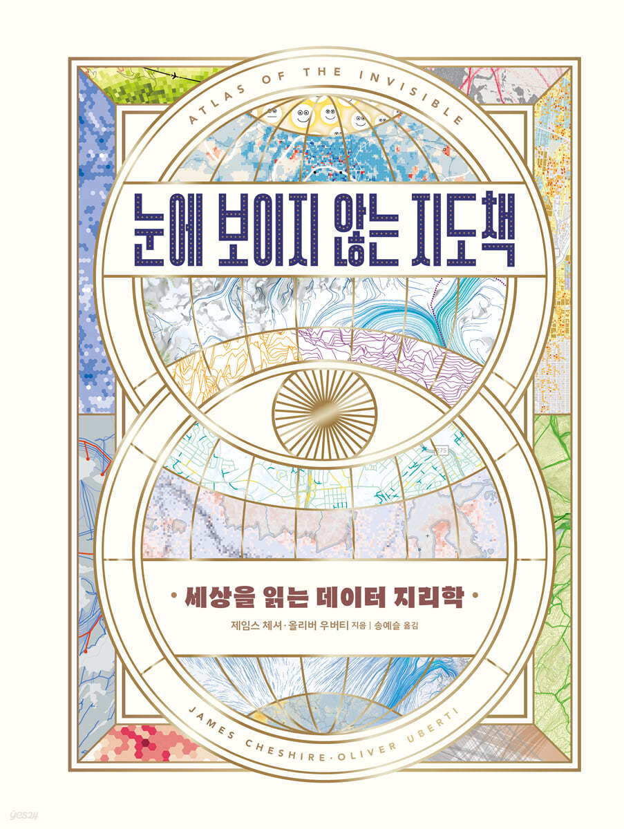
- A work that took four years to produce and won four North American and British mapmaking awards in 2021. - The only book that will show you the entirety of this world's past, present, and future, as well as the invisible world. This atlas, hailed as “a true successor to Humboldt” and “a mapmaker’s dream come true,” swept the 2021 North American and British map awards. This book is the result of a four-year production process by James Cheshire, a cartographer and professor of geographic information at University College London, and Oliver Uberti, a senior designer at National Geographic. The maps they create are not simply tools for indicating places and finding locations. It is another planet that shows us the entire world we live in at a glance. The subjects they deal with span the past and present, and all corners of the world and all sorts of places. A look at the "Oral Movement Map," created based on the testimonies of Holocaust survivors, reveals at a glance the vast currents where the intimate memories of the individuals involved intersect with historical persecution, while a map that meticulously maps the routes of secret operations during the Vietnam War reveals the secrets of President Nixon and the United States. As you follow the graphic that matches the beginning and end of the slave trade, the reality of a massive conspiracy will soon take shape before your eyes. A map showing the distribution of nitrogen dioxide clearly shows which industries and countries emit more exhaust gas. A map that superimposes sea level changes over time comes across as vivid as a painting depicting a sinking island. The authors of this book have processed and presented the large and small patterns constantly created by the world's countless movements into the most effective map possible. The visualized big data they capture reveals the world's invisible aspects without any modifications. Readers will be confronted with the real truth about the world, gain geopolitical insights into human movements, and gain the power to interpret data. This highly artistic geography textbook, with its rich storytelling contained in each of the 60 or so colorful maps that unfold refreshingly and its gold-leaf binding, is a must-have collection. The appendix at the end of the book provides a detailed explanation of the various methodologies employed to effectively present three- and four-dimensional realities on two-dimensional maps, facilitating a deeper understanding of geography and geopolitics. |
- You can preview some of the book's contents.
Preview
index
preface
Preface | Behold the unseen
Data at Our Doorstep │ Invisible River │ Data-Created Course │ Secrets Discovered │ A Year of Sleep Records
Chapter 1: Where We Come From
A Vagabond's Life │ A Witness's Map │ Partial Inheritance │ Pure Superstition │ Ancestral Land │ The Sea of Data │ Facing the Red Stain │ Inhuman Flow │ Naming Culture │ A Gift from Heaven
Chapter 2: Who We Are
Population Line │ Anytime, Anywhere Census │ American Exodus │ Commuting to the United States │ Long-distance Driving │ The Road to Recovery │ Degrees of Light │ The Lure of the City │ Rapid Change │ A Revolution in Mobility │ Ease of Access │ Rivers of Connection │ Octopus Garden
Chapter 3: How We Act
Redlining Richmond │ Power Outage │ State of Mind │ Passport Check │ Carbon Overhead │ Exhaust Gases in Detail │ Current │ Air Monitoring │ Look for Lead │ Uninhabitable Environment │ Southern Apathy │ Unequal Workloads │ Cowards' Uproar │ Indian Women Speak Out More Than Ever │ Crisis in View │ Bombshell Report │ Operation Niagara │ The End
Chapter 4 What We Face
Heat Changes │ Too Hot to Go to Mecca? │ Burning Scars │ Stormy Seas │ Shifting Ice │ Swimming Underwater │ Sea of Crime │ Places in Danger │ Fasten Your Seat Belt │ Seeing Eyes │ Move Quickly and Conquer the Map │ Salt in the Shadows │ When the Sun Comes Out │ A New Era
Epilogue | The Power of Data
Behavioral Patterns │ Hidden Data on Twitter │ Osaka Epidemic │ Glacier Tracking
Appendix | Flattening the Earth
Good books to read together
source
annotation
Acknowledgements
Preface | Behold the unseen
Data at Our Doorstep │ Invisible River │ Data-Created Course │ Secrets Discovered │ A Year of Sleep Records
Chapter 1: Where We Come From
A Vagabond's Life │ A Witness's Map │ Partial Inheritance │ Pure Superstition │ Ancestral Land │ The Sea of Data │ Facing the Red Stain │ Inhuman Flow │ Naming Culture │ A Gift from Heaven
Chapter 2: Who We Are
Population Line │ Anytime, Anywhere Census │ American Exodus │ Commuting to the United States │ Long-distance Driving │ The Road to Recovery │ Degrees of Light │ The Lure of the City │ Rapid Change │ A Revolution in Mobility │ Ease of Access │ Rivers of Connection │ Octopus Garden
Chapter 3: How We Act
Redlining Richmond │ Power Outage │ State of Mind │ Passport Check │ Carbon Overhead │ Exhaust Gases in Detail │ Current │ Air Monitoring │ Look for Lead │ Uninhabitable Environment │ Southern Apathy │ Unequal Workloads │ Cowards' Uproar │ Indian Women Speak Out More Than Ever │ Crisis in View │ Bombshell Report │ Operation Niagara │ The End
Chapter 4 What We Face
Heat Changes │ Too Hot to Go to Mecca? │ Burning Scars │ Stormy Seas │ Shifting Ice │ Swimming Underwater │ Sea of Crime │ Places in Danger │ Fasten Your Seat Belt │ Seeing Eyes │ Move Quickly and Conquer the Map │ Salt in the Shadows │ When the Sun Comes Out │ A New Era
Epilogue | The Power of Data
Behavioral Patterns │ Hidden Data on Twitter │ Osaka Epidemic │ Glacier Tracking
Appendix | Flattening the Earth
Good books to read together
source
annotation
Acknowledgements
Detailed image

Into the book
Only then did I feel the presence of death among us.
I felt helpless and very sad.
These sentiments are missing from the data points pointing to our next-door neighbors.
In the official record, the death of your neighbor is just another number to add to the total, another dot on the map of our streets and districts, our cities and countries, and even the world.
A blatant, yet cleanly sanitized death.
This doesn't tell the whole story.
---From the "Preface"
For centuries, atlases depicted things humans could see, such as roads, rivers, and mountains.
Now we need a map that shows us how invisible patterns shape our lives.
"The Invisible Map" is an ode to the invisible, to a world of information that cannot be conveyed through letters or numbers alone.
I hope the patterns visualized in this book will help you choose whether to remain in the same life or to rebuild a better world.
---From the "Preface"
Humboldt dreamed of a scientific methodology that “embraced art, history, literature, and politics, and was supported by solid data,” but as the disciplines diverged, his great imagination was neglected.
Humboldt, who was more interested in 'nature' than 'philosophy', climbed volcanoes, collected seawater, and measured cacti.
I traveled around and collected a lot of information, and I also asked others for information.
In the preface to his representative work, Cosmos, he said:
“Nature is… a unity of diverse phenomena, a harmony of creatures of different forms and characteristics, a vast whole animated by the breath of life.”
---From the "Preface"
For a long time, maps have been objects that shape our perspective on the world.
So those who had the resources to make maps did so to solidify their own interests.
Even a cursory glance at the history of data collection and mapmaking quickly reveals the hidden desires of the creators of modern maps.
Every continent became a parcel of land, a named possession, and every person was crammed into a certain category.
Imperialists, those who deliberately ignore the truth, and so on, all drew their desired territories or typhoon paths on the map.
---From "Truth for Governance"
When anti-government protests spread across North Africa and the Middle East in the early 2010s, social media on mobile phones played a major role in mobilizing protesters.
A decade later, Hong Kong protesters used an online emoji map to share police locations in real time.
The fact that the Chinese government desperately tried to block this app speaks volumes about how effective it was.
At the same time, it shows the reality that technology cannot replace power.
---From "Truth for Governance"
Your data is yours.
Since you are the one who creates the data, you have some say in how the data is used and whether it is appropriate to use it.
We can't just leave it to corporations or politicians to oversee it.
The reliability of data must be protected by everyone.
To do that, you first need to know how to decrypt the data.
I felt helpless and very sad.
These sentiments are missing from the data points pointing to our next-door neighbors.
In the official record, the death of your neighbor is just another number to add to the total, another dot on the map of our streets and districts, our cities and countries, and even the world.
A blatant, yet cleanly sanitized death.
This doesn't tell the whole story.
---From the "Preface"
For centuries, atlases depicted things humans could see, such as roads, rivers, and mountains.
Now we need a map that shows us how invisible patterns shape our lives.
"The Invisible Map" is an ode to the invisible, to a world of information that cannot be conveyed through letters or numbers alone.
I hope the patterns visualized in this book will help you choose whether to remain in the same life or to rebuild a better world.
---From the "Preface"
Humboldt dreamed of a scientific methodology that “embraced art, history, literature, and politics, and was supported by solid data,” but as the disciplines diverged, his great imagination was neglected.
Humboldt, who was more interested in 'nature' than 'philosophy', climbed volcanoes, collected seawater, and measured cacti.
I traveled around and collected a lot of information, and I also asked others for information.
In the preface to his representative work, Cosmos, he said:
“Nature is… a unity of diverse phenomena, a harmony of creatures of different forms and characteristics, a vast whole animated by the breath of life.”
---From the "Preface"
For a long time, maps have been objects that shape our perspective on the world.
So those who had the resources to make maps did so to solidify their own interests.
Even a cursory glance at the history of data collection and mapmaking quickly reveals the hidden desires of the creators of modern maps.
Every continent became a parcel of land, a named possession, and every person was crammed into a certain category.
Imperialists, those who deliberately ignore the truth, and so on, all drew their desired territories or typhoon paths on the map.
---From "Truth for Governance"
When anti-government protests spread across North Africa and the Middle East in the early 2010s, social media on mobile phones played a major role in mobilizing protesters.
A decade later, Hong Kong protesters used an online emoji map to share police locations in real time.
The fact that the Chinese government desperately tried to block this app speaks volumes about how effective it was.
At the same time, it shows the reality that technology cannot replace power.
---From "Truth for Governance"
Your data is yours.
Since you are the one who creates the data, you have some say in how the data is used and whether it is appropriate to use it.
We can't just leave it to corporations or politicians to oversee it.
The reliability of data must be protected by everyone.
To do that, you first need to know how to decrypt the data.
---From "Epilogue: The Power of Data"
Publisher's Review
★2021 American Geographical Society Globe Book Award Winner
★2021 Stanford Award Winner in the Printed Map Category
★2021 British Map Society Award Winner
★2021 John C.
Vassalmeu Award Theme Map Category Winner
The latest data on rich themes are processed intuitively and easily understandable.
The most sensory and in-depth graphic map
Long ago, maps were a collection of visualized information.
Humboldt, a 19th-century scientist, explored the world, collected information, surveyed mountains and seas, and attempted to create a map of the world.
Nightingale used her "rose chart" to show the relationship between hygiene and military mortality, and John Snow mapped the streets of London during a cholera outbreak, laying the foundation for modern disease maps.
As statistics developed, academic disciplines diversified, and the digital age arrived, maps were absorbed and developed into advanced navigation systems.
Maps no longer seem to be an effective medium for communicating anything other than directions and locations, nor are they popular enough to warrant anyone's time.
But mapmaker James Cheshire and National Geographic senior designer Oliver Uberti are turning back the clock on maps.
Like Humboldt two centuries earlier, their goal is to reveal 'patterns' and 'situations', not just locations or directions.
Their maps, which skillfully process the patterns of big data created by modern technology and present them in unique and sophisticated graphics, shine as a form that has regained the status of the most comprehensive intellectual medium.
The maps in this book clearly reveal hidden truths about our world. They trace past human migrations using DNA traces, while mobile phone signals reveal current population movements.
The world's happiness and anxiety levels by country are revealed, revealing how climate change is affecting everything from hurricanes to the pilgrimage to Mecca.
It also charts the world's most commonly used surnames and given names, showing the geographically influenced naming cultures of the region.
We examine patterns from a distance, like a bird's eye view, and sometimes very close, like a zoom lens.
Each map depicts the planet we live on in a unique way and from an unfamiliar angle.
The results of this work, which digitizes all the world's patterns—people, objects, nature, communications, etc.—and maps them out, are not only sophisticated and rigorous, but also methodologically ingenious and entertaining enough to make you laugh at times.
These special maps reveal the truth and illusion of hidden history, and provide insight into what is happening around the world.
The world needs people who can read maps properly.
― The power of geography, geopolitics, and data interpretation
'Literacy', literally the ability to interpret text and use it for oneself, has become important in this era.
But in an age where visualized and imaged data are more captivating than text, the ability to interpret visual data has also become important.
Visual data is the most easily deceptive information, and various figures packaged as big data also blind us under the guise of objectivity.
When visual data and geography meet, what we see are the flows and directions of movement—the movement of the world.
What are the routes of illegal whaling vessels, and where are they heading? Which country has the highest passport power, demonstrating its freedom of movement? When data is placed on a map, we can compare global figures at a glance, discern patterns in the data, and discern the power it holds.
When we encounter the movements of this world spread out on the map, the world we see finally reveals its true form.
The authors also say that data and map interpretation skills are essential for everyone living in this era.
As technology advances, we leave traces everywhere.
Who uses these traces? Ads are recommended based on your internet search history, and the watch on your wrist tracks your movements.
If we are the ones who created the data, we also have the right to decide how the data is used.
If maps and data have long been tools of governance and war, in modern society they have become tools for politicians and corporations.
Now the subject must change.
That's why data literacy is more important than ever in modern society.
The truths of the invisible world revealed on the map
Zooming in on what data optimism misses
Data clearly cannot be an indicator that shows 'all' of the world.
But you have a choice about what that data shows.
This book listens to the powerless and small voices of the world that have been overlooked by data optimism.
The world of Indian women protesting louder than ever, and the plight of refugees in Myanmar that only a satellite map can reveal.
Their actions clearly create meaningful patterns, forming a phenomenon that resembles a picture on a map.
As mapping technology and data analysis advance, people are experiencing the irony of missing out on many things.
Also, the numbers in the data often argue for optimism in the form of 'facts' that 'the world is getting better'.
But the world cannot be accurately understood through optimism alone, and it is not a graph that moves in one direction.
Analyzing working hours data by gender and paid and unpaid labor reveals that inequality persists, and global warming is rapidly reaching dangerous levels.
Although it has been said that poverty and happiness index are not proportional, income and happiness index are significantly proportional.
This book uncovers what numbers in large data don't say.
Even small sounds, small actions, and weak voices clearly have patterns.
These are the voices we need to hear in the world.
★2021 Stanford Award Winner in the Printed Map Category
★2021 British Map Society Award Winner
★2021 John C.
Vassalmeu Award Theme Map Category Winner
The latest data on rich themes are processed intuitively and easily understandable.
The most sensory and in-depth graphic map
Long ago, maps were a collection of visualized information.
Humboldt, a 19th-century scientist, explored the world, collected information, surveyed mountains and seas, and attempted to create a map of the world.
Nightingale used her "rose chart" to show the relationship between hygiene and military mortality, and John Snow mapped the streets of London during a cholera outbreak, laying the foundation for modern disease maps.
As statistics developed, academic disciplines diversified, and the digital age arrived, maps were absorbed and developed into advanced navigation systems.
Maps no longer seem to be an effective medium for communicating anything other than directions and locations, nor are they popular enough to warrant anyone's time.
But mapmaker James Cheshire and National Geographic senior designer Oliver Uberti are turning back the clock on maps.
Like Humboldt two centuries earlier, their goal is to reveal 'patterns' and 'situations', not just locations or directions.
Their maps, which skillfully process the patterns of big data created by modern technology and present them in unique and sophisticated graphics, shine as a form that has regained the status of the most comprehensive intellectual medium.
The maps in this book clearly reveal hidden truths about our world. They trace past human migrations using DNA traces, while mobile phone signals reveal current population movements.
The world's happiness and anxiety levels by country are revealed, revealing how climate change is affecting everything from hurricanes to the pilgrimage to Mecca.
It also charts the world's most commonly used surnames and given names, showing the geographically influenced naming cultures of the region.
We examine patterns from a distance, like a bird's eye view, and sometimes very close, like a zoom lens.
Each map depicts the planet we live on in a unique way and from an unfamiliar angle.
The results of this work, which digitizes all the world's patterns—people, objects, nature, communications, etc.—and maps them out, are not only sophisticated and rigorous, but also methodologically ingenious and entertaining enough to make you laugh at times.
These special maps reveal the truth and illusion of hidden history, and provide insight into what is happening around the world.
The world needs people who can read maps properly.
― The power of geography, geopolitics, and data interpretation
'Literacy', literally the ability to interpret text and use it for oneself, has become important in this era.
But in an age where visualized and imaged data are more captivating than text, the ability to interpret visual data has also become important.
Visual data is the most easily deceptive information, and various figures packaged as big data also blind us under the guise of objectivity.
When visual data and geography meet, what we see are the flows and directions of movement—the movement of the world.
What are the routes of illegal whaling vessels, and where are they heading? Which country has the highest passport power, demonstrating its freedom of movement? When data is placed on a map, we can compare global figures at a glance, discern patterns in the data, and discern the power it holds.
When we encounter the movements of this world spread out on the map, the world we see finally reveals its true form.
The authors also say that data and map interpretation skills are essential for everyone living in this era.
As technology advances, we leave traces everywhere.
Who uses these traces? Ads are recommended based on your internet search history, and the watch on your wrist tracks your movements.
If we are the ones who created the data, we also have the right to decide how the data is used.
If maps and data have long been tools of governance and war, in modern society they have become tools for politicians and corporations.
Now the subject must change.
That's why data literacy is more important than ever in modern society.
The truths of the invisible world revealed on the map
Zooming in on what data optimism misses
Data clearly cannot be an indicator that shows 'all' of the world.
But you have a choice about what that data shows.
This book listens to the powerless and small voices of the world that have been overlooked by data optimism.
The world of Indian women protesting louder than ever, and the plight of refugees in Myanmar that only a satellite map can reveal.
Their actions clearly create meaningful patterns, forming a phenomenon that resembles a picture on a map.
As mapping technology and data analysis advance, people are experiencing the irony of missing out on many things.
Also, the numbers in the data often argue for optimism in the form of 'facts' that 'the world is getting better'.
But the world cannot be accurately understood through optimism alone, and it is not a graph that moves in one direction.
Analyzing working hours data by gender and paid and unpaid labor reveals that inequality persists, and global warming is rapidly reaching dangerous levels.
Although it has been said that poverty and happiness index are not proportional, income and happiness index are significantly proportional.
This book uncovers what numbers in large data don't say.
Even small sounds, small actions, and weak voices clearly have patterns.
These are the voices we need to hear in the world.
GOODS SPECIFICS
- Publication date: October 17, 2022
- Format: Hardcover book binding method guide
- Page count, weight, size: 218 pages | 866g | 190*257*20mm
- ISBN13: 9791155815380
- ISBN10: 1155815386
You may also like
카테고리
korean


korean

![GQ KOREA Mark (Monthly): December [2025]](http://librairie.coreenne.fr/cdn/shop/files/8ef265dbbfbf186523ed75ba7319009d.jpg?v=1765340328&width=3840)


