

Dialogue on the spread
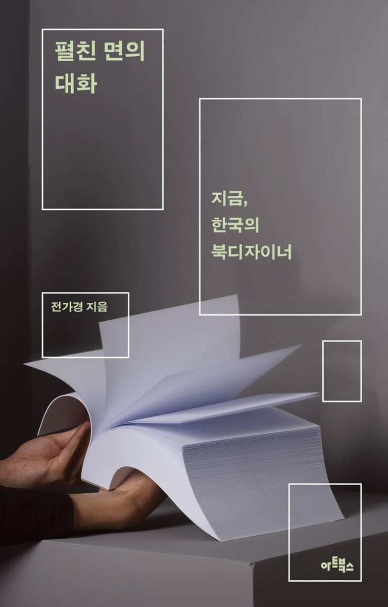 |
Description
Book Introduction
Ten conversations unfolding from the deepest parts of the book.
The book before us, and the people who shaped it.
Drawing the Landscape of Korean Publishing Since the 2010s Through Book Design
A collection of interviews with Korean book designers
Visual culture researcher Jeon Ga-kyung has published a collection of interviews titled "Dialogues on the Open Page: Book Designers in Korea Today," in which she met with eleven of the most active book designers (ten teams) in Korea, listened to their stories, and wrote and compiled them.
The result of a two-year long-term project that began in 2022, this book features conversations between authors and designers about books and design, with interspersed writings telling a rich story about the history of publishing and the form of books.
The theme that unites these eleven designers, who span a wide range of disciplines and languages, from in-house and freelance designers to commercial and art publishers, and who present their design methods with varying degrees of success, is none other than the paper book.
Jeon Ga-kyung, a design writer who studies graphic design and runs the Daegu-based publishing company April Snow, has long explored the relationship between images, text, and design through photo books.
His interest in this book is not in figuring out what book design is in this era or in hastily predicting the future of books.
Instead, based on a deep affection for the designers who participated in the interviews, he closely examines their work and, by threading this through the perspectives of visual culture and design history, he sketches out a genealogy of modern Korean book design, a history that has yet to be firmly established.
Filled with love for “paper books, which constantly remind us of the reason for the existence of fingerprints in an age where a smooth world is semi-forced” (p. 279), “Dialogue of the Open Page” is a tribute to books, and while it vividly illuminates the labor of workers that is not visible on the surface, it takes us to the back of the books we love so much and unfolds the story of designers who create the expression of the books and make space for the letters.
The book before us, and the people who shaped it.
Drawing the Landscape of Korean Publishing Since the 2010s Through Book Design
A collection of interviews with Korean book designers
Visual culture researcher Jeon Ga-kyung has published a collection of interviews titled "Dialogues on the Open Page: Book Designers in Korea Today," in which she met with eleven of the most active book designers (ten teams) in Korea, listened to their stories, and wrote and compiled them.
The result of a two-year long-term project that began in 2022, this book features conversations between authors and designers about books and design, with interspersed writings telling a rich story about the history of publishing and the form of books.
The theme that unites these eleven designers, who span a wide range of disciplines and languages, from in-house and freelance designers to commercial and art publishers, and who present their design methods with varying degrees of success, is none other than the paper book.
Jeon Ga-kyung, a design writer who studies graphic design and runs the Daegu-based publishing company April Snow, has long explored the relationship between images, text, and design through photo books.
His interest in this book is not in figuring out what book design is in this era or in hastily predicting the future of books.
Instead, based on a deep affection for the designers who participated in the interviews, he closely examines their work and, by threading this through the perspectives of visual culture and design history, he sketches out a genealogy of modern Korean book design, a history that has yet to be firmly established.
Filled with love for “paper books, which constantly remind us of the reason for the existence of fingerprints in an age where a smooth world is semi-forced” (p. 279), “Dialogue of the Open Page” is a tribute to books, and while it vividly illuminates the labor of workers that is not visible on the surface, it takes us to the back of the books we love so much and unfolds the story of designers who create the expression of the books and make space for the letters.
- You can preview some of the book's contents.
Preview
index
Entering
Designing a 'genre'
Kim Da-hee's book
Working at a publishing company, becoming a designer
Jo Seul-gi's book
New enough to not be surprising
Park Yeon-mi's book
Consider the minimum requirements for a book
Shin Deok-ho's book
What's the best world
Jeon Yong-wan's book
The most suitable tool for constructing a narrative
Lee Jae-young's book
Something I've always wanted to try
Kim Dong-shin's book
A book that lasts a long time without causing harm to the world
Park So-young's book
Beauty that begins at the limit
Oh Hye-jin's book
Book Design as Feminist Practice
Good Question Book
Designing a 'genre'
Kim Da-hee's book
Working at a publishing company, becoming a designer
Jo Seul-gi's book
New enough to not be surprising
Park Yeon-mi's book
Consider the minimum requirements for a book
Shin Deok-ho's book
What's the best world
Jeon Yong-wan's book
The most suitable tool for constructing a narrative
Lee Jae-young's book
Something I've always wanted to try
Kim Dong-shin's book
A book that lasts a long time without causing harm to the world
Park So-young's book
Beauty that begins at the limit
Oh Hye-jin's book
Book Design as Feminist Practice
Good Question Book
Detailed image

Into the book
Developmentalism has been a prerequisite for writing history.
Design history was not free from traditional historical views.
What design history records are the 'newness' of the times and exceptional individuals such as 'geniuses'.
What is inevitably left out of this historical perspective are the anonymous designers who silently go about their work in everyday life.
Since the industrial age, design has required the arduous process of communication and compromise.
However, the reality is that many design activities have been considered the achievements of a single outstanding designer or the results have received more attention than the process.
A result that satisfies everyone is difficult to achieve without a constant process of compromise.
---From "Designing a Genre"
I have a principle for body design: design it so that it is 'easy to edit.'
This will make it easier to make additional edits or change workers during reprinting.
This is my position as a typesetter and manager, and I think it's just as important as my desire for a great layout as a designer.
---From "Becoming a Publishing Company Employee, Becoming a Designer"
Personally, I like screens that have elements stripped down, like a cover page.
If it's a conceptual or minimal portfolio, it might look a bit more 'presentable' than it is now.
On the other hand, I also think this.
If the design is simple and without information, like a cover, it may look harmonious when viewed as a collection of all volumes in the series, but it is weak when viewed individually.
Each book must be considered as a product to be sold.
This is also what the publisher asks of me.
Great design is great, but as a designer, I strive to maximize my performance within the given conditions and environment.
---From "Newness That Isn't Surprising"
The question arose: 'If you individually folded and bound 100 cigarette paper samples, could you call it a book?'
This is the minimum requirement to be called a 'book'.
The thickness and pattern of the sample paper are all different.
Rubber-filled paper has a soft pattern and an embossed texture.
There is no text-based information in this bundle of papers.
However, since the paper is produced with differences in type, thickness, etc. so that it can be selected according to individual tastes, the paper itself contains information.
I'm going to try making a book with this cigarette paper.
---From "Considering the Minimum Requirements for a Book"
The text that everyone opens to 'read' is the territory of the book, which cannot help but be conservative.
But that is also where it can be most radical.
Being slow and insensitive to change paradoxically means that the ripple effects of change can be the greatest.
In commercial publishing design, the presence of a book is still determined by its cover, and the text has little impact on the sales and impression of the book.
But if we go back further in the history of the book, the body of the book was in the text.
---From "What is the best world"
The book features a neat and elegant arrangement of various voices from 6699 Press.
Perhaps because of the nature of 6699 Press's books, which feature a lot of dialogue and speech, people of various situations, backgrounds, occupations, and nationalities appear here and there, each telling their own stories.
There, waves of emotions such as longing, comfort, sadness, loneliness, regret, regret, anger, determination, and doubt flow like a melody.
A collection of short stories and a book that offers warm words to the lonely majority living in modern times.
In this way, the book planned by Lee Jae-young shows a cross-section of a designer who knows how to listen.
---From "The Most Suitable Tool for Building a Narrative"
During the process of working, I felt that the norms were more strongly embedded in me than I thought.
Because they were different formative materials from what we were taught or what we thought were good.
While working, I constantly adjusted my attitude towards the standards of beauty.
I've often thought about what beauty means in design, and whether it has to be beautiful.
---From "Things I Want to Try at Least Once"
Rather than a design that is novel or loud and draws attention, the resonance of the classic typography of old books or the text where each letter is meticulously woven so that the labor of the worker is clearly visible is much deeper.
A design that is well balanced.
I've loved Penguin Books since before I knew Jan Tschichold, and they're so tightly structured that nothing can be touched.
Because I pursued a perfect harmony rather than a flashy expression, I was able to work with Yeolhwadang for a long time because it fit well with their direction.
Even though they were published a long time ago, they are still well-organized, and they are books with good proportions and balance that you can read over and over without getting tired of them… … .
I like books like that.
---From "Books that do no harm to the world and remain for a long time"
At the end of the paper, he quotes conceptual artist Sol LeWitt, saying, “Anyone can draw by following instructions.” However, I do not completely agree with this statement, as I believe that subjective interpretation is ultimately necessary to produce beautiful forms.
Sol LeWitt said that the beauty of the result doesn't matter, but to me it matters a lot.
The constraints set are only a starting point.
---From "Beauty Begins from Limits"
The reason why publishing is a natural tool for these graphic designers and activists is because of the dual nature of the book medium: conservative and radical.
Their cases are also encouraging in that they build a narrative of women who create books.
Throughout history, books, represented by written texts, have been the exclusive domain of men.
But even within that rigid system, women have tried to create gaps in the system by writing and co-publishing books, both anonymously and under their own names.
So, let's pay attention to the books they will continue to create in the future.
Because that's where the language of tomorrow that we need to keep an eye on will be built.
As much as there is still change around us, we need language, the language of books for a more equal tomorrow.
Design history was not free from traditional historical views.
What design history records are the 'newness' of the times and exceptional individuals such as 'geniuses'.
What is inevitably left out of this historical perspective are the anonymous designers who silently go about their work in everyday life.
Since the industrial age, design has required the arduous process of communication and compromise.
However, the reality is that many design activities have been considered the achievements of a single outstanding designer or the results have received more attention than the process.
A result that satisfies everyone is difficult to achieve without a constant process of compromise.
---From "Designing a Genre"
I have a principle for body design: design it so that it is 'easy to edit.'
This will make it easier to make additional edits or change workers during reprinting.
This is my position as a typesetter and manager, and I think it's just as important as my desire for a great layout as a designer.
---From "Becoming a Publishing Company Employee, Becoming a Designer"
Personally, I like screens that have elements stripped down, like a cover page.
If it's a conceptual or minimal portfolio, it might look a bit more 'presentable' than it is now.
On the other hand, I also think this.
If the design is simple and without information, like a cover, it may look harmonious when viewed as a collection of all volumes in the series, but it is weak when viewed individually.
Each book must be considered as a product to be sold.
This is also what the publisher asks of me.
Great design is great, but as a designer, I strive to maximize my performance within the given conditions and environment.
---From "Newness That Isn't Surprising"
The question arose: 'If you individually folded and bound 100 cigarette paper samples, could you call it a book?'
This is the minimum requirement to be called a 'book'.
The thickness and pattern of the sample paper are all different.
Rubber-filled paper has a soft pattern and an embossed texture.
There is no text-based information in this bundle of papers.
However, since the paper is produced with differences in type, thickness, etc. so that it can be selected according to individual tastes, the paper itself contains information.
I'm going to try making a book with this cigarette paper.
---From "Considering the Minimum Requirements for a Book"
The text that everyone opens to 'read' is the territory of the book, which cannot help but be conservative.
But that is also where it can be most radical.
Being slow and insensitive to change paradoxically means that the ripple effects of change can be the greatest.
In commercial publishing design, the presence of a book is still determined by its cover, and the text has little impact on the sales and impression of the book.
But if we go back further in the history of the book, the body of the book was in the text.
---From "What is the best world"
The book features a neat and elegant arrangement of various voices from 6699 Press.
Perhaps because of the nature of 6699 Press's books, which feature a lot of dialogue and speech, people of various situations, backgrounds, occupations, and nationalities appear here and there, each telling their own stories.
There, waves of emotions such as longing, comfort, sadness, loneliness, regret, regret, anger, determination, and doubt flow like a melody.
A collection of short stories and a book that offers warm words to the lonely majority living in modern times.
In this way, the book planned by Lee Jae-young shows a cross-section of a designer who knows how to listen.
---From "The Most Suitable Tool for Building a Narrative"
During the process of working, I felt that the norms were more strongly embedded in me than I thought.
Because they were different formative materials from what we were taught or what we thought were good.
While working, I constantly adjusted my attitude towards the standards of beauty.
I've often thought about what beauty means in design, and whether it has to be beautiful.
---From "Things I Want to Try at Least Once"
Rather than a design that is novel or loud and draws attention, the resonance of the classic typography of old books or the text where each letter is meticulously woven so that the labor of the worker is clearly visible is much deeper.
A design that is well balanced.
I've loved Penguin Books since before I knew Jan Tschichold, and they're so tightly structured that nothing can be touched.
Because I pursued a perfect harmony rather than a flashy expression, I was able to work with Yeolhwadang for a long time because it fit well with their direction.
Even though they were published a long time ago, they are still well-organized, and they are books with good proportions and balance that you can read over and over without getting tired of them… … .
I like books like that.
---From "Books that do no harm to the world and remain for a long time"
At the end of the paper, he quotes conceptual artist Sol LeWitt, saying, “Anyone can draw by following instructions.” However, I do not completely agree with this statement, as I believe that subjective interpretation is ultimately necessary to produce beautiful forms.
Sol LeWitt said that the beauty of the result doesn't matter, but to me it matters a lot.
The constraints set are only a starting point.
---From "Beauty Begins from Limits"
The reason why publishing is a natural tool for these graphic designers and activists is because of the dual nature of the book medium: conservative and radical.
Their cases are also encouraging in that they build a narrative of women who create books.
Throughout history, books, represented by written texts, have been the exclusive domain of men.
But even within that rigid system, women have tried to create gaps in the system by writing and co-publishing books, both anonymously and under their own names.
So, let's pay attention to the books they will continue to create in the future.
Because that's where the language of tomorrow that we need to keep an eye on will be built.
As much as there is still change around us, we need language, the language of books for a more equal tomorrow.
---From "Book Design as Feminist Practice"
Publisher's Review
Between art publishing and commercial publishing
Designer as Pioneer and Worker
Until now, the so-called beautiful books in the visual design industry have tended to be concentrated in art publications by small design studios or freelance designers.
However, in order to closely examine the development of domestic book design to a certain level today, it is necessary to examine the numerous designers engaged in commercial publishing and the diverse books they create, both inside and out.
In the first conversation of this book, “Designing ‘Genre,’” designer Dahee Kim, who has been creating books for Golden Bough, Minumsa Publishing Group, and Panmidong for over 10 years, draws a genealogy of design for science fiction, horror, and mystery novels, which were previously undervalued and lumped into the category of genre literature.
His book designs demonstrate “the process of the breakdown of the formal distinctions between fiction and non-fiction, pure literature and genre fiction” (p. 16), and furthermore, they allow us to examine the value of the designs of practical books, self-help books, and economics and management books that are not even considered for judging in the competition for beautiful books.
In the next chapter, "Becoming a Publishing Employee, Becoming a Designer," we meet Jo Seul-gi, a designer at Munhak-kwa-Jiseongsa, who conveys the reality of the industry through the eyes of an in-house designer who takes on the roles of typesetter and manager.
He demonstrates the expertise of a veteran designer who achieves the dual task of inheriting the traditional visual identity of Munhak-kwa-Jiseong-sa while presenting new designs every time, such as the design of the Korean Poet Line with its red logo in a square shape, square frame, and iconic illustrations.
Next, designer Park Yeon-mi, who worked at construction companies and Minumsa before becoming a freelancer, shares her experience of thoughtful collaboration with clients in “Newness That Isn’t Surprising.”
This is a passage that shows that the best designs are created through a process of constant communication and compromise with numerous collaborators.
His design is also an example that proves that “just as new and challenging book designs in art publishing can be an experiment in commercial book design that breaks away from convention while also being popular” (p. 100).
Digging into the nature of books
The world of contact points reopening
Another value of "Dialogue on the Open Page" is that it presents a new way of looking at books as objects.
As designers who have always worked with paper, they each have their own unique concerns about the format of books.
Shin Deok-ho, a freelance designer based in Germany who primarily collaborates with clients in the cultural and artistic fields, introduces the topic of his thesis in “Considering the Minimum Requirements of a Book” and asks about the minimum conditions that make a book a book.
If we were to bind 100 sheets of tobacco paper, each unprinted but made of different materials and each possessing its own information, could we truly call it a book? His question, which focuses on the formal characteristics of the book medium, is repeated as he successfully establishes a medium of different grammar on paper, much like translating a video sequence into the language of a book.
Jeon Yong-wan, who has worked for Yeolhwadang and Munhak-kwa-Jiseongsa and is now a freelance designer, persistently explores the typesetting of the main text, which is often overlooked due to the general standard of viewing the cover as the center of book design in “What Best World?”
The words and lines he meticulously weaves, the margins and alignment he meticulously polishes, truly reveal the body of the book, the text, which is often overlooked in the name of economy.
In his typographic exploration, letters, words, sentences, and writing acquire the possibility of “being reassembled at any time and entering a new world of semantic networks” (p. 169).
In the following book, "Books that do not harm the world and last a long time," Yeolhwadang's in-house designer Park So-young inherits Yeolhwadang's design identity with her craftsmanlike sensibility, including simple typography and a cover that fully conveys the texture of the paper.
In the books he created, where he rarely does any post-processing on the cover, the physical properties of the paper are felt directly.
The infinite whiteness of paper, the world of contact points that unfold as you touch its surface, reminds us of the value of paper books in this age where countless amounts of data are poured out and evaporated.
What is beauty in books?
Eleven Forms of Unclear Value
"Dialogue on the Open Surface" is also an example of a book that presents eleven different perspectives on the sensitive topic of beauty.
Hosted by the Korean Publishers Association, the "Most Beautiful Book in Korea" awards ceremony, which began in 2020, is a rare opportunity for book design to be recognized under a public system. However, each year, the judging criteria and the selected works are met with both large and small objections.
Kim Dong-shin, who worked as the design team leader at the publishing company Dolbegae and is now a freelance designer, looked back on the single-volume book designs he has presented in “Something I Want to Try Once” and asked, “What is beauty in design?
“I often thought about whether it had to be beautiful” (p. 232).
His book design questions the formative devices we have naturally acquired as good, and serves as an opportunity to reconsider the deeply rooted standards of beauty and the politics of the norms that create them.
On the other hand, the fact that the value of beauty is subjective also means that each person has a clear image of what they consider beautiful.
For Kim Da-hee, it is “the expertise to fully understand the content and to organize the information the reader needs in a clear and concise manner” (p. 32); for Shin Deok-ho, it is “a book that clearly explains why this book should be published for this content and its plausibility” (p. 136); for Park So-young, it is “a text that is meticulously woven so that the worker’s labor is clearly visible, rather than a design that focuses attention with novelty or loud noise” (p. 274); and for Lee Jae-young, it is “the organic and dynamic contrast created by each letter and line” (p. 205).
Meanwhile, designer Oh Hye-jin, who runs the design studio Owayi and works on a variety of graphic design projects, focuses more on the process of creating the beauty of books.
He asserts that the limitations of the form and format of a book can never hinder the beauty of the final product, and in "Beauty Begins from Limits," he presents book design as a graphic design methodology.
Due to the various variables derived from the set conditions and the context built from them, his designs are not confined to a specific form or classification, but show different answers each time.
The belief that design can change the world
Scenes of struggle etched into the history of Korean book design.
Can designers transform society through publishing? This book poses perhaps the most pressing question, and it's fueled by Lee Jae-young, the designer behind 6699 Press.
For him, books are a stage that gives a microphone to those who have been deprived of their voice, and design is the most suitable tool for constructing their narrative.
His self-published works, notable for their unconventional typography and colorful use of paper, offer a unique space for those oppressed by impersonal standards.
His book, in which people of various circumstances, backgrounds, occupations, and nationalities each quietly unravel their stories, reveals the thoughtfulness of a designer who knows how to listen.
Good Question, a design studio co-run by designers Uyuni and Shinsuna, who are part of the print-based feminist communities Bom Alarm and Bosch respectively, was a driving force behind the feminist moment in the design world in 2017.
Their case, as both graphic designers and activists, reminds us of the vitality of books as “both a sacred archive and a counter-media in which radical language is written” (p. 358), and of the essential purpose of publishing: to spread messages.
Beginning with conversations with eleven designers, the author's seasoned writing, which retraces the history of Korean book design with a wealth of background knowledge of visual culture, offers an engaging perspective on the history of publishing through design.
This is why 『Dialogue on an Open Page』, as an archive that shows an era, has value beyond just a collection of interviews.
The interviewees, who have been practicing graphic design for an average of more than 10 years, are part of a generation that personally experienced the tectonic shift in the visual design world in the mid-2000s and has now established themselves as a key player in the domestic publishing design field.
Therefore, conversations with them serve as raw materials for examining Korean book design both synchronically and diachronically.
Furthermore, the short stories' dialogues, sometimes supporting or competing with each other, lead readers into a heated debate on various subtopics of book design.
The book, which is dealt with sharply on the open ground, and the story about book design expands the perspective on books.
Finally, the pictorial section, which begins as the interview section ends, includes the designer's book design specifications along with illustrations.
We have included as much detailed information as possible about the bibliography, including the type of paper (jacket-cover (wrapper)-band-end paper-body), the font of the body and cover, post-processing, and binding method.
Another point where this book's thoughtfulness stands out is the fact that it shows the relative size of the book in square format compared to the "Dialogue on the Open Page" so that the actual size of the book in the pictorial can be estimated.
Designer as Pioneer and Worker
Until now, the so-called beautiful books in the visual design industry have tended to be concentrated in art publications by small design studios or freelance designers.
However, in order to closely examine the development of domestic book design to a certain level today, it is necessary to examine the numerous designers engaged in commercial publishing and the diverse books they create, both inside and out.
In the first conversation of this book, “Designing ‘Genre,’” designer Dahee Kim, who has been creating books for Golden Bough, Minumsa Publishing Group, and Panmidong for over 10 years, draws a genealogy of design for science fiction, horror, and mystery novels, which were previously undervalued and lumped into the category of genre literature.
His book designs demonstrate “the process of the breakdown of the formal distinctions between fiction and non-fiction, pure literature and genre fiction” (p. 16), and furthermore, they allow us to examine the value of the designs of practical books, self-help books, and economics and management books that are not even considered for judging in the competition for beautiful books.
In the next chapter, "Becoming a Publishing Employee, Becoming a Designer," we meet Jo Seul-gi, a designer at Munhak-kwa-Jiseongsa, who conveys the reality of the industry through the eyes of an in-house designer who takes on the roles of typesetter and manager.
He demonstrates the expertise of a veteran designer who achieves the dual task of inheriting the traditional visual identity of Munhak-kwa-Jiseong-sa while presenting new designs every time, such as the design of the Korean Poet Line with its red logo in a square shape, square frame, and iconic illustrations.
Next, designer Park Yeon-mi, who worked at construction companies and Minumsa before becoming a freelancer, shares her experience of thoughtful collaboration with clients in “Newness That Isn’t Surprising.”
This is a passage that shows that the best designs are created through a process of constant communication and compromise with numerous collaborators.
His design is also an example that proves that “just as new and challenging book designs in art publishing can be an experiment in commercial book design that breaks away from convention while also being popular” (p. 100).
Digging into the nature of books
The world of contact points reopening
Another value of "Dialogue on the Open Page" is that it presents a new way of looking at books as objects.
As designers who have always worked with paper, they each have their own unique concerns about the format of books.
Shin Deok-ho, a freelance designer based in Germany who primarily collaborates with clients in the cultural and artistic fields, introduces the topic of his thesis in “Considering the Minimum Requirements of a Book” and asks about the minimum conditions that make a book a book.
If we were to bind 100 sheets of tobacco paper, each unprinted but made of different materials and each possessing its own information, could we truly call it a book? His question, which focuses on the formal characteristics of the book medium, is repeated as he successfully establishes a medium of different grammar on paper, much like translating a video sequence into the language of a book.
Jeon Yong-wan, who has worked for Yeolhwadang and Munhak-kwa-Jiseongsa and is now a freelance designer, persistently explores the typesetting of the main text, which is often overlooked due to the general standard of viewing the cover as the center of book design in “What Best World?”
The words and lines he meticulously weaves, the margins and alignment he meticulously polishes, truly reveal the body of the book, the text, which is often overlooked in the name of economy.
In his typographic exploration, letters, words, sentences, and writing acquire the possibility of “being reassembled at any time and entering a new world of semantic networks” (p. 169).
In the following book, "Books that do not harm the world and last a long time," Yeolhwadang's in-house designer Park So-young inherits Yeolhwadang's design identity with her craftsmanlike sensibility, including simple typography and a cover that fully conveys the texture of the paper.
In the books he created, where he rarely does any post-processing on the cover, the physical properties of the paper are felt directly.
The infinite whiteness of paper, the world of contact points that unfold as you touch its surface, reminds us of the value of paper books in this age where countless amounts of data are poured out and evaporated.
What is beauty in books?
Eleven Forms of Unclear Value
"Dialogue on the Open Surface" is also an example of a book that presents eleven different perspectives on the sensitive topic of beauty.
Hosted by the Korean Publishers Association, the "Most Beautiful Book in Korea" awards ceremony, which began in 2020, is a rare opportunity for book design to be recognized under a public system. However, each year, the judging criteria and the selected works are met with both large and small objections.
Kim Dong-shin, who worked as the design team leader at the publishing company Dolbegae and is now a freelance designer, looked back on the single-volume book designs he has presented in “Something I Want to Try Once” and asked, “What is beauty in design?
“I often thought about whether it had to be beautiful” (p. 232).
His book design questions the formative devices we have naturally acquired as good, and serves as an opportunity to reconsider the deeply rooted standards of beauty and the politics of the norms that create them.
On the other hand, the fact that the value of beauty is subjective also means that each person has a clear image of what they consider beautiful.
For Kim Da-hee, it is “the expertise to fully understand the content and to organize the information the reader needs in a clear and concise manner” (p. 32); for Shin Deok-ho, it is “a book that clearly explains why this book should be published for this content and its plausibility” (p. 136); for Park So-young, it is “a text that is meticulously woven so that the worker’s labor is clearly visible, rather than a design that focuses attention with novelty or loud noise” (p. 274); and for Lee Jae-young, it is “the organic and dynamic contrast created by each letter and line” (p. 205).
Meanwhile, designer Oh Hye-jin, who runs the design studio Owayi and works on a variety of graphic design projects, focuses more on the process of creating the beauty of books.
He asserts that the limitations of the form and format of a book can never hinder the beauty of the final product, and in "Beauty Begins from Limits," he presents book design as a graphic design methodology.
Due to the various variables derived from the set conditions and the context built from them, his designs are not confined to a specific form or classification, but show different answers each time.
The belief that design can change the world
Scenes of struggle etched into the history of Korean book design.
Can designers transform society through publishing? This book poses perhaps the most pressing question, and it's fueled by Lee Jae-young, the designer behind 6699 Press.
For him, books are a stage that gives a microphone to those who have been deprived of their voice, and design is the most suitable tool for constructing their narrative.
His self-published works, notable for their unconventional typography and colorful use of paper, offer a unique space for those oppressed by impersonal standards.
His book, in which people of various circumstances, backgrounds, occupations, and nationalities each quietly unravel their stories, reveals the thoughtfulness of a designer who knows how to listen.
Good Question, a design studio co-run by designers Uyuni and Shinsuna, who are part of the print-based feminist communities Bom Alarm and Bosch respectively, was a driving force behind the feminist moment in the design world in 2017.
Their case, as both graphic designers and activists, reminds us of the vitality of books as “both a sacred archive and a counter-media in which radical language is written” (p. 358), and of the essential purpose of publishing: to spread messages.
Beginning with conversations with eleven designers, the author's seasoned writing, which retraces the history of Korean book design with a wealth of background knowledge of visual culture, offers an engaging perspective on the history of publishing through design.
This is why 『Dialogue on an Open Page』, as an archive that shows an era, has value beyond just a collection of interviews.
The interviewees, who have been practicing graphic design for an average of more than 10 years, are part of a generation that personally experienced the tectonic shift in the visual design world in the mid-2000s and has now established themselves as a key player in the domestic publishing design field.
Therefore, conversations with them serve as raw materials for examining Korean book design both synchronically and diachronically.
Furthermore, the short stories' dialogues, sometimes supporting or competing with each other, lead readers into a heated debate on various subtopics of book design.
The book, which is dealt with sharply on the open ground, and the story about book design expands the perspective on books.
Finally, the pictorial section, which begins as the interview section ends, includes the designer's book design specifications along with illustrations.
We have included as much detailed information as possible about the bibliography, including the type of paper (jacket-cover (wrapper)-band-end paper-body), the font of the body and cover, post-processing, and binding method.
Another point where this book's thoughtfulness stands out is the fact that it shows the relative size of the book in square format compared to the "Dialogue on the Open Page" so that the actual size of the book in the pictorial can be estimated.
GOODS SPECIFICS
- Date of issue: April 19, 2024
- Page count, weight, size: 376 pages | 664g | 144*225*21mm
- ISBN13: 9788961964432
- ISBN10: 8961964437
You may also like
카테고리
korean


korean

![GQ KOREA Mark (Monthly): December [2025]](http://librairie.coreenne.fr/cdn/shop/files/8ef265dbbfbf186523ed75ba7319009d.jpg?v=1765340328&width=3840)


