

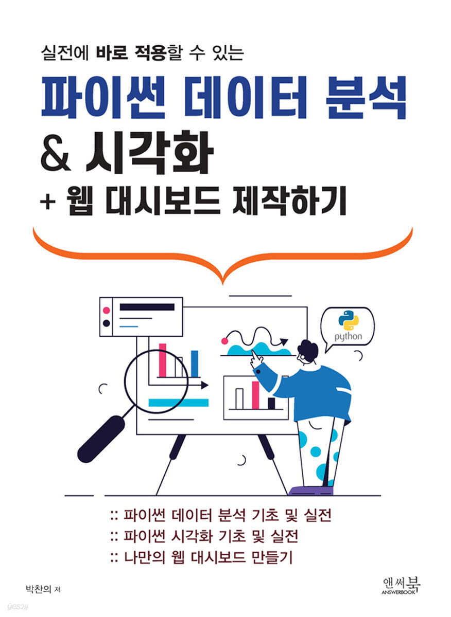
Python Data Analysis & Visualization + Web Dashboard Creation
 |
Description
Book Introduction
"Python Data Analysis & Visualization + Web Dashboard Creation" is packed with practical, hands-on content, including the fundamentals of Python data analysis and visualization, useful tips, and building a data web dashboard. Key lessons learned include:
「01.
In "Pandas Basics to Practice for Handling Structured Data," we cover everything from the basics of Pandas, the national library for handling structured data, to essential methods and tips for practical use.
In "02 Python Visualization: From Basics to Practice," we cover Python's representative data visualization libraries: Matplotlib, Seaborn, and Plotly.
Learn practical methods and tips for drawing simple, clean graphs.
「03.
In "Creating a Streamlit Web Dashboard Without Web Basics," you will learn the basics of the Streamlit library, which allows you to easily create a web dashboard without prior web-related knowledge.
You will learn how to create a simple web dashboard using a real-world dataset and gain insights from the data.
Please refer to page 5 for instructions on how to download the example datasets and source code files for this book.
「01.
In "Pandas Basics to Practice for Handling Structured Data," we cover everything from the basics of Pandas, the national library for handling structured data, to essential methods and tips for practical use.
In "02 Python Visualization: From Basics to Practice," we cover Python's representative data visualization libraries: Matplotlib, Seaborn, and Plotly.
Learn practical methods and tips for drawing simple, clean graphs.
「03.
In "Creating a Streamlit Web Dashboard Without Web Basics," you will learn the basics of the Streamlit library, which allows you to easily create a web dashboard without prior web-related knowledge.
You will learn how to create a simple web dashboard using a real-world dataset and gain insights from the data.
Please refer to page 5 for instructions on how to download the example datasets and source code files for this book.
index
CHAPTER 01: Basic Python Data Analysis Using Pandas
Pandas Series and Dataframe
Selecting columns and rows in a Dataframe
Selecting columns using select_dtypes
Selecting rows and columns using the filter method
Renaming rows and columns using rename
The info, describe, value_counts, and unique methods are the basis for understanding data.
fillna and dropna methods for handling missing values
The quantile method for calculating the quantiles of data
Query method to filter only the desired data
Pandas' flower, the groupby method for group-by-group operations
Characteristics of time series data
resample method for grouping time series data
CHAPTER 02: Practical Tips for the Pandas Library
Things to do when you first encounter data
Group continuous data to analyze categorical data
Find the maximum number of consecutive occurrences that satisfy the condition
How to handle outliers: clip and quantile methods
Interpolate/extrapolate missing values
Row slicing in a sorted index
Group by multiple columns including timestamp data
Standardize data by specific group within a dataset
String operations using the groupby method
Split one row into multiple rows
CHAPTER 03: Python Data Visualization with Matplotlib, Seaborn, and Plotly
Matplotlib components and features
Scatterplot
Regplot
Lineplot
Boxplot, Stripplot, Swarmplot
Histplot
Heatmap
Matplotlib's axes-level plot and figure-level plot
Graph detail tuning
CHAPTER 04: Practical Tips for Matplotlib, Seaborn, and Plotly Libraries
How to neatly display tick labels in a time series graph with dates on the x-axis
Drawing multi-axis graphs
Adjusting the legend position
Highlight the spine of a graph
Representing text within a graph
Drawing horizontal and vertical lines
Fine-tuning the graph by mapping each ax divided by FacetGrid
Highlighting axes that meet specific conditions in FacetGrid
Displaying the equation and correlation coefficient of the linear regression line in regplot
Converting the graph's axes to log format
Utilizing Seaborn color palette and Plotly color
CHAPTER 05 Creating a Data Dashboard Using Python Streamlit
Installing and Running Streamlit
Understanding Text and Tables
Understanding the Different Widgets: Button
Understanding Various Widgets: Checkbox, Toggle
Understanding Various Widgets: Selectbox, Radio, Multiselect
Understanding the Different Widgets: Slider
Understanding the Different Widgets: Input
Understanding the various widgets: File uploader
Displaying charts and images
Understanding the Layout
Understanding Session State and Caching
A simple Streamlit web dashboard creation tutorial
Pandas Series and Dataframe
Selecting columns and rows in a Dataframe
Selecting columns using select_dtypes
Selecting rows and columns using the filter method
Renaming rows and columns using rename
The info, describe, value_counts, and unique methods are the basis for understanding data.
fillna and dropna methods for handling missing values
The quantile method for calculating the quantiles of data
Query method to filter only the desired data
Pandas' flower, the groupby method for group-by-group operations
Characteristics of time series data
resample method for grouping time series data
CHAPTER 02: Practical Tips for the Pandas Library
Things to do when you first encounter data
Group continuous data to analyze categorical data
Find the maximum number of consecutive occurrences that satisfy the condition
How to handle outliers: clip and quantile methods
Interpolate/extrapolate missing values
Row slicing in a sorted index
Group by multiple columns including timestamp data
Standardize data by specific group within a dataset
String operations using the groupby method
Split one row into multiple rows
CHAPTER 03: Python Data Visualization with Matplotlib, Seaborn, and Plotly
Matplotlib components and features
Scatterplot
Regplot
Lineplot
Boxplot, Stripplot, Swarmplot
Histplot
Heatmap
Matplotlib's axes-level plot and figure-level plot
Graph detail tuning
CHAPTER 04: Practical Tips for Matplotlib, Seaborn, and Plotly Libraries
How to neatly display tick labels in a time series graph with dates on the x-axis
Drawing multi-axis graphs
Adjusting the legend position
Highlight the spine of a graph
Representing text within a graph
Drawing horizontal and vertical lines
Fine-tuning the graph by mapping each ax divided by FacetGrid
Highlighting axes that meet specific conditions in FacetGrid
Displaying the equation and correlation coefficient of the linear regression line in regplot
Converting the graph's axes to log format
Utilizing Seaborn color palette and Plotly color
CHAPTER 05 Creating a Data Dashboard Using Python Streamlit
Installing and Running Streamlit
Understanding Text and Tables
Understanding the Different Widgets: Button
Understanding Various Widgets: Checkbox, Toggle
Understanding Various Widgets: Selectbox, Radio, Multiselect
Understanding the Different Widgets: Slider
Understanding the Different Widgets: Input
Understanding the various widgets: File uploader
Displaying charts and images
Understanding the Layout
Understanding Session State and Caching
A simple Streamlit web dashboard creation tutorial
Detailed image

Publisher's Review
The book [Python Data Analysis & Visualization + Web Dashboard Creation] is not a bible like an encyclopedia of Python from A to Z.
This is a practical reference book on Python data analysis and visualization, packed with essential content that can be applied immediately in the field!
The core content of this book is as follows:
- Python Data Analysis Basics and Practice
- Python Visualization Basics and Practice
- Create your own web dashboard
Who is the target audience for this book?
- Anyone who wants to automate boring, repetitive data tasks!
- For those who want to leave work 5 minutes earlier through efficient work!
- For those who want to learn practical, practical knowledge that can be applied immediately in a limited amount of time!
- For those who want a book that can be used immediately in real life!
- For those who want to create their own web dashboard!
This is a practical reference book on Python data analysis and visualization, packed with essential content that can be applied immediately in the field!
The core content of this book is as follows:
- Python Data Analysis Basics and Practice
- Python Visualization Basics and Practice
- Create your own web dashboard
Who is the target audience for this book?
- Anyone who wants to automate boring, repetitive data tasks!
- For those who want to leave work 5 minutes earlier through efficient work!
- For those who want to learn practical, practical knowledge that can be applied immediately in a limited amount of time!
- For those who want a book that can be used immediately in real life!
- For those who want to create their own web dashboard!
GOODS SPECIFICS
- Date of issue: January 31, 2024
- Page count, weight, size: 254 pages | 670g | 190*257*20mm
- ISBN13: 9791193059180
- ISBN10: 1193059186
You may also like
카테고리
korean


korean

![GQ KOREA Mark (Monthly): December [2025]](http://librairie.coreenne.fr/cdn/shop/files/8ef265dbbfbf186523ed75ba7319009d.jpg?v=1765340328&width=3840)


