

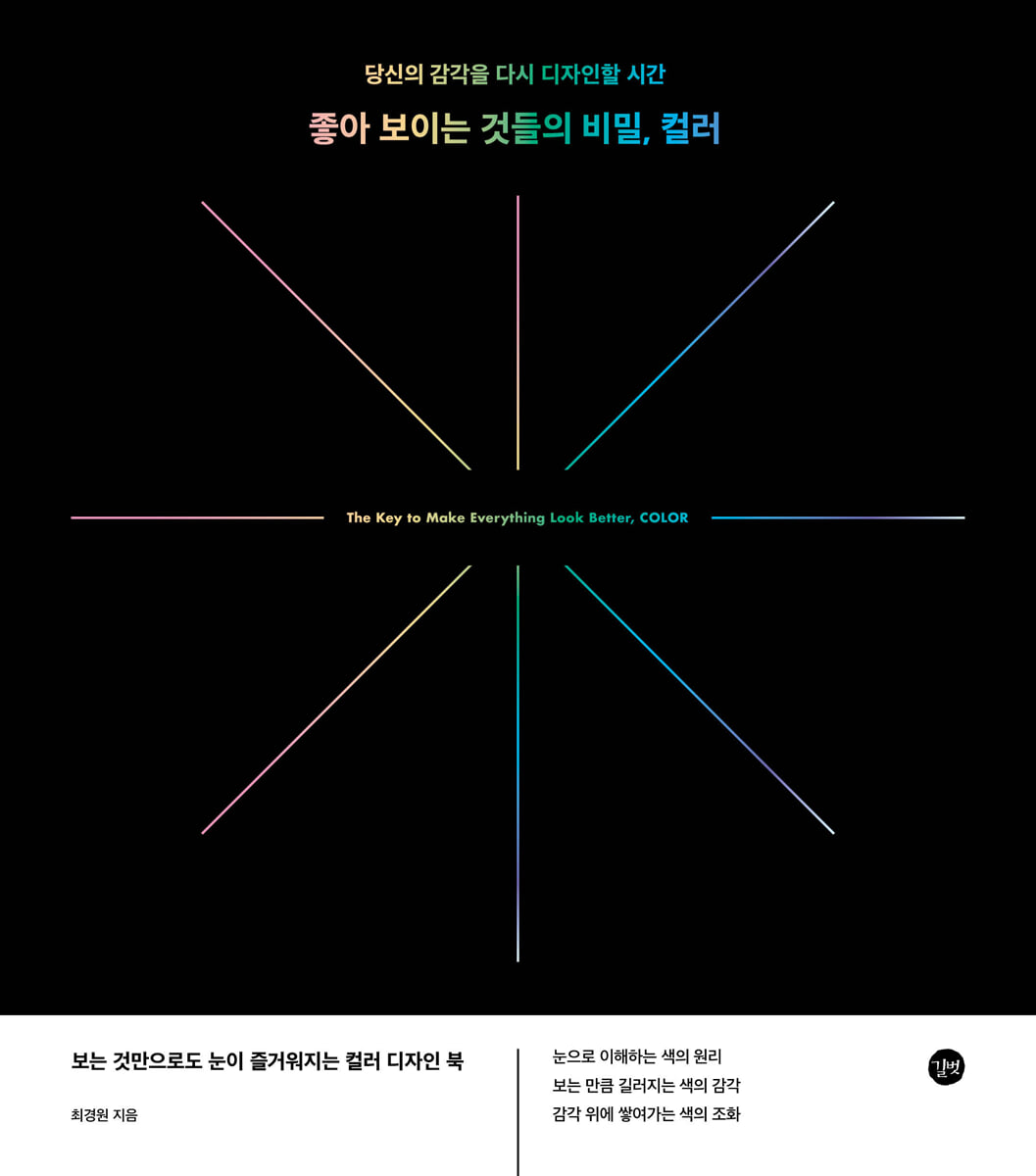
The secret to looking good: color
 |
Description
Book Introduction
A color design book that is a feast for the eyes just by looking at it.
- The principle of color as understood by the eye
- The more you look, the more your sense of color develops.
- Harmony of colors built on the senses
- The principle of color as understood by the eye
- The more you look, the more your sense of color develops.
- Harmony of colors built on the senses
- You can preview some of the book's contents.
Preview
index
PART 01 :: What is color?
CHAPTER 01 Beautiful colors that please the eyes
01 The joy of color
02 Color characteristics
+ Cost-effective beauty
+ The most intense sensory information
+ Colors that are not created
03 Why Color is Difficult to Handle
+ Everyday but difficult subjects
+ Absence of theoretical sophistication
+ It is considered a problem of sense
04 The key is the principle of color
+ Nearly infinite color combinations
+ Mechanical action of light and eyes
+ There is no perfect color combination
+ Overcoming color preconceptions
CHAPTER 02 Color of the Eye and Function
01 Philosophical perception and physical characteristics of color
+ Color imperfection and color sensation
+ Color as a secondary attribute
02 Colors perceived by the eye
+ The luck of being able to see colors
+ Composition of light and visible light
+ Structure of the eye and color perception
03 Three primary colors and three primary colors
04 Primary and mixed colors
05 Colors perceived and colors perceived
06 A system for classifying numerous colors
PART 02 :: The Principle of Color Movement
CHAPTER 03 Color Wheel and Color Principles
01 Primary colors and color wheel
02 Color relationships formed on the color wheel
03 Fundamental principles of color harmony
04 Harmony of adjacent colors
+ Characteristics and problem solving of adjacent color harmony
+ Yellow adjacent color harmony
+ Blue adjacent color harmony
+ Red adjacent color harmony
05 Harmony of complementary colors
+ The principle of complementary colors blending
+ Red-green complementary contrast
+ Blue-orange complementary color contrast
+ Yellow-violet complementary contrast
06 Various color harmonies using the color wheel
+ Between adjacent and complementary colors
+ Color combinations in an isosceles triangle relationship
+ Color combinations with consistent distance
CHAPTER 04 Color Skeleton, Brightness
01 Color brightness that determines color harmony
+ The hidden principles behind beautiful colors
+ Color skeleton brightness
+ Brightness difference and color harmony
02 Color harmony with distinct differences in brightness
+ Colors with gradually changing brightness
+ White-black harmony with maximized brightness difference
+ Transcendent White
+ Overwhelming black
+ Color harmony with large difference in brightness
03 Color harmony with little difference in brightness
+ possibility of ambiguity
+ Ambiguous brightness contrast that creates a sense of mystery
+ Deep luminance contrast in dark colors
04 The meeting of the principles of brightness and color
+ The principle of brightness working in adjacent colors
+ The principle of brightness working in complementary colors
CHAPTER 05 The World of True Color, Saturation
01 Saturation to create deep color depth
+ Low-saturation colors different from primary colors
+ Difference between primary colors and low-saturation colors
02 How saturation is created
+ Principle of saturation decline and stages of saturation
+ The principle by which numerous colors are created
03 The world of charming saturation
+ Color difference according to saturation level
+ Why low-saturation colors are attractive
04 Saturation Contrast and Color Harmony
+ The charm of color created by saturation contrast
+ The mystery created by similar saturation
05 Saturation Contrast and Color
+ Meeting of adjacent colors and saturation
+ The meeting of complementary colors and saturation
06 Saturation Contrast and Brightness
+ Effect that appears when brightness is applied to saturation
+ Saturation and color variations at similar brightness
+ Saturation and color variations in luminance contrast
CHAPTER 01 Beautiful colors that please the eyes
01 The joy of color
02 Color characteristics
+ Cost-effective beauty
+ The most intense sensory information
+ Colors that are not created
03 Why Color is Difficult to Handle
+ Everyday but difficult subjects
+ Absence of theoretical sophistication
+ It is considered a problem of sense
04 The key is the principle of color
+ Nearly infinite color combinations
+ Mechanical action of light and eyes
+ There is no perfect color combination
+ Overcoming color preconceptions
CHAPTER 02 Color of the Eye and Function
01 Philosophical perception and physical characteristics of color
+ Color imperfection and color sensation
+ Color as a secondary attribute
02 Colors perceived by the eye
+ The luck of being able to see colors
+ Composition of light and visible light
+ Structure of the eye and color perception
03 Three primary colors and three primary colors
04 Primary and mixed colors
05 Colors perceived and colors perceived
06 A system for classifying numerous colors
PART 02 :: The Principle of Color Movement
CHAPTER 03 Color Wheel and Color Principles
01 Primary colors and color wheel
02 Color relationships formed on the color wheel
03 Fundamental principles of color harmony
04 Harmony of adjacent colors
+ Characteristics and problem solving of adjacent color harmony
+ Yellow adjacent color harmony
+ Blue adjacent color harmony
+ Red adjacent color harmony
05 Harmony of complementary colors
+ The principle of complementary colors blending
+ Red-green complementary contrast
+ Blue-orange complementary color contrast
+ Yellow-violet complementary contrast
06 Various color harmonies using the color wheel
+ Between adjacent and complementary colors
+ Color combinations in an isosceles triangle relationship
+ Color combinations with consistent distance
CHAPTER 04 Color Skeleton, Brightness
01 Color brightness that determines color harmony
+ The hidden principles behind beautiful colors
+ Color skeleton brightness
+ Brightness difference and color harmony
02 Color harmony with distinct differences in brightness
+ Colors with gradually changing brightness
+ White-black harmony with maximized brightness difference
+ Transcendent White
+ Overwhelming black
+ Color harmony with large difference in brightness
03 Color harmony with little difference in brightness
+ possibility of ambiguity
+ Ambiguous brightness contrast that creates a sense of mystery
+ Deep luminance contrast in dark colors
04 The meeting of the principles of brightness and color
+ The principle of brightness working in adjacent colors
+ The principle of brightness working in complementary colors
CHAPTER 05 The World of True Color, Saturation
01 Saturation to create deep color depth
+ Low-saturation colors different from primary colors
+ Difference between primary colors and low-saturation colors
02 How saturation is created
+ Principle of saturation decline and stages of saturation
+ The principle by which numerous colors are created
03 The world of charming saturation
+ Color difference according to saturation level
+ Why low-saturation colors are attractive
04 Saturation Contrast and Color Harmony
+ The charm of color created by saturation contrast
+ The mystery created by similar saturation
05 Saturation Contrast and Color
+ Meeting of adjacent colors and saturation
+ The meeting of complementary colors and saturation
06 Saturation Contrast and Brightness
+ Effect that appears when brightness is applied to saturation
+ Saturation and color variations at similar brightness
+ Saturation and color variations in luminance contrast
Detailed image

Publisher's Review
It's time to redesign your senses
A color design book that is a feast for the eyes just by looking at it.
[The Secret to Looking Good: Color]
The principle of color as understood by the eye
Color is difficult to approach only through the senses, and it becomes distant if approached only through theory.
This book is an introductory design book that explains the basic structure and principles of color so that you can learn them visually.
From basic concepts like the color wheel, brightness, saturation, and complementary colors to how they are applied in actual design, we help anyone easily understand them by visually explaining them with abundant image examples.
When we understand 'what is awkward and why it is out of harmony' not through sensation but through structure, color becomes a tool that can be treated as a standard rather than a feeling.
The more you look, the more your sense of color develops
Good color comes from an eye for difference and harmony, rather than special talent.
This book explains, not just in terms of sense, why these colors feel harmonious, focusing on examples of color usage by actual artists and designers, such as Van Gogh's intense contrast of blue and yellow, Rothko's red and cotton, Mendini's bold complementary color combinations, and Armani's restrained gray tones.
By approaching the work not as a mere appreciation of the work, but as an analytical interpretation of color, readers develop the ability to verbalize their own sense of color and develop a discerning eye for making choices.
The harmony of colors that builds up on the senses
Colors do not exist alone, but always operate in a relationship with each other.
This book demonstrates various combinations of adjacent, complementary, and tonal colors with real-life examples, visually explaining the balance and contrast required to achieve color harmony.
Beyond vague assessments such as "safe but monotonous" or "popular but uncomfortable," the book offers practical insight through the "Principles of Color Composition" to help anyone understand why life is like that and how to adjust it to achieve balance.
A color design book that is a feast for the eyes just by looking at it.
[The Secret to Looking Good: Color]
The principle of color as understood by the eye
Color is difficult to approach only through the senses, and it becomes distant if approached only through theory.
This book is an introductory design book that explains the basic structure and principles of color so that you can learn them visually.
From basic concepts like the color wheel, brightness, saturation, and complementary colors to how they are applied in actual design, we help anyone easily understand them by visually explaining them with abundant image examples.
When we understand 'what is awkward and why it is out of harmony' not through sensation but through structure, color becomes a tool that can be treated as a standard rather than a feeling.
The more you look, the more your sense of color develops
Good color comes from an eye for difference and harmony, rather than special talent.
This book explains, not just in terms of sense, why these colors feel harmonious, focusing on examples of color usage by actual artists and designers, such as Van Gogh's intense contrast of blue and yellow, Rothko's red and cotton, Mendini's bold complementary color combinations, and Armani's restrained gray tones.
By approaching the work not as a mere appreciation of the work, but as an analytical interpretation of color, readers develop the ability to verbalize their own sense of color and develop a discerning eye for making choices.
The harmony of colors that builds up on the senses
Colors do not exist alone, but always operate in a relationship with each other.
This book demonstrates various combinations of adjacent, complementary, and tonal colors with real-life examples, visually explaining the balance and contrast required to achieve color harmony.
Beyond vague assessments such as "safe but monotonous" or "popular but uncomfortable," the book offers practical insight through the "Principles of Color Composition" to help anyone understand why life is like that and how to adjust it to achieve balance.
GOODS SPECIFICS
- Date of issue: June 23, 2025
- Page count, weight, size: 312 pages | 650g | 185*210*15mm
- ISBN13: 9791140713639
- ISBN10: 1140713639
You may also like
카테고리
korean


korean

![GQ KOREA Mark (Monthly): December [2025]](http://librairie.coreenne.fr/cdn/shop/files/8ef265dbbfbf186523ed75ba7319009d.jpg?v=1765340328&width=3840)


