

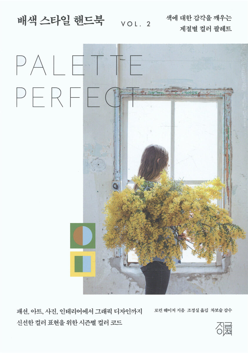
Color Matching Style Handbook Vol. 2
 |
Description
Book Introduction
What color suits this season?
Knowing the colors of each season is a great way to discover countless different colors.
It gives you the power to freely arrange colors!
After the cold, gray wind passes like a blade, an ivory spring breeze gently blows, and the pale green of new buds begins to raise their heads on the frozen ground.
We visually encounter the warm spring air that relaxes our bodies, which have been stiff all winter, in our clothes, food, and all of nature.
Our bodies and minds change with the changing seasons. What colors will they be filled with in spring? What about in summer, fall, or winter?
Lauren Wager, the 'designer's designer' who provides fresh color inspiration with sophisticated color combination ideas to everyone from the general public to design experts, has returned to Korea with 'Color Combination Style Handbook V.2'.
If the previous work, 『Color Style Handbook』, focused on the psychological effects of color and presented a palette for each emotion to help manage emotions, create a pleasant space, and enrich daily life, this book suggests a color style that can be utilized for each season by paying attention to the beauty of nature that changes with the seasons, the mood of daily life, and seasonal emotions.
This time, Lauren Weiser's unique curation stands out, being neat and elegant while simultaneously evoking strong emotions.
Among them, the greatest virtue of this book is its concept of 'seasonal color palette' that is faithful to the basics and application of color combination.
Since color is light itself, the sense of color begins with understanding the relationship with light. Since light also determines the characteristics of the seasons, utilizing the medium of seasons not only greatly helps in understanding basic color theory, but also gives you the power to freely combine countless and diverse colors.
A sense of color is no longer just an essential virtue for artists, designers, or colorists.
We live in an era where a sense of color is required in almost every area of life, from fashion and beauty to interior design and even tech and food.
Let's take a closer look at our nature and daily lives through the lens of seasons.
You will realize that our space and time are filled with indescribably colorful and beautiful colors that were previously invisible to your eyes.
As Mark Twain said, every season is more beautiful to those who are in communion with nature!
Knowing the colors of each season is a great way to discover countless different colors.
It gives you the power to freely arrange colors!
After the cold, gray wind passes like a blade, an ivory spring breeze gently blows, and the pale green of new buds begins to raise their heads on the frozen ground.
We visually encounter the warm spring air that relaxes our bodies, which have been stiff all winter, in our clothes, food, and all of nature.
Our bodies and minds change with the changing seasons. What colors will they be filled with in spring? What about in summer, fall, or winter?
Lauren Wager, the 'designer's designer' who provides fresh color inspiration with sophisticated color combination ideas to everyone from the general public to design experts, has returned to Korea with 'Color Combination Style Handbook V.2'.
If the previous work, 『Color Style Handbook』, focused on the psychological effects of color and presented a palette for each emotion to help manage emotions, create a pleasant space, and enrich daily life, this book suggests a color style that can be utilized for each season by paying attention to the beauty of nature that changes with the seasons, the mood of daily life, and seasonal emotions.
This time, Lauren Weiser's unique curation stands out, being neat and elegant while simultaneously evoking strong emotions.
Among them, the greatest virtue of this book is its concept of 'seasonal color palette' that is faithful to the basics and application of color combination.
Since color is light itself, the sense of color begins with understanding the relationship with light. Since light also determines the characteristics of the seasons, utilizing the medium of seasons not only greatly helps in understanding basic color theory, but also gives you the power to freely combine countless and diverse colors.
A sense of color is no longer just an essential virtue for artists, designers, or colorists.
We live in an era where a sense of color is required in almost every area of life, from fashion and beauty to interior design and even tech and food.
Let's take a closer look at our nature and daily lives through the lens of seasons.
You will realize that our space and time are filled with indescribably colorful and beautiful colors that were previously invisible to your eyes.
As Mark Twain said, every season is more beautiful to those who are in communion with nature!
- You can preview some of the book's contents.
Preview
index
Introduction
SUMMER
Summer's classic colors
Neutral colors for summer
Bold colors for summer
AUTUMN
Classic fall colors
Neutral colors for fall
Bold colors of fall
WINTER
Classic winter colors
Neutral colors for winter
Bold colors for winter
SPRING
Classic colors of spring
Neutral colors for spring
Bold colors of spring
Artist Index
SUMMER
Summer's classic colors
Neutral colors for summer
Bold colors for summer
AUTUMN
Classic fall colors
Neutral colors for fall
Bold colors of fall
WINTER
Classic winter colors
Neutral colors for winter
Bold colors for winter
SPRING
Classic colors of spring
Neutral colors for spring
Bold colors of spring
Artist Index
Detailed image

Into the book
Color is a very essential element in the process of perceiving the world through sight, but it is often overlooked.
For those who work or study in a creative field—designers, artists, photographers, filmmakers, florists, chefs—observing color carefully and practicing seeing things with a pure eye can open up a whole new perspective on the world.
Among them, if we look at colors through the lens of seasons, we will have the opportunity to see colors more closely.
--- p.6
One of the ways to convey newness in fashion is through color.
…the reality is that color trends can take years to become accepted across society and commercially successful.
Color trends tend to evolve over time, shifting in new directions very slightly, rather than changing drastically with each season or year.
--- p.9
Although not absolute, the fashion industry still follows traditional trends when choosing colors for each season.
When we think of 'spring', we think of pastel colors, and there is still a strong perception that bright or neon colors are summer colors.
In fall and winter, people choose clothes and accessories with deep shades, and especially in winter, they prefer bright and flashy colors that fit the Christmas atmosphere.
In this way, seasonal color codes are based on common sense, sociocultural standards, and seasonal sales patterns.
The extent to which color codes are followed will vary depending on new trends, product types, and geographic conditions of the market.
--- p.10
When we make decisions about color, everything that surrounds us—our culture, our traditions, our memories, our senses—influences them.
Whether consciously or not, the colors we choose to wear are a way of showing what emotions we are connected to at a particular time.
--- p.10
The seasons constantly move us forward.
Seasons come and go as if they were natural, but perhaps it is because they pass by so quickly that they feel even more beautiful.
Each season brings new sights, smells, sounds, and sensations through its unique colors and light, guiding us into a new phase of life.
The seasons speak to us on behalf of nature, telling us to focus on the present.
Like each color, each season carries its own unique wisdom, its own perception of beauty and limitations.
--- p.24
I really like unexpected color combinations that don't seem to go together.
If you want to create creative results, I encourage you to keep an open mind and try unexpected color combinations when choosing a color palette.
Summer is a bright, lively and peaceful season.
And these vivid colors reflect the mood of this season well.
--- p.70
Even though I'm a summer lover to the core, if I were asked to pick my favorite color, I'd always pick fall.
Colors reminiscent of autumn foliage, such as burnt orange, mustard, ochre, caramel, and olive green, evoke a warm, earthy feeling.
--- p.92
Winter is the most dramatic season.
Bright, intense winter colors add drama to the palette.
Winter's bold colors, like deep red, deep teal, majestic purple, and frozen blue, are very powerful and bold.
--- p.202
As spring is a season of rediscovery and creation, let's get creative and find color combinations that evoke a lively and vibrant feeling when creating our spring color palette!
For those who work or study in a creative field—designers, artists, photographers, filmmakers, florists, chefs—observing color carefully and practicing seeing things with a pure eye can open up a whole new perspective on the world.
Among them, if we look at colors through the lens of seasons, we will have the opportunity to see colors more closely.
--- p.6
One of the ways to convey newness in fashion is through color.
…the reality is that color trends can take years to become accepted across society and commercially successful.
Color trends tend to evolve over time, shifting in new directions very slightly, rather than changing drastically with each season or year.
--- p.9
Although not absolute, the fashion industry still follows traditional trends when choosing colors for each season.
When we think of 'spring', we think of pastel colors, and there is still a strong perception that bright or neon colors are summer colors.
In fall and winter, people choose clothes and accessories with deep shades, and especially in winter, they prefer bright and flashy colors that fit the Christmas atmosphere.
In this way, seasonal color codes are based on common sense, sociocultural standards, and seasonal sales patterns.
The extent to which color codes are followed will vary depending on new trends, product types, and geographic conditions of the market.
--- p.10
When we make decisions about color, everything that surrounds us—our culture, our traditions, our memories, our senses—influences them.
Whether consciously or not, the colors we choose to wear are a way of showing what emotions we are connected to at a particular time.
--- p.10
The seasons constantly move us forward.
Seasons come and go as if they were natural, but perhaps it is because they pass by so quickly that they feel even more beautiful.
Each season brings new sights, smells, sounds, and sensations through its unique colors and light, guiding us into a new phase of life.
The seasons speak to us on behalf of nature, telling us to focus on the present.
Like each color, each season carries its own unique wisdom, its own perception of beauty and limitations.
--- p.24
I really like unexpected color combinations that don't seem to go together.
If you want to create creative results, I encourage you to keep an open mind and try unexpected color combinations when choosing a color palette.
Summer is a bright, lively and peaceful season.
And these vivid colors reflect the mood of this season well.
--- p.70
Even though I'm a summer lover to the core, if I were asked to pick my favorite color, I'd always pick fall.
Colors reminiscent of autumn foliage, such as burnt orange, mustard, ochre, caramel, and olive green, evoke a warm, earthy feeling.
--- p.92
Winter is the most dramatic season.
Bright, intense winter colors add drama to the palette.
Winter's bold colors, like deep red, deep teal, majestic purple, and frozen blue, are very powerful and bold.
--- p.202
As spring is a season of rediscovery and creation, let's get creative and find color combinations that evoke a lively and vibrant feeling when creating our spring color palette!
--- p.265
Publisher's Review
From fashion, art, photography, interior design to graphic design
Seasonal color codes for fresh color expression
This book is divided into four chapters, each explaining the colors corresponding to each season: spring, summer, fall, and winter.
To express the most vibrant and energetic season of the year, the color swatches for summer colors were presented in circles, while the color swatches for fall colors were presented in squares to focus on the sense of stability that this season brings.
The diamond shape, which symbolizes focus, strength and inner balance, is embodied in winter colors.
Finally, the colors of spring are represented by triangles with their tops pointing upwards, suggesting hope, growth, and rising.
Additionally, the color palette is depicted in a fresh and dynamic way, allowing the viewer to observe the effect that certain colors have when used in the foreground or background, and when the colors are placed close together or far apart.
And just like in the 『Color Style Handbook』, we've included the works of famous designers, artists, photographers, florists, and illustrators, as well as color codes such as CMYK and RGB, to help you use color more delicately.
Each season brings new sights, smells, sounds, and sensations through its unique colors and light, ushering us into a new phase of life.
This book shows how observing nature, our ordinary daily lives, and finding beauty in it can be valuable and lead to meaningful creation.
This book will be a great source of inspiration not only for design professionals but also for the general public, and it will also serve as an excellent guide to developing the fundamentals and application of color.
“The seasons awaken our sense of color!”
Seasonal color combinations that evoke rich emotions, sensations, and ideas.
Nature's colors change with the seasons.
Spring represents youth in nature, and the clear and fresh feeling of spring is expressed in bright colors.
Summer shows the most brilliant forms and colors, and paints nature with the warmest and most saturated colors.
The colors of autumn contrast strongly with those of spring.
Winter is a time in nature when the earth's power contracts and becomes passive.
In this way, the seasons awaken our sense of color and allow us to experience countless changes in color tones.
“Spring adds new beauty to everything that exists.”
Spring symbolizes a fresh start, a new beginning, and resurrection.
Flowers begin to bloom, grass and trees come back to life, and green fills the landscape, bringing a vibrant new life to nature.
Spring's classic colors are subtle and bright, in keeping with the positive energy this season brings.
Pastel, rainbow, turquoise, yellow, and pink colors are often observed along with green.
If you want to create a spring neutral palette that feels light and natural, try combining colors like ivory, cream, light olive, hazelnut, sand, and peach.
Since spring is a season of rediscovery and creation, if you want to emphasize vitality and liveliness in your palette, you can choose any color from the rainbow, such as bright yellow or orange, and present it as a bold color of spring.
“Summer is always the best time.”
A season filled with dazzling sunshine and scorching heat! The sweltering heat and humidity make even movement difficult, but the abundance of outdoor activities makes it a season filled with the vibrant energy and vitality of youth.
The emotions that summer brings are especially well reflected in the colors seen in nature.
The classic colors of summer are the yellow reminiscent of the blazing sun, the blue of the sky, the green of the grassy fields, and the turquoise of the sea.
Meanwhile, summer's neutral colors have a soft, gentle, and delicate glow, reminiscent of a vacation getaway from the busy daily life.
Tan, beige, and light pink are similar to the colors of beach sand, while soft yellow resembles the morning sunlight.
Bold colors like hot pink, neon yellow, radiant orange, and marine aqua also fill summer with bright, fun colors.
“Autumn has come again, and another page has turned.”
All seasons symbolize change, but the changes of autumn are particularly evident as the weather changes from hot to cool, the days grow shorter, and the leaves fall one by one.
The lush green leaves turn yellow, and the warm hues of harvest-ready grains and fruits, such as golden rice, wheat, persimmons, chestnuts, pumpkins, and eggplants, spread out in abundance around us.
Classic colors reminiscent of autumn foliage, such as burnt orange, mustard, ochre, caramel, and olive green, evoke a warm, earthy feel.
Fruits and vegetables such as apples, bananas, carrots, beets, and paprika, which are about to be harvested, are also ripening in their own gorgeous autumn colors.
Bold colors like ruby red, orange, emerald green, purple, fuchsia, and royal blue can also be combined with more natural, muted autumn colors to create vivid and vibrant color combinations.
If you're looking for a more subtle fall palette, try neutrals like khaki, cedar brown, mossy green, and navy blue.
“Winter is not a season, it’s a festival.”
Winter is a time of peace and reflection, a time to pause, cozy up, and plan for the coming year.
The gray of the bare tree branches, the white of the snow covering the ground, and the deep blue and black of the night sky well reflect the atmosphere of this season, which is filled with silence and stillness.
During the festive season, including Christmas, traditional colors such as berry red, forest green, cobalt blue, and metallic colors like gold or silver stand out.
Meanwhile, winter presents a special feast of light.
The frost on the bare branches sparkles golden, and the entire world is covered in white snow, creating a spectacular winter scene.
Bright, bold winter colors add drama to your palette, and if you want to make a strong impression by emulating winter's toughness, bold colors like deep red, deep teal, majestic purple, and frozen blue are perfect.
Seasonal color codes for fresh color expression
This book is divided into four chapters, each explaining the colors corresponding to each season: spring, summer, fall, and winter.
To express the most vibrant and energetic season of the year, the color swatches for summer colors were presented in circles, while the color swatches for fall colors were presented in squares to focus on the sense of stability that this season brings.
The diamond shape, which symbolizes focus, strength and inner balance, is embodied in winter colors.
Finally, the colors of spring are represented by triangles with their tops pointing upwards, suggesting hope, growth, and rising.
Additionally, the color palette is depicted in a fresh and dynamic way, allowing the viewer to observe the effect that certain colors have when used in the foreground or background, and when the colors are placed close together or far apart.
And just like in the 『Color Style Handbook』, we've included the works of famous designers, artists, photographers, florists, and illustrators, as well as color codes such as CMYK and RGB, to help you use color more delicately.
Each season brings new sights, smells, sounds, and sensations through its unique colors and light, ushering us into a new phase of life.
This book shows how observing nature, our ordinary daily lives, and finding beauty in it can be valuable and lead to meaningful creation.
This book will be a great source of inspiration not only for design professionals but also for the general public, and it will also serve as an excellent guide to developing the fundamentals and application of color.
“The seasons awaken our sense of color!”
Seasonal color combinations that evoke rich emotions, sensations, and ideas.
Nature's colors change with the seasons.
Spring represents youth in nature, and the clear and fresh feeling of spring is expressed in bright colors.
Summer shows the most brilliant forms and colors, and paints nature with the warmest and most saturated colors.
The colors of autumn contrast strongly with those of spring.
Winter is a time in nature when the earth's power contracts and becomes passive.
In this way, the seasons awaken our sense of color and allow us to experience countless changes in color tones.
“Spring adds new beauty to everything that exists.”
Spring symbolizes a fresh start, a new beginning, and resurrection.
Flowers begin to bloom, grass and trees come back to life, and green fills the landscape, bringing a vibrant new life to nature.
Spring's classic colors are subtle and bright, in keeping with the positive energy this season brings.
Pastel, rainbow, turquoise, yellow, and pink colors are often observed along with green.
If you want to create a spring neutral palette that feels light and natural, try combining colors like ivory, cream, light olive, hazelnut, sand, and peach.
Since spring is a season of rediscovery and creation, if you want to emphasize vitality and liveliness in your palette, you can choose any color from the rainbow, such as bright yellow or orange, and present it as a bold color of spring.
“Summer is always the best time.”
A season filled with dazzling sunshine and scorching heat! The sweltering heat and humidity make even movement difficult, but the abundance of outdoor activities makes it a season filled with the vibrant energy and vitality of youth.
The emotions that summer brings are especially well reflected in the colors seen in nature.
The classic colors of summer are the yellow reminiscent of the blazing sun, the blue of the sky, the green of the grassy fields, and the turquoise of the sea.
Meanwhile, summer's neutral colors have a soft, gentle, and delicate glow, reminiscent of a vacation getaway from the busy daily life.
Tan, beige, and light pink are similar to the colors of beach sand, while soft yellow resembles the morning sunlight.
Bold colors like hot pink, neon yellow, radiant orange, and marine aqua also fill summer with bright, fun colors.
“Autumn has come again, and another page has turned.”
All seasons symbolize change, but the changes of autumn are particularly evident as the weather changes from hot to cool, the days grow shorter, and the leaves fall one by one.
The lush green leaves turn yellow, and the warm hues of harvest-ready grains and fruits, such as golden rice, wheat, persimmons, chestnuts, pumpkins, and eggplants, spread out in abundance around us.
Classic colors reminiscent of autumn foliage, such as burnt orange, mustard, ochre, caramel, and olive green, evoke a warm, earthy feel.
Fruits and vegetables such as apples, bananas, carrots, beets, and paprika, which are about to be harvested, are also ripening in their own gorgeous autumn colors.
Bold colors like ruby red, orange, emerald green, purple, fuchsia, and royal blue can also be combined with more natural, muted autumn colors to create vivid and vibrant color combinations.
If you're looking for a more subtle fall palette, try neutrals like khaki, cedar brown, mossy green, and navy blue.
“Winter is not a season, it’s a festival.”
Winter is a time of peace and reflection, a time to pause, cozy up, and plan for the coming year.
The gray of the bare tree branches, the white of the snow covering the ground, and the deep blue and black of the night sky well reflect the atmosphere of this season, which is filled with silence and stillness.
During the festive season, including Christmas, traditional colors such as berry red, forest green, cobalt blue, and metallic colors like gold or silver stand out.
Meanwhile, winter presents a special feast of light.
The frost on the bare branches sparkles golden, and the entire world is covered in white snow, creating a spectacular winter scene.
Bright, bold winter colors add drama to your palette, and if you want to make a strong impression by emulating winter's toughness, bold colors like deep red, deep teal, majestic purple, and frozen blue are perfect.
GOODS SPECIFICS
- Date of issue: November 30, 2023
- Page count, weight, size: 304 pages | 736g | 148*210*22mm
- ISBN13: 9791188554751
- ISBN10: 1188554751
You may also like
카테고리
korean


korean

![GQ KOREA Mark (Monthly): December [2025]](http://librairie.coreenne.fr/cdn/shop/files/8ef265dbbfbf186523ed75ba7319009d.jpg?v=1765340328&width=3840)


