

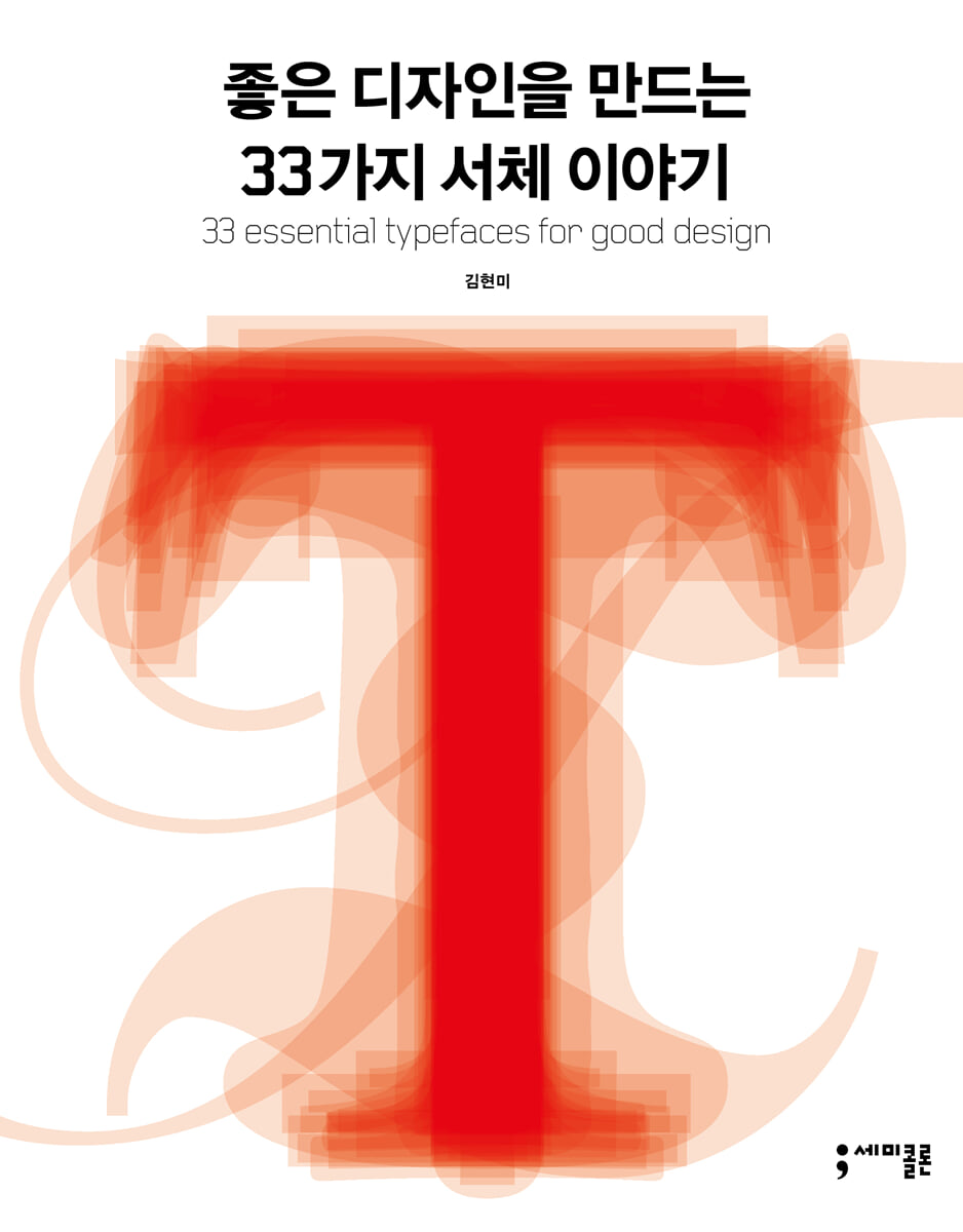
33 Typefaces That Create Great Design
 |
Description
Book Introduction
A steady seller in the design and typography fields
The very book that has been a guide for designers on typefaces for the past 15 years.
Revised edition of "33 Typefaces for Good Design" published
Published by Semicolon in 2007, "33 Typeface Stories for Creating Good Design" is an introductory book on typography written by a Korean author that has been consistently loved by many readers for a long time.
This book, which selects 33 essential typefaces from the history of Western typography and tells the stories of their creation and the designers who created them, has firmly established itself as a must-read for design majors.
In particular, it served as a guide for font selection for designers in typography-related fields such as visual design, advertising design, fashion, and branding, and provided knowledge and information to those interested in fonts.
Fifteen years after the first edition, a revised edition of "33 Typeface Stories for Creating Good Design" is being published.
In this revised edition, information has been supplemented to adapt to the changing design environment, and the contents of the first edition have been reviewed and errors corrected.
The revised edition retains the 33 fonts covered in the first edition, but adds a new type called '19th Century Display Font Styles' to the existing font classification.
This is a very vibrant type in the history of typography, giving us a glimpse into the various exaggerated and decorative types that appeared in the advertising era of the 19th century.
Additionally, the existing appendix containing basic font terminology and chronology has been supplemented with content related to 'punctuation marks' to help users utilize punctuation marks in English typography.
The very book that has been a guide for designers on typefaces for the past 15 years.
Revised edition of "33 Typefaces for Good Design" published
Published by Semicolon in 2007, "33 Typeface Stories for Creating Good Design" is an introductory book on typography written by a Korean author that has been consistently loved by many readers for a long time.
This book, which selects 33 essential typefaces from the history of Western typography and tells the stories of their creation and the designers who created them, has firmly established itself as a must-read for design majors.
In particular, it served as a guide for font selection for designers in typography-related fields such as visual design, advertising design, fashion, and branding, and provided knowledge and information to those interested in fonts.
Fifteen years after the first edition, a revised edition of "33 Typeface Stories for Creating Good Design" is being published.
In this revised edition, information has been supplemented to adapt to the changing design environment, and the contents of the first edition have been reviewed and errors corrected.
The revised edition retains the 33 fonts covered in the first edition, but adds a new type called '19th Century Display Font Styles' to the existing font classification.
This is a very vibrant type in the history of typography, giving us a glimpse into the various exaggerated and decorative types that appeared in the advertising era of the 19th century.
Additionally, the existing appendix containing basic font terminology and chronology has been supplemented with content related to 'punctuation marks' to help users utilize punctuation marks in English typography.
- You can preview some of the book's contents.
Preview
index
Preface to the Revised Edition
Preface to the first edition
1.
Feel the Italian Renaissance with the Centaur font
2.
Bembo: The prototype of the Western Roman font created by the golden partnership
3.
Garamond, the prototype of an elegant and dignified serif typeface
4.
In France there is Garamond, in England there is Caslon.
5.
Goudy: A special Roman font born in the United States
6.
Times Roman, an 'all-weather' font created for the newspaper
7.
A gift from Sabon typography master Jan Tschichold
8.
Palatino A Roman font characterized by the liveliness of penmanship.
9.
Baskerville, a modern typeface that emerged in the 18th century.
10.
Bodoni, a font from Italy, reminiscent of the Venus de Milo
11.
Walbaum, the most original German Romantic typeface
12.
Clarendon, a body typeface that emerged during the Industrial Revolution
13.
Berthold City, the font that inspired the IBM logo
14.
Century Schoolbook, a font created through the talent and effort of two generations.
15.
Franklin Gothic: A font that preserves American modernism.
16.
Akzidenz Grotesk, a font that continues the tradition of new typography
17.
Helvetica, the official typeface of the 20th century
18.
Universe Typographic Color Palette
19.
Futura, a font that embodies the spirit of Bauhaus
20.
Avant Garde A typeface born during the golden age of American magazine design.
21.
Gill Sans, the most British typeface
22.
Optima Optima: The optimal combination of serif and sans serif
23.
Frutiger, a typeface created for the signage system at Paris Charles de Gaulle Airport
24.
Perpetua, a sculpted serif typeface by sculptor Eric Gill
25.
Lithos A font that expresses the inscriptions of the Greek era
26.
Snell Roundhand, a handwritten font with a refined and emotional visual message.
27.
Peignot, an Art Deco typeface by poster artist Cassandre
28.
Cooper Black: A fluffy serif typeface you can't help but love.
29.
Block: A sans-serif typeface in the 'poster style' that ushered in the 20th century.
30.
Oakland: A bitmap font that heralded the arrival of the digital age
31.
Fette Fraktur: A typeface that became a symbol of the nation and its ideology
32. Fonts supporting OCR A and OCR B optical character recognition technologies
33.
Rotis, a typeface by German master Otl Eicher
Basic font terms
punctuation marks
font family
Font chronology
References
Source of the illustration
Search
Preface to the first edition
1.
Feel the Italian Renaissance with the Centaur font
2.
Bembo: The prototype of the Western Roman font created by the golden partnership
3.
Garamond, the prototype of an elegant and dignified serif typeface
4.
In France there is Garamond, in England there is Caslon.
5.
Goudy: A special Roman font born in the United States
6.
Times Roman, an 'all-weather' font created for the newspaper
7.
A gift from Sabon typography master Jan Tschichold
8.
Palatino A Roman font characterized by the liveliness of penmanship.
9.
Baskerville, a modern typeface that emerged in the 18th century.
10.
Bodoni, a font from Italy, reminiscent of the Venus de Milo
11.
Walbaum, the most original German Romantic typeface
12.
Clarendon, a body typeface that emerged during the Industrial Revolution
13.
Berthold City, the font that inspired the IBM logo
14.
Century Schoolbook, a font created through the talent and effort of two generations.
15.
Franklin Gothic: A font that preserves American modernism.
16.
Akzidenz Grotesk, a font that continues the tradition of new typography
17.
Helvetica, the official typeface of the 20th century
18.
Universe Typographic Color Palette
19.
Futura, a font that embodies the spirit of Bauhaus
20.
Avant Garde A typeface born during the golden age of American magazine design.
21.
Gill Sans, the most British typeface
22.
Optima Optima: The optimal combination of serif and sans serif
23.
Frutiger, a typeface created for the signage system at Paris Charles de Gaulle Airport
24.
Perpetua, a sculpted serif typeface by sculptor Eric Gill
25.
Lithos A font that expresses the inscriptions of the Greek era
26.
Snell Roundhand, a handwritten font with a refined and emotional visual message.
27.
Peignot, an Art Deco typeface by poster artist Cassandre
28.
Cooper Black: A fluffy serif typeface you can't help but love.
29.
Block: A sans-serif typeface in the 'poster style' that ushered in the 20th century.
30.
Oakland: A bitmap font that heralded the arrival of the digital age
31.
Fette Fraktur: A typeface that became a symbol of the nation and its ideology
32. Fonts supporting OCR A and OCR B optical character recognition technologies
33.
Rotis, a typeface by German master Otl Eicher
Basic font terms
punctuation marks
font family
Font chronology
References
Source of the illustration
Search
Detailed image

Into the book
Garamond is still loved today as a beautiful and comfortable body text font, and as a title font that gives messages a dignified and soft tone.
When typographer Jan Tschichold was commissioned by German type foundries in the 1960s to design a body typeface suited to the new era and technology, his choice was Garamond.
---From "Garamond, the prototype of an elegant and dignified serif typeface"
When The Times introduced Times New Roman on October 3, 1932, the new typeface immediately gained popularity among designers, and a year later in the United States, it began to be released and sold under the name Times Roman.
Stanley Morrison, a typographer and historian, designed only one typeface in his lifetime, but its influence was immense, and the history of Times Roman continues.
---From "Times Roman, an 'all-weather' font created for newspapers"
City is the font that served as the basis for the logo of IBM, the American company that pioneered and became synonymous with personal computers.
In 1956, legendary American graphic designer Paul Rand started with this typeface with a strong linear impression and created a logo that visually conveyed the values of accuracy and trustworthiness, with an impressive space within the square of the capital letter B.
However, as he watched the logo being used, he felt that it had some shortcomings and revised it again four years later. That is the 'stripe logo' that has contributed to building the brand identity of IBM without much change to this day.
---From "Bertolt City, the font that became the basis for the IBM logo"
The irregular thickness and awkward curves of early sans-serif typefaces cannot be found in Akzidenz Grotesk.
Fonts without serifs of a consistent thickness are basic forms that have eliminated all unnecessary elements, and the uneven width of letters is organized to ensure an even rhythm and space.
Akzidenz Grotesk was chosen as the typeface for 'New Typography', one of the 20th-century modernist movements, because it is a sans-serif typeface with excellent form and the most universal form that does not reveal the personal inclination of the type designer.
---From "Akzidenz Grotesk, a font that continues the tradition of new typography"
Helvetica was used extensively by multinational corporations, especially during the booming 1960s and 1970s, to build their visual identities.
Helvetica's neutral, readable form, free of exaggeration, and associated with precision, sophistication, and trustworthiness, has been used in a wide range of applications, from subway signs in major cities like New York and Tokyo to the identity designs of airlines like Lufthansa and American Airlines.
American graphic designer Michael Vanderbyl said, “In the late 1960s and 1970s, Helvetica wasn’t just a typeface.
“It was a lifestyle,” he said, which gives an idea of the visual environment that Helvetica was occupying at the time.
---From "Helvetica, the official typeface of the 20th century"
The typeface Avant-Garde existed only in uppercase until it was commercially released in 1970 by ITC, the typeface company founded by Herb Lubalin and Aaron Burns.
Experts have pointed out that avant-garde fonts are being abused and misused in ways that go against their original design intent.
In fact, when the uppercase and lowercase avant-garde letters are written without alternative letter pairs and with normal kerning, they fail to bring out the special characteristics of the avant-garde, such as tension and wit.
Herb Lubalin focused on the visual impression of words or sentences formed by letters coming together, so he used minimal letter spacing and line spacing.
In his work, we experience powerful typographic messages that put 'seeing' ahead of 'reading'.
When typographer Jan Tschichold was commissioned by German type foundries in the 1960s to design a body typeface suited to the new era and technology, his choice was Garamond.
---From "Garamond, the prototype of an elegant and dignified serif typeface"
When The Times introduced Times New Roman on October 3, 1932, the new typeface immediately gained popularity among designers, and a year later in the United States, it began to be released and sold under the name Times Roman.
Stanley Morrison, a typographer and historian, designed only one typeface in his lifetime, but its influence was immense, and the history of Times Roman continues.
---From "Times Roman, an 'all-weather' font created for newspapers"
City is the font that served as the basis for the logo of IBM, the American company that pioneered and became synonymous with personal computers.
In 1956, legendary American graphic designer Paul Rand started with this typeface with a strong linear impression and created a logo that visually conveyed the values of accuracy and trustworthiness, with an impressive space within the square of the capital letter B.
However, as he watched the logo being used, he felt that it had some shortcomings and revised it again four years later. That is the 'stripe logo' that has contributed to building the brand identity of IBM without much change to this day.
---From "Bertolt City, the font that became the basis for the IBM logo"
The irregular thickness and awkward curves of early sans-serif typefaces cannot be found in Akzidenz Grotesk.
Fonts without serifs of a consistent thickness are basic forms that have eliminated all unnecessary elements, and the uneven width of letters is organized to ensure an even rhythm and space.
Akzidenz Grotesk was chosen as the typeface for 'New Typography', one of the 20th-century modernist movements, because it is a sans-serif typeface with excellent form and the most universal form that does not reveal the personal inclination of the type designer.
---From "Akzidenz Grotesk, a font that continues the tradition of new typography"
Helvetica was used extensively by multinational corporations, especially during the booming 1960s and 1970s, to build their visual identities.
Helvetica's neutral, readable form, free of exaggeration, and associated with precision, sophistication, and trustworthiness, has been used in a wide range of applications, from subway signs in major cities like New York and Tokyo to the identity designs of airlines like Lufthansa and American Airlines.
American graphic designer Michael Vanderbyl said, “In the late 1960s and 1970s, Helvetica wasn’t just a typeface.
“It was a lifestyle,” he said, which gives an idea of the visual environment that Helvetica was occupying at the time.
---From "Helvetica, the official typeface of the 20th century"
The typeface Avant-Garde existed only in uppercase until it was commercially released in 1970 by ITC, the typeface company founded by Herb Lubalin and Aaron Burns.
Experts have pointed out that avant-garde fonts are being abused and misused in ways that go against their original design intent.
In fact, when the uppercase and lowercase avant-garde letters are written without alternative letter pairs and with normal kerning, they fail to bring out the special characteristics of the avant-garde, such as tension and wit.
Herb Lubalin focused on the visual impression of words or sentences formed by letters coming together, so he used minimal letter spacing and line spacing.
In his work, we experience powerful typographic messages that put 'seeing' ahead of 'reading'.
---From "Avant-garde, a typeface born in the golden age of American magazine design"
Publisher's Review
Typography, a great legacy of 20th-century graphic design
Why 33 fonts?
This book covers representative fonts according to the 'classification of fonts' method, which helps to understand and organize fonts.
This book's classification method is based on Maximilien Vox's typeface classification, but has been redefined to include modern typefaces and typefaces born in the digital age.
Thus, the 33 fonts selected in this book are those that best exemplify the form of each category, and are also classics whose functionality and beauty have been proven in the history of Western typography.
Even now, with the publication of this revised edition, each and every one of these fonts, without exception, possesses historical significance in its own right.
This book faithfully conveys the formal characteristics and basic knowledge of each typeface, as well as the historical background and stories of the typographic geniuses who created them.
Through this, general readers interested in design and typography can gain practical knowledge as well as the passion of the designers who created the typefaces.
By observing the interplay of the lives of various figures from different eras and cultures around a single typeface, we can reflect on the legacy of visual design and the endless creative possibilities it fosters.
Values and importance that remain constant even in a changing environment
Designer's creative thinking and use of typography
Typography is a Western cultural heritage that developed from Gutenberg's printing press, which began in 15th-century Europe, but its use is so widespread that it has deeply penetrated the lives of Koreans.
It has now become commonplace for Korean companies to develop and communicate with Roman-specific fonts as an essential element of branding in order to compete in the global market.
Recently, not only large corporations but also small and medium-sized enterprises are actively developing Roman-specific fonts for their global marketing needs.
In this context, in order for Korean visual designers to communicate visually to the world, it is necessary to have a certain level of understanding and ability in typography using the Roman alphabet.
A visual designer must have a good understanding of typefaces to be able to choose the typefaces that best convey their ideas visually, and to think creatively to give their work a competitive edge.
This book provides editorial design that allows designers to clearly understand the unique characteristics of each font, along with rich and colorful illustrations and information on the actual font sizes used, to help designers utilize them in their work.
You can get inspired by the work of master designers such as Paul Rand, Herb Lubalin, and Jan Tschichold, and see how each typeface has been used in various fields.
With the proliferation of new technologies today, some predict that artificial intelligence will replace designers.
Professor Kim Hyun-mi, author of this book, says, “Even amidst the changes in design tools and media brought about by technological innovation, the value that remains constant is the creative thinking that enables a design project to be properly understood, directed, and implemented.”
To this end, I hope this book will serve as a source of creative inspiration for designers living in the 21st century.
Why 33 fonts?
This book covers representative fonts according to the 'classification of fonts' method, which helps to understand and organize fonts.
This book's classification method is based on Maximilien Vox's typeface classification, but has been redefined to include modern typefaces and typefaces born in the digital age.
Thus, the 33 fonts selected in this book are those that best exemplify the form of each category, and are also classics whose functionality and beauty have been proven in the history of Western typography.
Even now, with the publication of this revised edition, each and every one of these fonts, without exception, possesses historical significance in its own right.
This book faithfully conveys the formal characteristics and basic knowledge of each typeface, as well as the historical background and stories of the typographic geniuses who created them.
Through this, general readers interested in design and typography can gain practical knowledge as well as the passion of the designers who created the typefaces.
By observing the interplay of the lives of various figures from different eras and cultures around a single typeface, we can reflect on the legacy of visual design and the endless creative possibilities it fosters.
Values and importance that remain constant even in a changing environment
Designer's creative thinking and use of typography
Typography is a Western cultural heritage that developed from Gutenberg's printing press, which began in 15th-century Europe, but its use is so widespread that it has deeply penetrated the lives of Koreans.
It has now become commonplace for Korean companies to develop and communicate with Roman-specific fonts as an essential element of branding in order to compete in the global market.
Recently, not only large corporations but also small and medium-sized enterprises are actively developing Roman-specific fonts for their global marketing needs.
In this context, in order for Korean visual designers to communicate visually to the world, it is necessary to have a certain level of understanding and ability in typography using the Roman alphabet.
A visual designer must have a good understanding of typefaces to be able to choose the typefaces that best convey their ideas visually, and to think creatively to give their work a competitive edge.
This book provides editorial design that allows designers to clearly understand the unique characteristics of each font, along with rich and colorful illustrations and information on the actual font sizes used, to help designers utilize them in their work.
You can get inspired by the work of master designers such as Paul Rand, Herb Lubalin, and Jan Tschichold, and see how each typeface has been used in various fields.
With the proliferation of new technologies today, some predict that artificial intelligence will replace designers.
Professor Kim Hyun-mi, author of this book, says, “Even amidst the changes in design tools and media brought about by technological innovation, the value that remains constant is the creative thinking that enables a design project to be properly understood, directed, and implemented.”
To this end, I hope this book will serve as a source of creative inspiration for designers living in the 21st century.
GOODS SPECIFICS
- Publication date: August 18, 2022
- Page count, weight, size: 364 pages | 814g | 180*230*20mm
- ISBN13: 9791192107653
- ISBN10: 1192107659
You may also like
카테고리
korean


korean

![GQ KOREA Mark (Monthly): December [2025]](http://librairie.coreenne.fr/cdn/shop/files/8ef265dbbfbf186523ed75ba7319009d.jpg?v=1765340328&width=3840)


