

My first HTML & CSS web design
 |
Description
Book Introduction
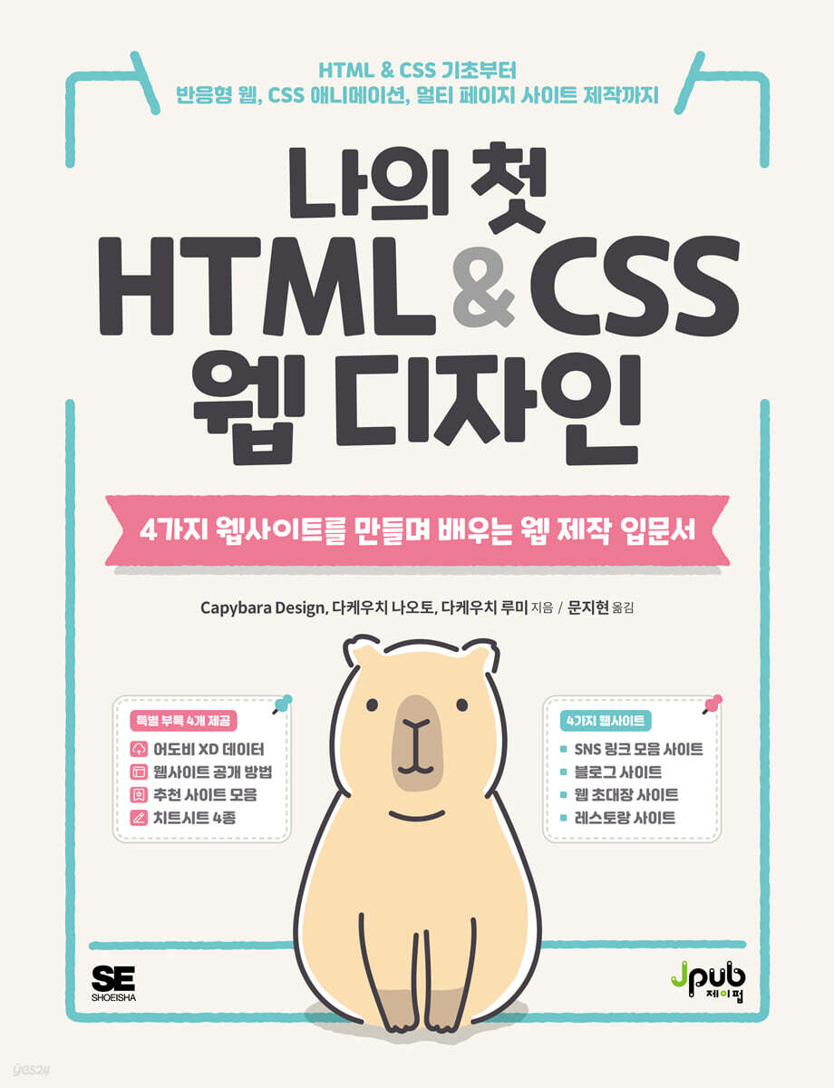
I've been waiting for a web design book this easy. Even if you know nothing about web development, you can learn the basics of HTML and CSS with just this one book. Cute cartoons and rich illustrations add to the fun of viewing. Learn the basics, as well as Flexbox layout, CSS grid layout, responsive web design, and CSS animation, by following the steps of creating a collection of social media links, a blog site, a web invitation site, and a restaurant site with a stunning web design. The appendix provides information on how to publish a website, a collection of recommended sites to help you build it, a cheat sheet, and sample design XD data for the site. |
- You can preview some of the book's contents.
Preview
index
Translator's Preface x
Beta Reader Review xii
Introduction xiii
How to Read This Book xv
Learning Points for Each Part xvi
Sites to be created in this book xvii
Download training data xxi
Download the four appendices xxii
Prologue comic xxvi
PART 1 Writing HTML
CHAPTER 1 Before You Begin
SECTION 1 Before You Begin Learning 2
SECTION 2 Understanding the Structure of a Website 3
SECTION 3 Installing Required Applications 4
SECTION 4 Learning Effectively 9
SECTION 5 Warming Up with a Super-Simple Example 12
CHAPTER 2 HTML Basics
SECTION 1 Why Markup Matters 14
SECTION 2: Summarizing the Love Letter Contents 16
SECTION 3: Taking Your First Steps with HTML 20
SECTION 4 Marking Up Your Love Letter 24
SECTION 5: Writing Readable Code 38
PART 2 Creating a SNS Link Collection Page
Sites to be created in this part → SNS link collection site 42
CHAPTER 3 CSS Basics
SECTION 1: Getting Started with CSS 44
SECTION 2 USING DEVELOPER TOOLS 46
SECTION 3 Connecting HTML and CSS 48
SECTION 4 Resetting the Browser's Default Styles 52
SECTION 5 Understanding the Box Model 54
CHAPTER 4 Writing CSS for SNS Link Collections
SECTION 1 Writing CSS 56
PART 3 Creating a Two-Column Page
Site to be created in this part → 2-column layout design 74
CHAPTER 5: Writing HTML for Your Blog Site
SECTION 1 Distinguishing Website Areas 76
SECTION 2 Marking Up Your Blog's Document Structure 78
SECTION 3 Understanding Outlines and Sections 83
SECTION 4 Learning Other New HTML Tags 86
CHAPTER 6 Writing CSS for Your Blog Site
SECTION 1 Understanding Flexbox Layout 90
SECTION 2 Writing CSS for the entire page and header 94
SECTION 3 Writing CSS for the Main Area and Sidebar 100
SECTION 4 Writing CSS for the Article Area and Footer 110
PART 4 Creating a 1-column page
Site to be created in this part → 1-column layout design 120
CHAPTER 7: Writing HTML for a Web Invitation Site
SECTION 1 Understanding HTML Structure 122
SECTION 2 Inserting Internal Links on Page 124
SECTION 3 Marking Up Forms 125
CHAPTER 8: Writing CSS for a Web Invitation Site
SECTION 1 CSS Writing Order 132
SECTION 2 How to Use Web Fonts 134
SECTION 3 Writing Font-Related CSS 136
SECTION 4 Writing Layout-Related CSS 137
SECTION 5 Writing Common Design CSS 139
SECTION 6 Writing Header CSS 140
SECTION 7 Writing CSS for the msg Section 149
SECTION 8 Writing CSS for the Date Section 153
SECTION 9 Writing CSS for the form section 157
SECTION 10 Writing CSS Footer and Parallax Effects 162
CHAPTER 9 Adding CSS Animations
SECTION 1 CSS Animation Basics 164
CHAPTER 10 Supporting Responsive Web Design
SECTION 1 Basics of Multi-Device Support 170
SECTION 2 Preparing for Responsive Web Design 172
SECTION 3 Placing Each Part on the Screen 177
SECTION 4 Adjusting the design of each part 180
SECTION 5 Creating Images for High-Resolution Displays 184
PART 5: CREATING A MULTI-PAGE SITE
Site to be created in this part → Multi-page site 188
CHAPTER 11: The Basics of Website Creation and Web Design
SECTION 1 Website Creation Process 190
SECTION 2 Web Design Overview 193
SECTION 3 Web Design Fundamentals 194
CHAPTER 12: Writing CSS for a Restaurant Site (Mobile)
SECTION 1: Points for Creating a Multi-Page Site 198
SECTION 2 Writing CSS for the TOP Page 200
SECTION 3 CONCEPT Writing Page CSS 208
SECTION 4 Writing CSS for the MENU Page 220
SECTION 5 Writing CSS for the INFO Page 224
CHAPTER 13: Writing CSS for a Restaurant Site (PC)
SECTION 1 Writing CSS for the TOP Page (PC) 234
SECTION 2: Writing CSS for the CONCEPT Page (PC) 240
SECTION 3 Writing CSS for the MENU Page (PC) 246
SECTION 4 Writing CSS for the INFO Page (PC) 248
CHAPTER 14 Learning How to Use Reference Sites
SECTION 1 Using Information on the Web 250
SECTION 2 Embedding Sample Code into Your Site 252
CHAPTER 15 Preparing Your Website for Public Release
SECTION 1 Setting a Favicon 254
SECTION 2 Setting Up OGP 256
Study Methods After Reading This Book 258
Beta Reader Review xii
Introduction xiii
How to Read This Book xv
Learning Points for Each Part xvi
Sites to be created in this book xvii
Download training data xxi
Download the four appendices xxii
Prologue comic xxvi
PART 1 Writing HTML
CHAPTER 1 Before You Begin
SECTION 1 Before You Begin Learning 2
SECTION 2 Understanding the Structure of a Website 3
SECTION 3 Installing Required Applications 4
SECTION 4 Learning Effectively 9
SECTION 5 Warming Up with a Super-Simple Example 12
CHAPTER 2 HTML Basics
SECTION 1 Why Markup Matters 14
SECTION 2: Summarizing the Love Letter Contents 16
SECTION 3: Taking Your First Steps with HTML 20
SECTION 4 Marking Up Your Love Letter 24
SECTION 5: Writing Readable Code 38
PART 2 Creating a SNS Link Collection Page
Sites to be created in this part → SNS link collection site 42
CHAPTER 3 CSS Basics
SECTION 1: Getting Started with CSS 44
SECTION 2 USING DEVELOPER TOOLS 46
SECTION 3 Connecting HTML and CSS 48
SECTION 4 Resetting the Browser's Default Styles 52
SECTION 5 Understanding the Box Model 54
CHAPTER 4 Writing CSS for SNS Link Collections
SECTION 1 Writing CSS 56
PART 3 Creating a Two-Column Page
Site to be created in this part → 2-column layout design 74
CHAPTER 5: Writing HTML for Your Blog Site
SECTION 1 Distinguishing Website Areas 76
SECTION 2 Marking Up Your Blog's Document Structure 78
SECTION 3 Understanding Outlines and Sections 83
SECTION 4 Learning Other New HTML Tags 86
CHAPTER 6 Writing CSS for Your Blog Site
SECTION 1 Understanding Flexbox Layout 90
SECTION 2 Writing CSS for the entire page and header 94
SECTION 3 Writing CSS for the Main Area and Sidebar 100
SECTION 4 Writing CSS for the Article Area and Footer 110
PART 4 Creating a 1-column page
Site to be created in this part → 1-column layout design 120
CHAPTER 7: Writing HTML for a Web Invitation Site
SECTION 1 Understanding HTML Structure 122
SECTION 2 Inserting Internal Links on Page 124
SECTION 3 Marking Up Forms 125
CHAPTER 8: Writing CSS for a Web Invitation Site
SECTION 1 CSS Writing Order 132
SECTION 2 How to Use Web Fonts 134
SECTION 3 Writing Font-Related CSS 136
SECTION 4 Writing Layout-Related CSS 137
SECTION 5 Writing Common Design CSS 139
SECTION 6 Writing Header CSS 140
SECTION 7 Writing CSS for the msg Section 149
SECTION 8 Writing CSS for the Date Section 153
SECTION 9 Writing CSS for the form section 157
SECTION 10 Writing CSS Footer and Parallax Effects 162
CHAPTER 9 Adding CSS Animations
SECTION 1 CSS Animation Basics 164
CHAPTER 10 Supporting Responsive Web Design
SECTION 1 Basics of Multi-Device Support 170
SECTION 2 Preparing for Responsive Web Design 172
SECTION 3 Placing Each Part on the Screen 177
SECTION 4 Adjusting the design of each part 180
SECTION 5 Creating Images for High-Resolution Displays 184
PART 5: CREATING A MULTI-PAGE SITE
Site to be created in this part → Multi-page site 188
CHAPTER 11: The Basics of Website Creation and Web Design
SECTION 1 Website Creation Process 190
SECTION 2 Web Design Overview 193
SECTION 3 Web Design Fundamentals 194
CHAPTER 12: Writing CSS for a Restaurant Site (Mobile)
SECTION 1: Points for Creating a Multi-Page Site 198
SECTION 2 Writing CSS for the TOP Page 200
SECTION 3 CONCEPT Writing Page CSS 208
SECTION 4 Writing CSS for the MENU Page 220
SECTION 5 Writing CSS for the INFO Page 224
CHAPTER 13: Writing CSS for a Restaurant Site (PC)
SECTION 1 Writing CSS for the TOP Page (PC) 234
SECTION 2: Writing CSS for the CONCEPT Page (PC) 240
SECTION 3 Writing CSS for the MENU Page (PC) 246
SECTION 4 Writing CSS for the INFO Page (PC) 248
CHAPTER 14 Learning How to Use Reference Sites
SECTION 1 Using Information on the Web 250
SECTION 2 Embedding Sample Code into Your Site 252
CHAPTER 15 Preparing Your Website for Public Release
SECTION 1 Setting a Favicon 254
SECTION 2 Setting Up OGP 256
Study Methods After Reading This Book 258
Detailed image
.jpg)
Into the book
CSS is an acronym for Cascading Style Sheets.
'Cascading' is a word that means a waterfall in the shape of steps, and it came to mean flowing (inheriting) from top to bottom like that shape.
/ As explained earlier, HTML is made up of a nested structure of elements (page 23).
Inheritance refers to the property whereby child elements inherit the CSS specified in the parent element.
/ Remember that not all CSS is inherited, but any CSS you specify on a parent element will by default be applied to its child elements.
--- p.44
HTML documents only contain semantic information and do not dictate visual effects such as changing the font size or line breaks.
/ The text marked as a title becomes larger and line-wrapped in the browser because the browser applies its own style to the title element.
/ These styles are called 'browser default styles'.
The official name is User Agent Stylesheet.
Because there is no unified specification for basic CSS, different styles may be applied depending on the browser.
--- p.52
The margin-bottom:40px; specified in STEP1 and the margin-top:80px; specified in STEP2 specify margins in the same area, but it does not result in a margin of 40px + 80px = 120px.
/ This is a phenomenon that occurs when specifying the vertical margins of adjacent elements, and is called margin collapsing.
/
When a margin offset occurs, the larger value of the margin applies.
--- p.151
Mobile First is a way of thinking that optimizes a site for the characteristics of mobile devices when designing it.
For example, consider the characteristics of small screen size, limited communication data, and intermittent viewing while on the move.
/ Please note that this is not simply a work order of 'starting with the mobile version'.
--- p.191
Design is often understood as something that makes the appearance beautiful, but the etymology of the word design (designare) contains the meaning of designing.
/ As seen in the production flow, there are several processes to create a design draft, and web design is established after all of these processes have been completed.
/ In other words, web design is not just about making the appearance beautiful, but it is also designed to suit the target users or the purpose of the site.
/ As the target or purpose changes, the definition of good design also changes.
--- p.193
There are times when the aspect ratio of images used on PCs with horizontal screens is different from that of smartphones with vertical screens.
You can prepare multiple images and swap them out depending on the device, but you can support various devices with a single image by using the object-fit property.
/ The object-fit property specifies how the image is displayed within the area occupied by the element.
objectposition
When used together, you can also specify which part of the image to display.
'Cascading' is a word that means a waterfall in the shape of steps, and it came to mean flowing (inheriting) from top to bottom like that shape.
/ As explained earlier, HTML is made up of a nested structure of elements (page 23).
Inheritance refers to the property whereby child elements inherit the CSS specified in the parent element.
/ Remember that not all CSS is inherited, but any CSS you specify on a parent element will by default be applied to its child elements.
--- p.44
HTML documents only contain semantic information and do not dictate visual effects such as changing the font size or line breaks.
/ The text marked as a title becomes larger and line-wrapped in the browser because the browser applies its own style to the title element.
/ These styles are called 'browser default styles'.
The official name is User Agent Stylesheet.
Because there is no unified specification for basic CSS, different styles may be applied depending on the browser.
--- p.52
The margin-bottom:40px; specified in STEP1 and the margin-top:80px; specified in STEP2 specify margins in the same area, but it does not result in a margin of 40px + 80px = 120px.
/ This is a phenomenon that occurs when specifying the vertical margins of adjacent elements, and is called margin collapsing.
/
When a margin offset occurs, the larger value of the margin applies.
--- p.151
Mobile First is a way of thinking that optimizes a site for the characteristics of mobile devices when designing it.
For example, consider the characteristics of small screen size, limited communication data, and intermittent viewing while on the move.
/ Please note that this is not simply a work order of 'starting with the mobile version'.
--- p.191
Design is often understood as something that makes the appearance beautiful, but the etymology of the word design (designare) contains the meaning of designing.
/ As seen in the production flow, there are several processes to create a design draft, and web design is established after all of these processes have been completed.
/ In other words, web design is not just about making the appearance beautiful, but it is also designed to suit the target users or the purpose of the site.
/ As the target or purpose changes, the definition of good design also changes.
--- p.193
There are times when the aspect ratio of images used on PCs with horizontal screens is different from that of smartphones with vertical screens.
You can prepare multiple images and swap them out depending on the device, but you can support various devices with a single image by using the object-fit property.
/ The object-fit property specifies how the image is displayed within the area occupied by the element.
objectposition
When used together, you can also specify which part of the image to display.
--- p.218
Publisher's Review
My first web design book: easy to learn, fun, and with stunning results.
Everyone has probably dreamed of having their own website at least once.
The editor of this book also created a website as soon as he learned to code.
I tried to make it somehow using a template, but I had no idea how to make it look better.
As I was editing this book, I realized that this was exactly the beginner's web design book I had been looking for.
When we open the book, the cute capybara character 'Capyjou' greets us.
Copyzoo creates a website collecting social media links to ask Copyko out on dates, and a business blog site to promote his carrot farm.
Copyzou, who decided to marry Kapiko, also creates a web invitation site and opens a restaurant, creating a restaurant site.
By following Copyzoo's life, you will be able to create four different types of amazing websites of your own.
The explanations of the 'human' web designers and markup designers that appear here and there are easy to understand and cover the core of web design.
We teach you step by step from the basics, so even those who start with no relevant knowledge will have no problem.
There are four appendices in total.
'How to Make Your Website Public' teaches you how to make your 'own website' public, and 'Recommended Sites' introduces 47 sites that the author (or translator) actually uses in his/her work.
'Sample Design XD Data' can be used for practice, such as image cropping or color extraction, and can be used as a reference when creating design files.
The most useful appendix, the 'cheat sheet', can be referenced not only while studying but also as you create and manage your website in the future.
Highly recommended for beginners who want to learn how to build a website from scratch, and for those who want to become a web designer.
Key Contents
- HTML & CSS Basics
-SNS link collection site
-Blog site
-Web invitation site
-CSS animation
-Responsive web design
-Restaurant site
-How to make your website public
Everyone has probably dreamed of having their own website at least once.
The editor of this book also created a website as soon as he learned to code.
I tried to make it somehow using a template, but I had no idea how to make it look better.
As I was editing this book, I realized that this was exactly the beginner's web design book I had been looking for.
When we open the book, the cute capybara character 'Capyjou' greets us.
Copyzoo creates a website collecting social media links to ask Copyko out on dates, and a business blog site to promote his carrot farm.
Copyzou, who decided to marry Kapiko, also creates a web invitation site and opens a restaurant, creating a restaurant site.
By following Copyzoo's life, you will be able to create four different types of amazing websites of your own.
The explanations of the 'human' web designers and markup designers that appear here and there are easy to understand and cover the core of web design.
We teach you step by step from the basics, so even those who start with no relevant knowledge will have no problem.
There are four appendices in total.
'How to Make Your Website Public' teaches you how to make your 'own website' public, and 'Recommended Sites' introduces 47 sites that the author (or translator) actually uses in his/her work.
'Sample Design XD Data' can be used for practice, such as image cropping or color extraction, and can be used as a reference when creating design files.
The most useful appendix, the 'cheat sheet', can be referenced not only while studying but also as you create and manage your website in the future.
Highly recommended for beginners who want to learn how to build a website from scratch, and for those who want to become a web designer.
Key Contents
- HTML & CSS Basics
-SNS link collection site
-Blog site
-Web invitation site
-CSS animation
-Responsive web design
-Restaurant site
-How to make your website public
GOODS SPECIFICS
- Date of issue: October 6, 2023
- Page count, weight, size: 288 pages | 188*245*20mm
- ISBN13: 9791192987149
- ISBN10: 1192987144
You may also like
카테고리
korean


korean

![GQ KOREA Mark (Monthly): December [2025]](http://librairie.coreenne.fr/cdn/shop/files/8ef265dbbfbf186523ed75ba7319009d.jpg?v=1765340328&width=3840)


