

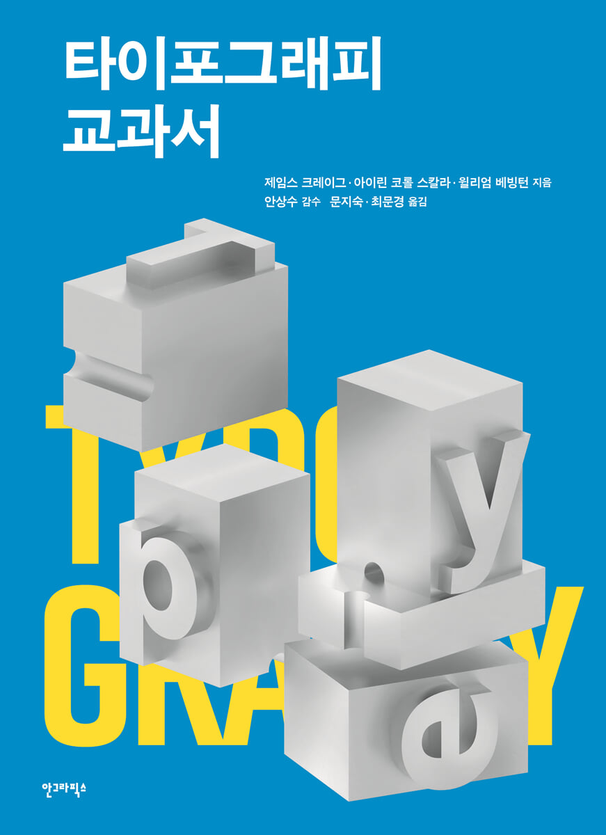
Typography textbook
 |
Description
Book Introduction
An essential guide to typography that you can learn step by step.
『Typography Textbook』 is a unique combination of textbook and specialized reference book.
This book provides a complete overview of the field of typography, from the origins of the alphabet to contemporary design.
The fundamentals of all type, the fundamentals inherent in all successful typographic design, are all discussed.
If a student had to choose just one book to guide them on their journey from the classroom to the design studio, this would be it.
Rather than overwhelming readers with the myriad of existing typefaces, we thoroughly reviewed five: Garamond, Baskerville, Bodoni, Century Expanded, and Helvetica.
Each typeface represents a significant stage in the evolution of typography and remains widely used today.
By understanding and working with these typefaces, you will learn how to use type creatively.
Whether it's to make type easier to read and more aesthetically pleasing, or simply to attract attention, the Typography Textbook has been revised to reflect the significant technological changes that have occurred in recent years.
At the same time, it retains the fundamental features that make this book indispensable for students and teachers.
This book will help you explore hundreds of solutions to design challenges and explore the vast world of typography information.
『Typography Textbook』 is a unique combination of textbook and specialized reference book.
This book provides a complete overview of the field of typography, from the origins of the alphabet to contemporary design.
The fundamentals of all type, the fundamentals inherent in all successful typographic design, are all discussed.
If a student had to choose just one book to guide them on their journey from the classroom to the design studio, this would be it.
Rather than overwhelming readers with the myriad of existing typefaces, we thoroughly reviewed five: Garamond, Baskerville, Bodoni, Century Expanded, and Helvetica.
Each typeface represents a significant stage in the evolution of typography and remains widely used today.
By understanding and working with these typefaces, you will learn how to use type creatively.
Whether it's to make type easier to read and more aesthetically pleasing, or simply to attract attention, the Typography Textbook has been revised to reflect the significant technological changes that have occurred in recent years.
At the same time, it retains the fundamental features that make this book indispensable for students and teachers.
This book will help you explore hundreds of solutions to design challenges and explore the vast world of typography information.
- You can preview some of the book's contents.
Preview
index
Before entering
1. Basics of Typography
Origin of the Alphabet
typographic terminology
Type scale
2 Five Classic Typefaces
category
characteristic
Garamond | Old Style
Baskerville | Transitional
Bodoni | Modern
Century Expanded | Egypt
Helvetica | Sans-serif
Letter Family
Practice | Identifying Typefaces
3 Designing with body text type
About the typeface
Letter spacing and word spacing
Line spacing adjustment | Reading
Line length
Type layout
Paragraph designation
Emphasize
grid
4 Designing with title fonts
Selecting a font for the title
Arranging fonts for titles
Visual Considerations
full stop
Title initials
Transforming fonts
5 colors
special color
Subtractive primary colors
Additive primary colors
6 Design Challenges
Solving design problems
Five classic typefaces
Type layout
typography style
Paragraph mark
expressive words
Visually enhanced quotes
Early fonts
grid
Brochure
Experimental Typography
threatening letter
logo
7 Traditional Typography Techniques
Design process
Creating a final draft
Preparing the manuscript
8 View font
classification
Old style
Transitional
Modern
Egyptian, slab serif
Sans serif
Script, Blackletter
Decorative, novelty
Ornaments, icons, and flourishes
9 Notes and Resources
full stop
Typesetting | Digital Design
Glossary
For those studying typography
Search
1. Basics of Typography
Origin of the Alphabet
typographic terminology
Type scale
2 Five Classic Typefaces
category
characteristic
Garamond | Old Style
Baskerville | Transitional
Bodoni | Modern
Century Expanded | Egypt
Helvetica | Sans-serif
Letter Family
Practice | Identifying Typefaces
3 Designing with body text type
About the typeface
Letter spacing and word spacing
Line spacing adjustment | Reading
Line length
Type layout
Paragraph designation
Emphasize
grid
4 Designing with title fonts
Selecting a font for the title
Arranging fonts for titles
Visual Considerations
full stop
Title initials
Transforming fonts
5 colors
special color
Subtractive primary colors
Additive primary colors
6 Design Challenges
Solving design problems
Five classic typefaces
Type layout
typography style
Paragraph mark
expressive words
Visually enhanced quotes
Early fonts
grid
Brochure
Experimental Typography
threatening letter
logo
7 Traditional Typography Techniques
Design process
Creating a final draft
Preparing the manuscript
8 View font
classification
Old style
Transitional
Modern
Egyptian, slab serif
Sans serif
Script, Blackletter
Decorative, novelty
Ornaments, icons, and flourishes
9 Notes and Resources
full stop
Typesetting | Digital Design
Glossary
For those studying typography
Search
Publisher's Review
An essential guide to typography that you can learn step by step.
『Typography Textbook』 is a unique combination of textbook and specialized reference book.
This book provides a complete overview of the field of typography, from the origins of the alphabet to contemporary design.
The fundamentals of all type, the fundamentals inherent in all successful typographic design, are all discussed.
If a student had to choose just one book to guide them on their journey from the classroom to the design studio, this would be it.
Rather than overwhelming readers with the myriad of existing typefaces, we thoroughly reviewed five: Garamond, Baskerville, Bodoni, Century Expanded, and Helvetica.
Each typeface represents a significant stage in the evolution of typography and remains widely used today.
By understanding and working with these typefaces, you will learn how to use type creatively.
Whether it's to make type easier to read and more aesthetically pleasing, or simply to attract attention, the Typography Textbook has been revised to reflect the significant technological changes that have occurred in recent years.
At the same time, it retains the fundamental features that make this book indispensable for students and teachers.
This book will help you explore hundreds of solutions to design challenges and explore the vast world of typography information.
Topic and Purpose
Typography is probably the most important subject that design students study in art school.
Although each field requires different specialized knowledge, what is commonly required is knowledge of typography.
In fact, there is very little that can be done without type, and in fact, most work is done solely with type.
Therefore, typography technology is still at the center of communication.
Students studying graphic design are the typographers of the future, and their success or failure depends on how well they are trained in working with type.
Typography of the Day
Typography is a living art form, with each generation of designers contributing something new and innovative.
It is an art that continues to grow and change, drawing both praise and criticism.
This fact shows that throughout history, various typographic changes and experiments have been subject to criticism.
Gutenberg's type was too cold and lacked the warmth of handwritten letters.
Over the centuries, typefaces designed afterward were criticized for causing eye fatigue and dizziness due to excessive contrast.
While other typefaces without serifs are considered difficult to read.
The debate continues.
There is no longer any need to 'passively hide' the type that has served as a quiet means of reinforcing the meaning of text.
Now, type can be expressed, enjoyed, experimented with, even shocking, and become pure art.
Some designers prefer a more traditional approach, while others welcome the freedom of change and experimentation.
And some people believe that the old and the new coexist.
Ultimately, they will lead us to a richer and more diverse world of typographic expression.
Anyway, there is no consensus on typography.
Students should be open-minded and accept all forms of typographic expression.
And from this point of view, they must develop their own aesthetic standards.
Hopefully, new visual designers will continue to redefine the boundaries and conventions of their art.
Some things are simply a rehash of past trends, but some innovations will stand the test of time.
And all of this will add to the rich history of typography.
5th edition
Although typography can be taught in a variety of ways, it is generally agreed that the most successful curriculum centers around a knowledge of metal type.
This revised edition of "Typography Textbook" combines a rich foundation with today's technology to provide readers with a deep and thorough understanding of typography.
We've redesigned the design and content to meet today's needs, using full color to add new information without missing any key points.
The original book, 『Designing with Type』, was first published in 1971.
The book sold over 250,000 copies and was adopted as a textbook in design schools around the world.
This suggests that despite the groundbreaking changes in the design industry, this book will continue to educate and inspire students.
We are confident that this fifth edition will be a valuable companion for a new generation of visual designers.
Korean edition published
The world has become smaller thanks to easier communication, frequent travel, and exchanges via the Internet.
So today, the significance of Western typography has grown more than ever.
Western typography can now be easily found anywhere in the world.
In this era, understanding the principles behind it has become increasingly important for graphic designers in other countries and speaking different languages. I believe that "Typography Textbook" is an essential textbook for Korean students and designers.
Because it effectively introduces Western typography by limiting the number of typefaces and focusing on design principles.
The book offers twelve projects designed to enhance your understanding of Western typography, and two companion websites complement the book's content.
We will also provide a variety of hands-on projects, from basic to the most advanced, to help you better understand and appreciate Western typography.
Once you've mastered the principles of typography, don't limit yourself to the basics; experiment as much as you can to achieve your creative and expressive goals.
By understanding the rules, you will also learn how to surpass them without compromising the principles of typography.
composition
1.
Typography Basics
Typography refers to the art of designing with type, and began around 1455 when Johannes Gutenberg perfected the technique of printing with single type.
Many of the technical terms we use today are derived from these early technologies.
This chapter introduces the origins of the alphabet and defines the terms and measures that form the basis of the typographic vocabulary.
As you become familiar with this knowledge, you will be able to convey your thoughts accurately and use type effectively.
2.
Five classic typefaces
So far we have covered typographic terminology and measurement systems for typefaces.
Now, we will look at five classic typefaces to see how they differ from each other.
Through this process, you will ultimately gain a greater awareness of type design and feel more confident when choosing your own type.
Each of the five typefaces represents a distinct period in the evolution of type design.
And they remain the most popular and widely used typefaces to this day.
3.
Designing with body text type
Designing with text involves choosing a typeface, deciding which words and phrases to emphasize, and determining how the type should be laid out on the page.
The final design will vary depending on the content of the manuscript being worked on, the intended readership, how well the designer understands typographic principles, and how much consideration is given to reading habits.
These play a crucial role in determining the final design, regardless of the design goal, whether it is to maximize reading comfort or to challenge commonly held typographic conventions.
4.
Designing with title font
The ability to use any typeface as a title typeface gave designers possibilities that didn't exist in previous generations.
Thanks to new technologies, typographic expressions have become diverse, ranging from the traditional to the very unusual.
In some cases, title text does not convey information, but simply serves the function of attracting attention or creating an interesting texture.
5.
color
Color is perhaps the most dramatic way to attract attention and elevate a design.
Even a single word attracts attention when printed in color.
Color also creates mood.
Some emotions are expressed in colors, such as fiery red, sky blue, and baby pink.
In addition to choosing a "good" color, you should consider font size, background color, background image, and whether the work will be printed with ink (spot or process color) or displayed in light.
Understanding the pros and cons of each will enable you to work effectively with color and type.
6.
Design assignment
A good design assignment stimulates students' creativity while broadening their typography knowledge.
These assignments can range from something as simple as highlighting a single word with typography to something as complex as designing an eight-page brochure.
All assignments can be completed intensively over the course of one semester.
At this time, the solution to the problem must be creative and practical.
If you take an overly experimental approach in the early stages, you may lose sight of the original goal of building a solid foundational understanding of typography.
For this reason, students should limit their use to the five type families introduced in this book.
7.
Traditional typography techniques
Aligning manuscripts, counting characters, sketching final drafts, and specifying type were once basic skills that every graphic designer mastered in the pre-computer era.
These were the traditional ways of assessing the ?jain.
Today's science and technology have certainly reduced the need for skills that were once indispensable.
Although rarely used today, creating a final draft is not only a quick lesson, but it is also an excellent way to become familiar with the construction and 'anatomy' of each typeface and how they are arranged on the page.
8.
View the text
There are hundreds of typefaces in the world, and many of them are of questionable value.
To help you find the best typefaces, we've added familiar typeface views: Old Style, Transitional, Modern, Egyptian/Slab Serif, and Sans Serif.
We also added additional typefaces in Decorative/Novelty, Script, Blackletter, and Ornamental/Iconic/Florish.
9.
Notes and Resources
So far, we've focused on understanding the basics of typography and how to design with type.
The historical data and references will also be of interest to serious graphic designers.
Here's a brief history of typesetting methods over the centuries, along with a glossary of graphic design terminology.
And now, for graphic designers who are now typographers themselves, I've added some good punctuation rules.
『Typography Textbook』 is a unique combination of textbook and specialized reference book.
This book provides a complete overview of the field of typography, from the origins of the alphabet to contemporary design.
The fundamentals of all type, the fundamentals inherent in all successful typographic design, are all discussed.
If a student had to choose just one book to guide them on their journey from the classroom to the design studio, this would be it.
Rather than overwhelming readers with the myriad of existing typefaces, we thoroughly reviewed five: Garamond, Baskerville, Bodoni, Century Expanded, and Helvetica.
Each typeface represents a significant stage in the evolution of typography and remains widely used today.
By understanding and working with these typefaces, you will learn how to use type creatively.
Whether it's to make type easier to read and more aesthetically pleasing, or simply to attract attention, the Typography Textbook has been revised to reflect the significant technological changes that have occurred in recent years.
At the same time, it retains the fundamental features that make this book indispensable for students and teachers.
This book will help you explore hundreds of solutions to design challenges and explore the vast world of typography information.
Topic and Purpose
Typography is probably the most important subject that design students study in art school.
Although each field requires different specialized knowledge, what is commonly required is knowledge of typography.
In fact, there is very little that can be done without type, and in fact, most work is done solely with type.
Therefore, typography technology is still at the center of communication.
Students studying graphic design are the typographers of the future, and their success or failure depends on how well they are trained in working with type.
Typography of the Day
Typography is a living art form, with each generation of designers contributing something new and innovative.
It is an art that continues to grow and change, drawing both praise and criticism.
This fact shows that throughout history, various typographic changes and experiments have been subject to criticism.
Gutenberg's type was too cold and lacked the warmth of handwritten letters.
Over the centuries, typefaces designed afterward were criticized for causing eye fatigue and dizziness due to excessive contrast.
While other typefaces without serifs are considered difficult to read.
The debate continues.
There is no longer any need to 'passively hide' the type that has served as a quiet means of reinforcing the meaning of text.
Now, type can be expressed, enjoyed, experimented with, even shocking, and become pure art.
Some designers prefer a more traditional approach, while others welcome the freedom of change and experimentation.
And some people believe that the old and the new coexist.
Ultimately, they will lead us to a richer and more diverse world of typographic expression.
Anyway, there is no consensus on typography.
Students should be open-minded and accept all forms of typographic expression.
And from this point of view, they must develop their own aesthetic standards.
Hopefully, new visual designers will continue to redefine the boundaries and conventions of their art.
Some things are simply a rehash of past trends, but some innovations will stand the test of time.
And all of this will add to the rich history of typography.
5th edition
Although typography can be taught in a variety of ways, it is generally agreed that the most successful curriculum centers around a knowledge of metal type.
This revised edition of "Typography Textbook" combines a rich foundation with today's technology to provide readers with a deep and thorough understanding of typography.
We've redesigned the design and content to meet today's needs, using full color to add new information without missing any key points.
The original book, 『Designing with Type』, was first published in 1971.
The book sold over 250,000 copies and was adopted as a textbook in design schools around the world.
This suggests that despite the groundbreaking changes in the design industry, this book will continue to educate and inspire students.
We are confident that this fifth edition will be a valuable companion for a new generation of visual designers.
Korean edition published
The world has become smaller thanks to easier communication, frequent travel, and exchanges via the Internet.
So today, the significance of Western typography has grown more than ever.
Western typography can now be easily found anywhere in the world.
In this era, understanding the principles behind it has become increasingly important for graphic designers in other countries and speaking different languages. I believe that "Typography Textbook" is an essential textbook for Korean students and designers.
Because it effectively introduces Western typography by limiting the number of typefaces and focusing on design principles.
The book offers twelve projects designed to enhance your understanding of Western typography, and two companion websites complement the book's content.
We will also provide a variety of hands-on projects, from basic to the most advanced, to help you better understand and appreciate Western typography.
Once you've mastered the principles of typography, don't limit yourself to the basics; experiment as much as you can to achieve your creative and expressive goals.
By understanding the rules, you will also learn how to surpass them without compromising the principles of typography.
composition
1.
Typography Basics
Typography refers to the art of designing with type, and began around 1455 when Johannes Gutenberg perfected the technique of printing with single type.
Many of the technical terms we use today are derived from these early technologies.
This chapter introduces the origins of the alphabet and defines the terms and measures that form the basis of the typographic vocabulary.
As you become familiar with this knowledge, you will be able to convey your thoughts accurately and use type effectively.
2.
Five classic typefaces
So far we have covered typographic terminology and measurement systems for typefaces.
Now, we will look at five classic typefaces to see how they differ from each other.
Through this process, you will ultimately gain a greater awareness of type design and feel more confident when choosing your own type.
Each of the five typefaces represents a distinct period in the evolution of type design.
And they remain the most popular and widely used typefaces to this day.
3.
Designing with body text type
Designing with text involves choosing a typeface, deciding which words and phrases to emphasize, and determining how the type should be laid out on the page.
The final design will vary depending on the content of the manuscript being worked on, the intended readership, how well the designer understands typographic principles, and how much consideration is given to reading habits.
These play a crucial role in determining the final design, regardless of the design goal, whether it is to maximize reading comfort or to challenge commonly held typographic conventions.
4.
Designing with title font
The ability to use any typeface as a title typeface gave designers possibilities that didn't exist in previous generations.
Thanks to new technologies, typographic expressions have become diverse, ranging from the traditional to the very unusual.
In some cases, title text does not convey information, but simply serves the function of attracting attention or creating an interesting texture.
5.
color
Color is perhaps the most dramatic way to attract attention and elevate a design.
Even a single word attracts attention when printed in color.
Color also creates mood.
Some emotions are expressed in colors, such as fiery red, sky blue, and baby pink.
In addition to choosing a "good" color, you should consider font size, background color, background image, and whether the work will be printed with ink (spot or process color) or displayed in light.
Understanding the pros and cons of each will enable you to work effectively with color and type.
6.
Design assignment
A good design assignment stimulates students' creativity while broadening their typography knowledge.
These assignments can range from something as simple as highlighting a single word with typography to something as complex as designing an eight-page brochure.
All assignments can be completed intensively over the course of one semester.
At this time, the solution to the problem must be creative and practical.
If you take an overly experimental approach in the early stages, you may lose sight of the original goal of building a solid foundational understanding of typography.
For this reason, students should limit their use to the five type families introduced in this book.
7.
Traditional typography techniques
Aligning manuscripts, counting characters, sketching final drafts, and specifying type were once basic skills that every graphic designer mastered in the pre-computer era.
These were the traditional ways of assessing the ?jain.
Today's science and technology have certainly reduced the need for skills that were once indispensable.
Although rarely used today, creating a final draft is not only a quick lesson, but it is also an excellent way to become familiar with the construction and 'anatomy' of each typeface and how they are arranged on the page.
8.
View the text
There are hundreds of typefaces in the world, and many of them are of questionable value.
To help you find the best typefaces, we've added familiar typeface views: Old Style, Transitional, Modern, Egyptian/Slab Serif, and Sans Serif.
We also added additional typefaces in Decorative/Novelty, Script, Blackletter, and Ornamental/Iconic/Florish.
9.
Notes and Resources
So far, we've focused on understanding the basics of typography and how to design with type.
The historical data and references will also be of interest to serious graphic designers.
Here's a brief history of typesetting methods over the centuries, along with a glossary of graphic design terminology.
And now, for graphic designers who are now typographers themselves, I've added some good punctuation rules.
GOODS SPECIFICS
- Date of issue: August 18, 2010
- Page count, weight, size: 208 pages | 518g | 178*245*20mm
- ISBN13: 9788970594583
- ISBN10: 8970594582
You may also like
카테고리
korean


korean

![GQ KOREA Mark (Monthly): December [2025]](http://librairie.coreenne.fr/cdn/shop/files/8ef265dbbfbf186523ed75ba7319009d.jpg?v=1765340328&width=3840)


