

Eric Spiekerman's Typography Essay
 |
Description
Book Introduction
"Typography Essay" provides students of typography and those who love type with an easy and clear understanding of type and design.
Eric Spiekerman, type designer, typography writer, and information planner, has completely updated this edition for web and mobile typography.
We've added a number of fresh visuals that demonstrate effective communication through type, and we've carefully selected and presented new typefaces.
Eric Spiekerman, type designer, typography writer, and information planner, has completely updated this edition for web and mobile typography.
We've added a number of fresh visuals that demonstrate effective communication through type, and we've carefully selected and presented new typefaces.
- You can preview some of the book's contents.
Preview
index
1. Type is everywhere.
The typeface is real.
It is an important part of our lives.
Only by realizing this simple fact can we begin to understand more effective ways of communicating.
2 What is a typeface?
Understanding the present of print, between its past and future, is inextricably linked to the question of who we are and how we communicate.
Letters are living things that are one with the atmosphere of society and the trends of the times.
3. A closer look at the typeface
Developing an eye for type begins with familiar elements on the page.
The first step to understanding type is to examine everything from the basic form of type to the most elaborate details.
4 Choosing a font
Choosing the right typeface for a specific purpose isn't as difficult as organizing your closet.
It's easy to choose a font that suits your content.
Express your individuality with 5 letters
Understanding the tone and feel of the text is essential to deciding which typeface to use and how to arrange it on paper.
6 Various types of letters
Once you understand the basic characteristics of a font, you can easily identify different fonts.
It's easiest to understand if you think of it in comparison to how people distinguish between themselves.
7 Handling Type
Whether a typeface is legible and readable depends on several basic principles.
The spacing between letters and words is especially important.
Choosing the right typeface for your text means handling these spaces accurately.
8. Placing the letters
Considering where and for what purpose a type will be used determines its effectiveness.
These simple layout principles create practical page layouts.
9 Type on the screen
Just as there is no younger brother like an older brother, the letters on the screen are not as good as the printed letters.
Although there are technical limitations, there should never be an inappropriate choice of font for any project that appears on screen.
10 There is no such thing as bad typography.
Letters are the basic element of communication.
As the means of communication change, the typeface also evolves in a unique and vibrant way.
11. Finishing
References, Index, Translator's Notes, Font Index, Copyright.
The typeface is real.
It is an important part of our lives.
Only by realizing this simple fact can we begin to understand more effective ways of communicating.
2 What is a typeface?
Understanding the present of print, between its past and future, is inextricably linked to the question of who we are and how we communicate.
Letters are living things that are one with the atmosphere of society and the trends of the times.
3. A closer look at the typeface
Developing an eye for type begins with familiar elements on the page.
The first step to understanding type is to examine everything from the basic form of type to the most elaborate details.
4 Choosing a font
Choosing the right typeface for a specific purpose isn't as difficult as organizing your closet.
It's easy to choose a font that suits your content.
Express your individuality with 5 letters
Understanding the tone and feel of the text is essential to deciding which typeface to use and how to arrange it on paper.
6 Various types of letters
Once you understand the basic characteristics of a font, you can easily identify different fonts.
It's easiest to understand if you think of it in comparison to how people distinguish between themselves.
7 Handling Type
Whether a typeface is legible and readable depends on several basic principles.
The spacing between letters and words is especially important.
Choosing the right typeface for your text means handling these spaces accurately.
8. Placing the letters
Considering where and for what purpose a type will be used determines its effectiveness.
These simple layout principles create practical page layouts.
9 Type on the screen
Just as there is no younger brother like an older brother, the letters on the screen are not as good as the printed letters.
Although there are technical limitations, there should never be an inappropriate choice of font for any project that appears on screen.
10 There is no such thing as bad typography.
Letters are the basic element of communication.
As the means of communication change, the typeface also evolves in a unique and vibrant way.
11. Finishing
References, Index, Translator's Notes, Font Index, Copyright.
Into the book
Page 121, “Various Typefaces”
A bold way to add contrast and adventure to your typography is to bring in typefaces from other letter families.
It is generally okay to mix different typefaces created by the same designer.
Joanna and Gill Sans by Eric Gill work well together, and most of Adrian Frutiger's typefaces also work well together.
Or, it is not bad to mix and match fonts created at the same time, and there are also cases where it is okay even if they are created at different times.
There are as many ways to mix fonts as there are fonts.
Page 139, “Handling Type”
Tracking refers to adjusting the spacing between letters in a lump (in computer typesetting, tracking means increasing or decreasing the spacing between letters, but in the era of metal type, it only meant widening the spacing between letters, as it could not be made narrower).
That is, add the same amount of space between all letters in the text.
It is at this point that Frederic Gaudí's declaration reminds us of our sense of crisis.
As the spacing between letters increases, the difficulty of understanding each word increases, and thus, it becomes difficult to understand the thoughts contained in the text.
Page 195, from “There Are No Bad Typefaces”
In addition to the typefaces that are familiar and effective to us, there are also typefaces that cannot be classified by simple criteria such as practicality or purpose.
These are the things that were born when a new inspiration suddenly came to the type designer one day.
Such individual artistic expression may struggle to appeal to a broad and diverse audience.
But every now and then a proper singer comes along and turns a simple song into a huge hit without much effort.
Even today's type specimen books contain hidden treasures of typography just waiting to be discovered.
In the right hands, technical limitations can be transformed into a blessing of simplicity, and an awkward alphabet can be transformed into the typographic hero of the day.
There is no such thing as bad typography.
A bold way to add contrast and adventure to your typography is to bring in typefaces from other letter families.
It is generally okay to mix different typefaces created by the same designer.
Joanna and Gill Sans by Eric Gill work well together, and most of Adrian Frutiger's typefaces also work well together.
Or, it is not bad to mix and match fonts created at the same time, and there are also cases where it is okay even if they are created at different times.
There are as many ways to mix fonts as there are fonts.
Page 139, “Handling Type”
Tracking refers to adjusting the spacing between letters in a lump (in computer typesetting, tracking means increasing or decreasing the spacing between letters, but in the era of metal type, it only meant widening the spacing between letters, as it could not be made narrower).
That is, add the same amount of space between all letters in the text.
It is at this point that Frederic Gaudí's declaration reminds us of our sense of crisis.
As the spacing between letters increases, the difficulty of understanding each word increases, and thus, it becomes difficult to understand the thoughts contained in the text.
Page 195, from “There Are No Bad Typefaces”
In addition to the typefaces that are familiar and effective to us, there are also typefaces that cannot be classified by simple criteria such as practicality or purpose.
These are the things that were born when a new inspiration suddenly came to the type designer one day.
Such individual artistic expression may struggle to appeal to a broad and diverse audience.
But every now and then a proper singer comes along and turns a simple song into a huge hit without much effort.
Even today's type specimen books contain hidden treasures of typography just waiting to be discovered.
In the right hands, technical limitations can be transformed into a blessing of simplicity, and an awkward alphabet can be transformed into the typographic hero of the day.
There is no such thing as bad typography.
---From the text
Publisher's Review
The Typography Guide You Need to Steal Sheep
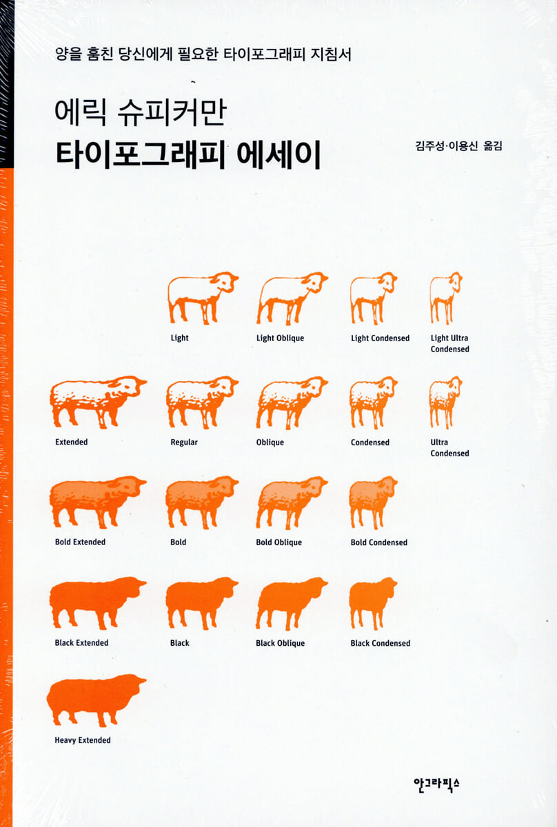
“Increasing the spacing between lowercase letters is like stealing sheep.”
In 1936, type designer Frederic Goudy attended an award ceremony for type design and immediately after receiving his award, he glanced at it and declared, “Increasing the spacing between black letter is like stealing sheep.”
The 'black letter' mentioned in this anecdote was later changed to 'lowercase', and the saying 'increasing the space between lowercase letters is no different from stealing sheep' was passed down.
It is not clear how 'black letter' became 'lowercase', but Eric Spiekerman expressed his hope that by the end of this book, 『Typography Essays』, the meaning and fun contained in Frederic Gaudí's seemingly enigmatic sayings such as 'increase the space between lowercase letters' and 'steal sheep' will be conveyed to the readers, and that they will no longer 'steal sheep'.
In other words, this book is a book that explains the language of typography, which is considered secretive and difficult, in an easy-to-understand way for those who want to communicate more effectively using letters.
Typefaces are a visual language that connects writers and readers, and there are thousands of fonts available to us.
We know from experience that when we express our message in the right language, others understand it much more easily.
This book shows that typography is not an art form reserved for a select few, but rather a powerful tool for anyone with a story to tell, whether on paper or on screen.
It gives you the opportunity to understand why there are so many fonts in the world, how to use them, and why more fonts are needed every day.
You will be able to think again about the letters that exist everywhere and that you may not have noticed before.
This is the one book that will accompany you on your essential journey, with rich visual aids, through examining various types of letters, selecting them appropriately, and handling them properly to express something.
As you read along, you'll discover the history, case studies, and perspectives on type and typography. For those more adventurous and interested in learning more about type, we recommend carefully reading the footnotes on the right side of the text.
These articles are a compilation of in-depth information.
You may also find the author's carefully curated list of reference books, websites, and fonts useful.
“Increasing the spacing between lowercase letters is like stealing sheep.”
In 1936, type designer Frederic Goudy attended an award ceremony for type design and immediately after receiving his award, he glanced at it and declared, “Increasing the spacing between black letter is like stealing sheep.”
The 'black letter' mentioned in this anecdote was later changed to 'lowercase', and the saying 'increasing the space between lowercase letters is no different from stealing sheep' was passed down.
It is not clear how 'black letter' became 'lowercase', but Eric Spiekerman expressed his hope that by the end of this book, 『Typography Essays』, the meaning and fun contained in Frederic Gaudí's seemingly enigmatic sayings such as 'increase the space between lowercase letters' and 'steal sheep' will be conveyed to the readers, and that they will no longer 'steal sheep'.
In other words, this book is a book that explains the language of typography, which is considered secretive and difficult, in an easy-to-understand way for those who want to communicate more effectively using letters.
Typefaces are a visual language that connects writers and readers, and there are thousands of fonts available to us.
We know from experience that when we express our message in the right language, others understand it much more easily.
This book shows that typography is not an art form reserved for a select few, but rather a powerful tool for anyone with a story to tell, whether on paper or on screen.
It gives you the opportunity to understand why there are so many fonts in the world, how to use them, and why more fonts are needed every day.
You will be able to think again about the letters that exist everywhere and that you may not have noticed before.
This is the one book that will accompany you on your essential journey, with rich visual aids, through examining various types of letters, selecting them appropriately, and handling them properly to express something.
As you read along, you'll discover the history, case studies, and perspectives on type and typography. For those more adventurous and interested in learning more about type, we recommend carefully reading the footnotes on the right side of the text.
These articles are a compilation of in-depth information.
You may also find the author's carefully curated list of reference books, websites, and fonts useful.
GOODS SPECIFICS
- Date of publication: October 10, 2014
- Page count, weight, size: 209 pages | 495g | 153*224*20mm
- ISBN13: 9788970597577
- ISBN10: 8970597573
You may also like
카테고리
korean


korean

![GQ KOREA Mark (Monthly): December [2025]](http://librairie.coreenne.fr/cdn/shop/files/8ef265dbbfbf186523ed75ba7319009d.jpg?v=1765340328&width=3840)


