

Typographic Design
 |
Description
Book Introduction
A Basic Typography Guide
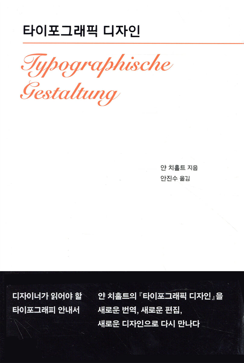
This book, "Typographic Design," is a theoretical book written by Jan Tschichold in 1935 after he moved from Germany to Switzerland due to Nazi oppression, following the publication of "New Typography" in 1928.
The somewhat radical and dogmatic stance of 『New Typography』 sparked several significant debates surrounding new typography.
In this book, Jan Tschichold further developed his ideas on custom typesetting and decorative typography, which he had previously argued for in New Typography.
In the process, he raised questions and answered them himself from a modern perspective, from microtypography to macrotypography, including the operation of letters, words, lines, paragraphs, paper specifications, tables, lines, colors, and everything surrounding typography.
Moreover, the new book ideas he advocated at the time are still valid for those who make books today, as well as for those who read books.
This book, "Typographic Design," is a theoretical book written by Jan Tschichold in 1935 after he moved from Germany to Switzerland due to Nazi oppression, following the publication of "New Typography" in 1928.
The somewhat radical and dogmatic stance of 『New Typography』 sparked several significant debates surrounding new typography.
In this book, Jan Tschichold further developed his ideas on custom typesetting and decorative typography, which he had previously argued for in New Typography.
In the process, he raised questions and answered them himself from a modern perspective, from microtypography to macrotypography, including the operation of letters, words, lines, paragraphs, paper specifications, tables, lines, colors, and everything surrounding typography.
Moreover, the new book ideas he advocated at the time are still valid for those who make books today, as well as for those who read books.
- You can preview some of the book's contents.
Preview
index
Recommendation
preface
Looking back through history
Decorative Typography Criticism
The true meaning and purpose of new or functional typography
type
Hand and machine typesetting
word
Lines of text
Emphasis in a line
Space between lines, shape lines, create paragraphs
Indenting the first line and ending the line
Font size ratio, headings, and typeface mixing
standard
Routine small print jobs
Planar space configuration
graph
line
color
paper
poster
Variety of forms
Concrete art
typography, color, drawing
new book
Translator's Note
preface
Looking back through history
Decorative Typography Criticism
The true meaning and purpose of new or functional typography
type
Hand and machine typesetting
word
Lines of text
Emphasis in a line
Space between lines, shape lines, create paragraphs
Indenting the first line and ending the line
Font size ratio, headings, and typeface mixing
standard
Routine small print jobs
Planar space configuration
graph
line
color
paper
poster
Variety of forms
Concrete art
typography, color, drawing
new book
Translator's Note
Detailed image

Into the book
Page 12, “Introduction”
The techniques and methods that cover all aspects of typography are undergoing fundamental changes, driven by the demands of this era.
The new rules I'm introducing were born from the recognition that, along with times of change, new and useful rules must also be created.
As these rules become more widespread, accurate and reasonable explanations will become essential.
Page 61, “Line spacing, line shape adjustment, paragraph creation”
Just as the space between words should be wider than between letters to make text readable, the space between lines should also be wider than the space between words, or at least no narrower.
In other words, a good piece of writing is one that has some space between lines.
Page 90, “Composition of Planar Space”
All typography is design on a flat surface.
Placing lines and paragraphs correctly is just as important as creating a clear, coherent contrast, and the two are closely related.
Today's typefaces are no longer decorated with ornamentation, but are used in their natural form.
So, we must pay attention to the role of type as a part of a plane, beyond the role of type in creating words or lines of text.
Jan Tschichold was not scolding the reckless mistake of not spacing letters or lines properly.
His sword is aimed at the poor attitude of typographers who do not respect readers and simply treat them as such, and at the typography culture that has become insensitive to this.
Perhaps the reason his writing remains an uncomfortable thorn in the hearts of typographers, then and now, is because it constantly spurred us to reaffirm the principle of respecting the reader, and perhaps because the shred of conscience we fortunately have left allows us to accept his writing with both cherishment and pain.
I hope that through Jan Tschichold's writings, we will be able to reawaken this spirit, which we have forgotten, blinded by the dazzling mirages of today, and which should be held deep within the heart of every typographer like a silver dagger.
The techniques and methods that cover all aspects of typography are undergoing fundamental changes, driven by the demands of this era.
The new rules I'm introducing were born from the recognition that, along with times of change, new and useful rules must also be created.
As these rules become more widespread, accurate and reasonable explanations will become essential.
Page 61, “Line spacing, line shape adjustment, paragraph creation”
Just as the space between words should be wider than between letters to make text readable, the space between lines should also be wider than the space between words, or at least no narrower.
In other words, a good piece of writing is one that has some space between lines.
Page 90, “Composition of Planar Space”
All typography is design on a flat surface.
Placing lines and paragraphs correctly is just as important as creating a clear, coherent contrast, and the two are closely related.
Today's typefaces are no longer decorated with ornamentation, but are used in their natural form.
So, we must pay attention to the role of type as a part of a plane, beyond the role of type in creating words or lines of text.
Jan Tschichold was not scolding the reckless mistake of not spacing letters or lines properly.
His sword is aimed at the poor attitude of typographers who do not respect readers and simply treat them as such, and at the typography culture that has become insensitive to this.
Perhaps the reason his writing remains an uncomfortable thorn in the hearts of typographers, then and now, is because it constantly spurred us to reaffirm the principle of respecting the reader, and perhaps because the shred of conscience we fortunately have left allows us to accept his writing with both cherishment and pain.
I hope that through Jan Tschichold's writings, we will be able to reawaken this spirit, which we have forgotten, blinded by the dazzling mirages of today, and which should be held deep within the heart of every typographer like a silver dagger.
---Page 150, from the Translator's Note
Publisher's Review
Faithful to the German original
After the first and revised editions of 『Typographic Design』 were published in Korea, several books related to Jan Tschichold were published, and many of them achieved notable results.
Therefore, to help readers understand the book in the early 1990s, this book has omitted the appendices, such as the commentary by Japanese graphic designer Hiromu Hara and the Jan Tschichold chronology, that were included in the first and revised editions, and has attempted to remain faithful to the original German text in terms of content.
Translator's Note and Format
However, presenting the original German text in its entirety without any device would likely have felt somewhat unfriendly to readers unfamiliar with the printing industry and culture at the time.
The device to solve this was the translator's note, and naturally, the content and number increased.
The translator decided that reading the text together on one page would be effective for several reasons, including the reading flow.
In order to effectively accommodate the main text and the translator's notes on one page, the current format was chosen, and the proportions followed those suggested by Jan Tschichold.
Jan Tschichold Jan Tschichold
In German-speaking countries, Jan Tschichold[tlt] is pronounced closer to 'Jan Tschichold'.
Nevertheless, in this book, it is written as ‘Jan Tschichold’ according to the foreign language notation rules established by the National Institute of the Korean Language.
Not only graphic designers
There was an unfortunate incident where the first and revised editions of this book were adopted as teaching materials in some schools even after they were out of print.
It is possible that copies of this book were circulated in those schools.
The fact that this book, published over 20 years ago, is still being read constantly in schools makes me realize its status as a typography classic.
Meanwhile, the worker, despite majoring in literature, counts the first edition of this book among the books he read outside of literary works during his student days.
Although it is a thoroughly practical typography guide, it offers another dimension of imagination beyond literature.
This book is recommended not only to graphic designers, but also to writers, planners, editors, and others who have a keen eye for words and letters, who cherish and despise them as they move between paragraphs and sentences.
After the first and revised editions of 『Typographic Design』 were published in Korea, several books related to Jan Tschichold were published, and many of them achieved notable results.
Therefore, to help readers understand the book in the early 1990s, this book has omitted the appendices, such as the commentary by Japanese graphic designer Hiromu Hara and the Jan Tschichold chronology, that were included in the first and revised editions, and has attempted to remain faithful to the original German text in terms of content.
Translator's Note and Format
However, presenting the original German text in its entirety without any device would likely have felt somewhat unfriendly to readers unfamiliar with the printing industry and culture at the time.
The device to solve this was the translator's note, and naturally, the content and number increased.
The translator decided that reading the text together on one page would be effective for several reasons, including the reading flow.
In order to effectively accommodate the main text and the translator's notes on one page, the current format was chosen, and the proportions followed those suggested by Jan Tschichold.
Jan Tschichold Jan Tschichold
In German-speaking countries, Jan Tschichold[tlt] is pronounced closer to 'Jan Tschichold'.
Nevertheless, in this book, it is written as ‘Jan Tschichold’ according to the foreign language notation rules established by the National Institute of the Korean Language.
Not only graphic designers
There was an unfortunate incident where the first and revised editions of this book were adopted as teaching materials in some schools even after they were out of print.
It is possible that copies of this book were circulated in those schools.
The fact that this book, published over 20 years ago, is still being read constantly in schools makes me realize its status as a typography classic.
Meanwhile, the worker, despite majoring in literature, counts the first edition of this book among the books he read outside of literary works during his student days.
Although it is a thoroughly practical typography guide, it offers another dimension of imagination beyond literature.
This book is recommended not only to graphic designers, but also to writers, planners, editors, and others who have a keen eye for words and letters, who cherish and despise them as they move between paragraphs and sentences.
GOODS SPECIFICS
- Date of publication: February 7, 2014
- Format: Hardcover book binding method guide
- Page count, weight, size: 152 pages | 406g | 163*243*20mm
- ISBN13: 9788970597232
- ISBN10: 8970597239
You may also like
카테고리
korean


korean

![GQ KOREA Mark (Monthly): December [2025]](http://librairie.coreenne.fr/cdn/shop/files/8ef265dbbfbf186523ed75ba7319009d.jpg?v=1765340328&width=3840)


