

Book Design 101
 |
Description
Book Introduction
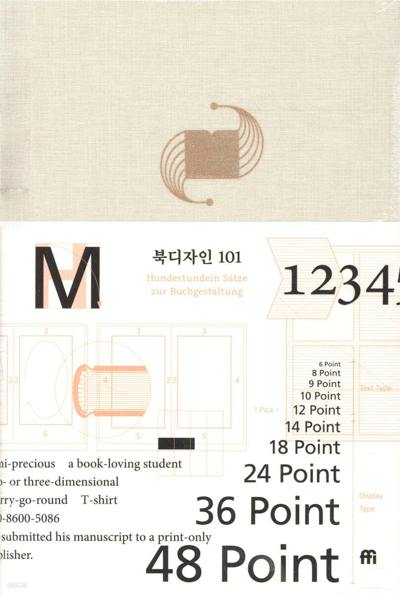
"Are there rules for book design? If so, where can we learn them?" Published in 1976, "Book Design 101" provides easy answers to these questions, a question that anyone working in or interested in book design has likely pondered at least once.
Albert Kapfer, a German book designer and typeface designer, divides the elements necessary for creating a book into 40, distills the essence into 101 paragraphs, and conveys his experience and knowledge in book design in simple, short sentences.
This book contains practical and specific content compared to other books on typography and book design.
Albert Kapfer, a German book designer and typeface designer, divides the elements necessary for creating a book into 40, distills the essence into 101 paragraphs, and conveys his experience and knowledge in book design in simple, short sentences.
This book contains practical and specific content compared to other books on typography and book design.
index
Author's Preface
Book Design 101
Translator's Note
References
Book Design 101
Translator's Note
References
Into the book
Basic rules regarding book design are valid only when they are reasonable and provable.
Therefore, the following content of this book is only applicable to book production outside the field of art, and it is hoped that this content will continue to be supplemented and widely disseminated through the experiences of others.
Knowledge and adherence to these basic rules will reduce the negligence and carelessness that can occur in the book production process, and will also reduce inefficient and useless attempts to correct what has been self-evident for centuries.
But most importantly, these rules should not become a shackle to new work.
Moreover, the sincere effort to find new and effective design forms deserves full support, even if it overlooks the material presented in this book.
---From the "Preface"
The format and size of a book are determined by considering the purpose of the text and the user's convenience.
The book should be as light as possible and not unnecessarily large.
For books that are meant to be read continuously, such as novels or humanities books, the format is determined by considering the optimal line length.
The optimal line length is 18 to 22 cicero (a unit of length in typography used in Europe, including France) when writing the body text in 9pt or 10pt font sizes, which are commonly used in general books.
1 sheet is about 4.512 mm long, and if you calculate the format considering this line length, the width of one page of the book will be 11 to 12 cm.
To find a beautiful width and height ratio suitable for a book, it is recommended to use the golden ratio (1:1.618) such as 11×18cm, 11×19cm, 12×20cm, etc.
---From "Pan-hyung"
For long periods of continuous reading, beige or ivory paper is easier on the eyes than bright white paper.
Even when using medium-quality paper with pulp, a color that is not too bright to the eye, such as ivory or eggshell white, is appropriate.
Letters are more readable on warm tones than on cool white.
---From "Paper"
When reading continuous text, the appropriate font size for adults is 9 to 10 pt.
When reading text set to 8pt in size, your eyes easily become tired.
At sizes of 12pt or larger, when reading at a normal reading distance (usually 30-35cm between the book and the eyes), the human eye focuses on a smaller number of letters.
Also, because reading a large amount of text typeset in 6pt or 7pt is harmful to the eyes, you should avoid setting a large amount of text in a small size.
---In "Font"
Margin width varies depending on the purpose of the book, the font used, and the line spacing.
For small format books such as paperbacks, the minimum margin width must be at least 10 mm.
When typeset with fine fonts and wide leading, the margins should be wider than when using strong fonts and narrow leading.
---From "Two panels facing each other"
In general, a table of contents is unnecessary in a novel.
The table of contents at the beginning of the novel allows the reader to anticipate the content before reading the main text.
In cases where the structure of the text is clearly stated in the introduction and the table of contents is established accordingly, such as in academic books or humanities books based on theses, the table of contents should appear after the introduction or preface.
---From the "Table of Contents"
The angular spine, where the spine ends in a straight line, makes the book appear to contain factual and objective content, but if the spine is thicker than 25mm, there is a risk that the binding inside will bend forward after a certain amount of use.
Therefore, a back that is moderately rounded so that the slope appears even is best.
Therefore, the following content of this book is only applicable to book production outside the field of art, and it is hoped that this content will continue to be supplemented and widely disseminated through the experiences of others.
Knowledge and adherence to these basic rules will reduce the negligence and carelessness that can occur in the book production process, and will also reduce inefficient and useless attempts to correct what has been self-evident for centuries.
But most importantly, these rules should not become a shackle to new work.
Moreover, the sincere effort to find new and effective design forms deserves full support, even if it overlooks the material presented in this book.
---From the "Preface"
The format and size of a book are determined by considering the purpose of the text and the user's convenience.
The book should be as light as possible and not unnecessarily large.
For books that are meant to be read continuously, such as novels or humanities books, the format is determined by considering the optimal line length.
The optimal line length is 18 to 22 cicero (a unit of length in typography used in Europe, including France) when writing the body text in 9pt or 10pt font sizes, which are commonly used in general books.
1 sheet is about 4.512 mm long, and if you calculate the format considering this line length, the width of one page of the book will be 11 to 12 cm.
To find a beautiful width and height ratio suitable for a book, it is recommended to use the golden ratio (1:1.618) such as 11×18cm, 11×19cm, 12×20cm, etc.
---From "Pan-hyung"
For long periods of continuous reading, beige or ivory paper is easier on the eyes than bright white paper.
Even when using medium-quality paper with pulp, a color that is not too bright to the eye, such as ivory or eggshell white, is appropriate.
Letters are more readable on warm tones than on cool white.
---From "Paper"
When reading continuous text, the appropriate font size for adults is 9 to 10 pt.
When reading text set to 8pt in size, your eyes easily become tired.
At sizes of 12pt or larger, when reading at a normal reading distance (usually 30-35cm between the book and the eyes), the human eye focuses on a smaller number of letters.
Also, because reading a large amount of text typeset in 6pt or 7pt is harmful to the eyes, you should avoid setting a large amount of text in a small size.
---In "Font"
Margin width varies depending on the purpose of the book, the font used, and the line spacing.
For small format books such as paperbacks, the minimum margin width must be at least 10 mm.
When typeset with fine fonts and wide leading, the margins should be wider than when using strong fonts and narrow leading.
---From "Two panels facing each other"
In general, a table of contents is unnecessary in a novel.
The table of contents at the beginning of the novel allows the reader to anticipate the content before reading the main text.
In cases where the structure of the text is clearly stated in the introduction and the table of contents is established accordingly, such as in academic books or humanities books based on theses, the table of contents should appear after the introduction or preface.
---From the "Table of Contents"
The angular spine, where the spine ends in a straight line, makes the book appear to contain factual and objective content, but if the spine is thicker than 25mm, there is a risk that the binding inside will bend forward after a certain amount of use.
Therefore, a back that is moderately rounded so that the slope appears even is best.
---From "Binding"
Publisher's Review
Published in 1976, Book Design 101 is a book that summarizes Albert Kapfer's experience and knowledge of book design.
In this book, he easily explains the conditions for good book design and the process of designing a book.
By reading this book, readers can understand the overall flow of book production, including selecting paper, choosing a font that matches the content of the book, determining the size of the book by considering the proportions of the pages, harmoniously adjusting the overall proportions, margins, and font size, what to avoid in book typography, and what to pay attention to when it comes to the beginning page of the book, title page design, footnotes, printing, and binding.
In this book, Copper divides the components and processes needed to create a book into 40 parts, and conveys them in 101 paragraphs in short sentences.
In this newly published Korean edition, information and images related to the original book's content have been added so that it can be applied to current book typography and book design situations in Korea.
In this book, he easily explains the conditions for good book design and the process of designing a book.
By reading this book, readers can understand the overall flow of book production, including selecting paper, choosing a font that matches the content of the book, determining the size of the book by considering the proportions of the pages, harmoniously adjusting the overall proportions, margins, and font size, what to avoid in book typography, and what to pay attention to when it comes to the beginning page of the book, title page design, footnotes, printing, and binding.
In this book, Copper divides the components and processes needed to create a book into 40 parts, and conveys them in 101 paragraphs in short sentences.
In this newly published Korean edition, information and images related to the original book's content have been added so that it can be applied to current book typography and book design situations in Korea.
GOODS SPECIFICS
- Date of issue: October 10, 2023
- Format: Hardcover book binding method guide
- Page count, weight, size: 112 pages | 124*190*20mm
- ISBN13: 9791196987619
- ISBN10: 1196987610
You may also like
카테고리
korean


korean

![GQ KOREA Mark (Monthly): December [2025]](http://librairie.coreenne.fr/cdn/shop/files/8ef265dbbfbf186523ed75ba7319009d.jpg?v=1765340328&width=3840)


